Fashion Kinect

A group of two developers and I joined together to develop an Xbox Kinect prototype for a virtual fitting room, which we called Fashion Kinect. Fashion Kinect allowed people to shop for clothing on eBay, try pieces on via texture mapping, and even share with friends using “fashion show” mode. This concept has since become a patent for eBay.

I storyboarded our primary flows and designed key parts of the interface while the developers got the Kinect working. This was particularly challenging because it was created before Microsoft released an official Kinect SDK. I produced a pitch video (complete with animation and voice narration) which secured us as finalists for a project expo in which the initial prototype was demo’ed, and it won a People’s Choice award.

To find out about some best practices in Kinect design that I learned from this project, read my post “Designing Kinect-Based Experiences”.

© eBay Inc.

Summary of my contributions

  • Lead interaction design
  • Storyboards
  • Sketching
  • Flows & wireframes
  • Visual design
  • Pitch video design & production

eBay for Windows Phone 7

The eBay app for Windows Phone 7 made use of the Metro design style & live tile notifications to provide customers with a fluid, up-to-date shopping experience.

In my role as lead interaction designer, I drove collaborative sessions with our small team of developers, QA and PM to brainstorm future releases. I shipped the Daily Deals and Dealfinder experiences, improved search refinements, and generated concepts for live tile notifications. One of my largest contributions to the project my creation of Expression Blend prototypes, which allowed us to quickly iterate on designs and cut out the need for spec documents.

© eBay Inc.

Summary of my activities

  • Lead interaction design
  • Ideation activities
  • Sketching
  • Flows & wireframes
  • Prototyping

GeForce.com

GeForce.com is a one-stop resource for hardcore enthusiast gamers who love tweaking their GeForce graphics processors. Initially launched as a proof-of-concept for Adobe Flex, it is now presented as an HTML/jQuery app to support mobile and tablet usage.

Partnering one-on-one with a team of developers, I designed the interaction flow, look-and-feel, and content/design guidelines.

© NVIDIA

Summary of my activities

  • Lead interaction design
  • Research
  • Information architecture
  • Sketching
  • Flows & wireframes
  • Prototyping
  • Visual design
  • Specs & guidelines

NVIDIA Design Garage

Design Garage was a demo application designed to show off the power of NVIDIA’s GeForce GTX 400 series of graphic processors. Car enthusiasts and 3D designers can use this app to quickly set up and customize photo-realistic renderings of some of the most distinguished autos. We designed the interaction to be minimal, and the UI to be collapsible, so as to keep focus on the high quality models and scenes.

I was partnered one-on-one with a developer for this project and produced flows, specifications and final visual assets.

© NVIDIA

Summary of my activities

  • Lead interaction design
  • Information architecture
  • Flows & wireframes
  • Visual design
  • Specs & guidelines

NVIDIA Product Index

The NVIDIA Product index project involved redesigning the company website’s product browse experience. We aimed to increase visitor click-through to product pages by moving from a plain text list (which had little organization and redundant links) to a layout that better described NVIDIA’s product offerings, hierarchy and breadth.

I collaborated closely with business owners to develop usage scenarios and a content structure. Through a highly iterative process of prototyping using Adobe Flash Catalyst alpha, I explored multiple ways that visitors could traverse product content.

Ultimately we settled on a simple, visual approach that allowed visitors to browse products by context of use or brand name. We surfaced teaser information about each product in tooltip form so that users could make an informed decision about which product pages to visit.

© NVIDIA

Summary of my activities

  • Lead interaction design
  • Scenarios
  • Diagramming
  • Sketches
  • Wireframing
  • Prototyping
  • Visual design

NVIDIA Optimus

NVIDIA Optimus technology maximizes the battery life on a notebook by automatically switching off the GPU (graphics processing unit) off when it is not needed and switching it on when needed again. The technology requires no user interaction, so all of these changes happen seamlessly without interrupting normal activities. Indicators and a settings panel are available for those who want an indication when the GPU is being turned on or off.

In addition to creating the control panel settings experience and the windows task bar flyout/notification icon experience, I designed the branding icon used in the NVIDIA Optimus badge.

© NVIDIA

Summary of my activities

  • Icon design
  • Flow diagramming
  • Visual design
  • Specifications

Find Jeffrey!

Illustration to find Jeffrey Zeldman

Have a blast trying to find An Event Apart organizer Jeffrey Zeldman in this Halloween-themed, homage-to-Where’s-Waldo illustration, which was included as part of my “New Users Matter, Too” presentation to demonstrate how we have a tendency to inundate new users with information.

Other characters included Val Head, Dan Mall, Brad Frost & his dog, Lara Hogan, Bill Nye, Neil DeGrasse Tyson, Rick & Morty, the cast of Stephen Universe, Zombie Waldo (it was Halloween, after all!), Frida Kahlo, and many more. See if you can find them!

Watch a time-lapse video of my illustration process.

NVIDIA professional tools identity

© NVIDIA

NVIDIA maintains a number of tools to help programmers and artists alike get the most from NVIDIA processors. I designed a system of icons and splash screens for these professional computing tools and SDKs using 3D rendering program Cinema 4D.

These included APEX, a framework where artists can create complex dynamic systems without any programming; SceniX, a scene graph with robust capabilities; and Parallel Insight (originally called Nexus), a parallel computing development environment built into Visual Studio. A shell theme is used across the products to communicate that they are all components of a larger toolset.

NVIDIA Hardware Icons

I created families of icons to represent NVIDIA components for use in installation wizards and software packages. Unlike product branding icons, these icons need to communicate steps and concepts. Particularly tricky is how to represent components that users may never see, like GPU chips. Some of my favorite pieces with 3D icons I created for reusable components, and the colorful GPU icon we’ve used in loading screens and the NVIDIA Optimus UI.

© NVIDIA

Icon sets for various products

Visual designs for a checklist app icon showing an engraved set of 3 checkmarks on a richly rendered clipboard in soft colours
Back in the earlier days of iOS, skeuomorphism was the optimal design language. Icons needed to be rich and dimensional. This icon represents an app concept for a repetition learning app.
Visual designs for a checklist app showing an atomic shape sitting on top of an inbox of to-dos
This icon, also rich and dimensional, was a concept for a to-do app with an “atomic” brand name. The icon was designed as both a 3D version for website usage and as a flattened version for the iOS app. This was created in Cinema 4D with post-processing in Photoshop.
Visual designs for a software component app where the icon looks like pieces in a model creation set
This earlier concept for a developer component library app was fun to work on, but ultimately didn’t make it into the final product due to complexity. However, I enjoy the concept behind it; perhaps one day I’ll take another spin.
Image showing 3 different styles of icons (green magnifying glass one, red target one, and blue toolbox one)
3 icons were needed to represent a family of web-based enterprise products aimed at helping companies manage their online presence. I designed a system of both 2D and 3D icons that could scale from web icons to large homepage illustrations. I conducted an online card sort to see which concepts users most commonly associated with each product’s description. I then sketched and finalized the icons based on this data. Icons were rendered in Cinema 4D with post processing in Photoshop.
All product names shown are placeholders.
Mockup of website home page with 3D icon of a magnifying glass hovering over a webpage featured in the main web banner
An example of one of the web tools’s icons shown as both the flattened site brand and a rich 3D rendering for the website header.
Image showing multiple rows of 8-bit and 16-bit printer settings icons
Not all icons can or should be richly rendered. These icons show a range of 8- and 16-bit aliased color icons, created to be displayed on the limited pixels of printer displays. It’s certainly tricky to communicate page layout variations in limited size and colour, but a fun challenge nonetheless.
Scan of sketches of icons
Sketching is an important part of icon design — first you have to find the right concept to start producing.

I’ve produced multiple icon sets for a variety of platforms and product types, ranging from small app development companies to large enterprise software suites. I enjoy the constraints offered by different platforms and the process of finding visual iconography that makes a strong affordance. I’ve had experience rendering icons from as small and limited as 8-bit color to those that are rendered in 3D software for rich platform displays.

First time user experiences in mobile apps

Designing good first time user experiences (FTUE) is not a project unique to mobile.  It has history in out of the box experiences, software installs, even workplace new hire onboarding. But designing the first time experience for a mobile app does present additional challenges.  It’s an important exercise for mobile product teams because it:
  • Refines the elevator pitch. Going through the exercise from a newbie perspective forces teams to think hard about their app’s value proposition. Products only have a short period of time—and limited real estate—to answer, “Why would I use this?”.
  • Affects brand perception A person’s first impression sets the tone for their perception of an app’s brand.
  • Impacts customer support Good out of the box experiences have been shown to reduce customer support costsSimilarly, good first time app experiences may reduce customer support emails and improve reviews in the app store.
  • Improves odds that new users will become returning users With 26% of users deleting an app after first use, the first time use scenario is your only opportunity to give them a reason to return.
Some mobile apps are rehashing mistakes that have already been recognized and overcome in other domains, so I’m covering 4 FTUE best practices that are especially important in the context of mobile apps. Continue reading

Salivation

Watercolor, 12″ x 16″
Part of Series: Killer Poms

In an anti-Kincaidian scene, a giant pomegranate monster is about to gobble up a helpless hummingbird. Sibling piece to “Splitjaw.”

Painted on 300 lb Arches coldpress paper with Winsor & Newton paints.

Splitjaw

Watercolor painting of a pomegranate split open to look like an Aliens movie facehugger, with seeds acting as teeth

Watercolor painting, 16″ x 12″
Part of Series: Killer Poms

This piece is inspired by the split-jawed monsters in sci-fi films, like the Aliens facehugger and Blade 2 split-face vampires. It’s a sibling piece to “Salivation.”

Painted on 300 lb Arches coldpress paper with Winsor & Newton paints.

December Watercolors & New Series

It’s a new year, and we’ve come to a final installment of watercolor sketches based on the watercolor sketch resolution I made last January.  Who would have thought 12 months would pass so quickly?

I plan to take my learnings from the sketch exercises from 2011 to create more exhibition- and sale-worthy pieces throughout the next year.  In fact, I’ve even started a new series in the last week.  Check out “Killer Poms” below and after the jump.  Many of these will be available for sale.

Manic Grin - Here's a look at one painting from a series called "Killer Poms" (5"x7" - Contact for pricing). Check out the others after the jump!

Continue reading

November Watercolors

We’re coming up on the end of the year. I was lucky to get watercolor sketches done this month, between the holidays, travel, and general busy-ness. I also hit a snag when I ran out of watercolor paper and tried to supplement with some general purpose drawing paper until the art store opened the next day. Kids, don’t try this at home: it’s never worth it to use crappy paper, even if you’re desperate.

In November I also upgraded from my 5×7 Moleskine Watercolor Notebook to a 10×7 Strathmore 400 Series Field Watercolor Notebook. So far, I’m loving the Strathmore much more than the Moleskine because the spiral binding provides more flexibility, the paper and cover are sturdier, and the aspect ratio of each page is more comfortable.

I had some fun with simple lines and angles in this piece.

Continue reading

October Watercolors

Trick or treat!  It’s Halloween, and also the day for a watercolor update.  Oddly, I did no pumpkin, ghost or zombie paintings this month. I did some traveling this October so, instead of 16+ quick paintings in my sketchbook, I used my vacation time to create more refined, professional pieces.  I’ve also included a scan of one of them in progress to show a bit of my technique.  Feel free to inquire about purchases of the originals or getting prints made. I’ve been asked how I deal, space-wise, with the large amount of watercolors that I’ve generated this year.  While many of them are nicely tucked away in sketchbooks, the singular, larger pieces are displayed clothesline-style on my walls.  I’ve found this to be the most nondestructive and space conscious way to display watercolors.  Then I only need to frame my favorites.   It’s much cheaper than purchasing frames for everything!

Twine and mini-clothespins are a quick, easy and non-destructive solution for displaying mulitple watercolors.

Enjoy the watercolors from this month, and I’ll see you all in November with another update. Continue reading

The “Focal Button”: A Pattern for Emphasizing Key Features in an iPhone App

As iPhone apps mature, designers are exploring new navigation structures that can support an increasing breadth of content while keeping simple tasks accessible.  There are now many examples of custom navigation, such as TweetBot’s flyout menus and Twitter’s label-less, contextual tab bar.

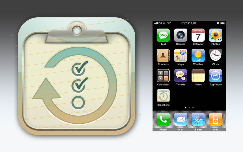
A budding navigational design pattern that is growing in use is the custom center tab button.  In this approach, app designers centralize their app’s primary tasks or content under the middle-most button of a standard 3- or 5-button iPhone tab bar.  This “focal button” provides a way to indicate and drive users to the primary functionality of the app, allows for top-level awareness of secondary content sections, and doesn’t require as much re-learning as a completely custom navigation design.

To differentiate the focal button from the other tabs, it is typically given a special visual treatment and an action label (ie, “Check In” or “Scan” vs. “News” or “Featured”).  Its visual emphasis helps users quickly recognize the core action they need to take, while its location, directly above the iPhone’s hardware home button, gives it a natural physical reference point. Continue reading

September Watercolors

I’m pleased to announce month 9 of watercolor sketching. This batch from September is more impressionistic than last month’s illustrative bunch. Many of these paintings were spontaneous and unplanned. For several of them, I didn’t even bother to add blue tape for clean borders. This gave them a very gestural feel.  I also created several vigorous “action” paintings. Enjoy and, as usual, please contact me with technique questions or purchasing inquiries. Cheers!

This turned out to be a lovely portrait sketch. While, in real life, the subject was coyly smirking, I gave her a more

Continue reading