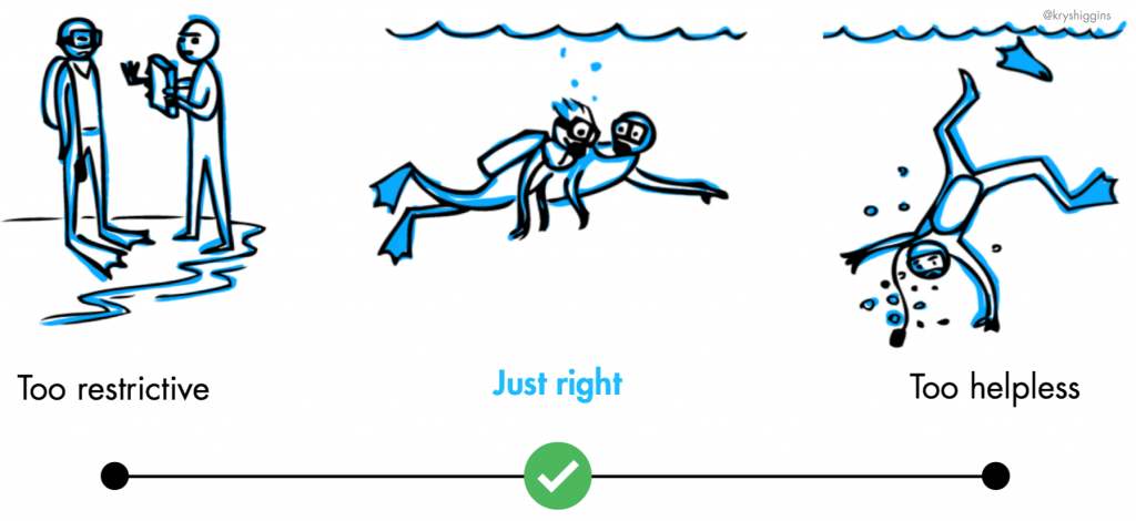
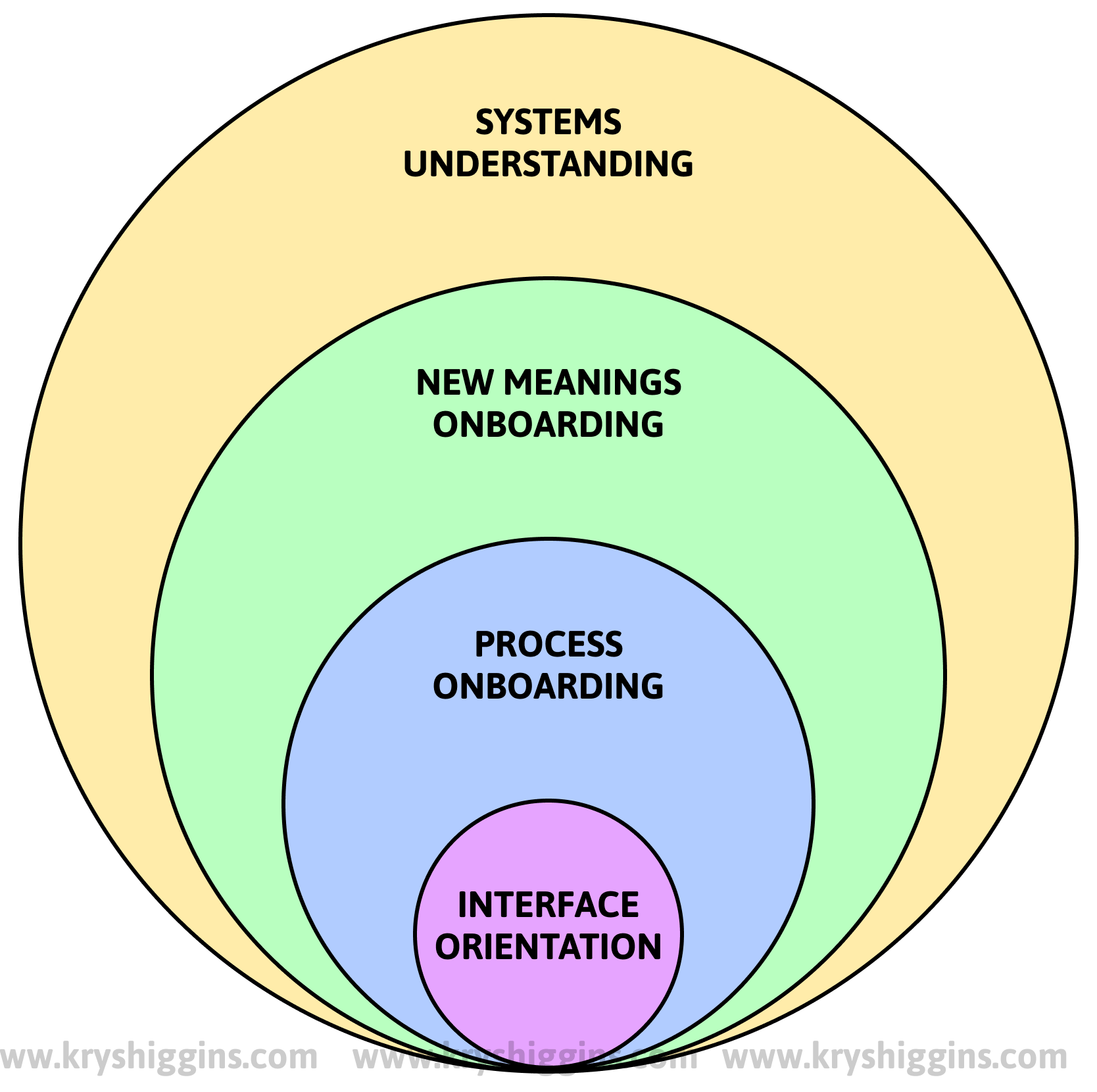
The choreography of companion setup

In an earlier post, I wrote about setup wizards with tips on when to use them and how to design them. The guidance I shared in that article is extensible across every type of setup experience, but I’d like to take a moment to show how that guidance relates to a very specific type of setup experience called companion setup. In this post, I’ll introduce companion setup, when it’s useful, and provide tips on how to choreograph the flow within it.

Illustration of two devices juggling symbols associated with setup, such as toggles, checkboxes, info icons, bluetooth icon, and password lock icon.

Continue reading

Levels of user onboarding

Discussion about user onboarding often focuses on teaching new users how to use a product’s interface. There are dozens of third-party plugins that offer various ways to point out product navigation, features, and affordances. However, this only scratches the surface of what onboarding can be about. The biggest opportunities for onboarding happen at higher levels. 

Similar to how The Society for Human Resource Management (SHRM) says that employee onboarding can happen at multiple levels, user onboarding can also be tiered. Here’s the 4 levels of user onboarding that I currently think about, from lowest highest level: interface orientation, process onboarding, new meanings onboarding, and systems understanding. 

Illustration of 4 levels of onboarding represented as 4 concentric circles, with interface orientation being the smallest circle and systems understanding being the largest, outer circle.

Continue reading

The design of setup wizards

I often talk about onboarding as having a few jobs: Building trust; familiarizing users with a product’s offerings; setting up logistics; and  guiding users toward next steps, until they achieve a steady state. 

That third item in the list, setting up logistics, sometimes becomes the responsibility of setup wizards. I’ve worked on and encountered a fair number of setup wizards in my time working on apps, devices, and operating systems. In this post, I’ll give you an overview of what goes into designing one.

Continue reading

Happy Birthday, Clippy

It’s Clippy’s birthday!

On November 19, 1996, Microsoft announced the release of Office 97, and the famously overzealous paperclip assistant was born. Here’s just a little bit about Clippy (full name: Clippit) and it’s relationship to onboarding.

Continue reading

From “user education” to “product education”

There’s a term used in the product development world that has started to make me cringe, even though I know I’ve used it before. It’s unavoidable if you work on any experience that even remotely touches user onboarding. But it can have a negative impact on human-centered product design. The offending term? “User education.” 

Continue reading

An onboarding reading list

Over the years, I’ve encountered a variety of posts, books, papers, and talks that have expanded my thinking about what goes into good user onboarding. That’s because user onboarding is a blend of many educational, behavioral, human resources, design, and business practices, rather than a separate instance of design.

Continue reading

When “explicit” onboarding isn’t the right choice

I recently downloaded a calculator app. This app greeted me with a series of first-run tooltips explaining various parts of the app. It was an example of an “explicit” first-run experience—when guidance is provided on temporary layers or in one-off flows—that was unnecessary. Let’s quickly run through some of the issues with applying an explicit educational approach to this calculator app, in the hope it can help you decide if implementing an “explicit” onboarding experience for your new users is the right way to go.

Continue reading

What other product folks said about user onboarding

Over the last few months, I asked different people who work on products in services, in a variety of industries, to share their perspectives on user onboarding. While I’ve heard from many people over the years, I wanted to ask a few pointed questions. Via questionnaires and interviews, 48 people* shared with me the challenges they faced in trying to create a good user onboarding experience, the goals they felt user onboarding needed to achieve, and how they defined the scope of it. My goal was to understand the range of perspectives different people have about user onboarding, and find common themes. In the spirit of sharing, this post is a lightweight recap of what stuck out most from these conversations (and I’d love to hear if your perspective is similar or different!).

Continue reading

Bookending with good beginnings & ends

This piece was written together with Joe Macleod and also published as part of UXLX 2020.

When we design products and services, we focus a lot on the core user experience, or what we envision seasoned users to be doing day to day. But a good product or service will be bookended by a strong beginning, and a strong end.

Continue reading

User education as Pokemon evos

When people think of user education in products, they’re often thinking of certain set of UI patterns. In some cases, these patterns can be helpful. But, in most other cases, the patterns are overused and applied inappropriately to many situations. They quickly become anti-patterns.

I’ve illustrated that slippery slope by drawing these “patterns” as if they were Pokemon evolutions. You know, when a seemingly harmless pattern can turn into a formidable beast.

Continue reading

Plotters, pantsers, and user onboarding

Illustration of one person making a single list of steps, and another making a wild, messy drawing of multiple paths

The final seasons of fantasy TV series Game of Thrones were considered a complete flop, with character arcs reaching conclusions that seemed rushed and contrary to the paths they were on in prior seasons. Of the many discussions about why the end of the series felt so wrong, one critique from Twitter user @DSilvermint caught my eye. He attributed the cause to two different writer archetypes: “plotters” (those who start with a detailed outline and clear ending before writing a story, but which allows for less organic character development), and “pantsers” (those who “fly by the seat of their pants” by developing the characters and story as they write, seeing where it takes them, but because of that it can feel like the story doesn’t have a planned endpoint). According to @DSilvermint’s critique, the original book author George RR Martin was a pantser who hadn’t yet figured out where the story would take his characters, while the show producers were plotters focused on reaching a set finale. The conflict between these two approaches could have been one of the reasons the pace to a plotted ending of the show felt so jarring compared to earlier seasons that pulled directly from George RR Martin’s work.

That got me thinking about onboarding design. User onboarding is a process of guiding a new user on their journey from a product’s entry point to an endpoint of success, and can present challenges similar to that of writers trying to shephard characters through a plot. And if we look at difference designs, we can see evidence that some take a plotter’s approach, and others take a pantser’s one.

Continue reading

Onboarding people to AI experiences

With artificial intelligence and its many variants becoming core parts of our products, we need to think about how to onboard users to automated experiences. The principles that underpin good user onboarding for AI aren’t that different from the principles that underpin good user onboarding for anything else. But, because of the unpredictable nature of AI, we must embrace interactive, multi-part guidance more than ever before, instead of the information-heavy approaches that still dominate onboarding for traditional products today.

Sketch of a person being carried by a conveyor belt as they flick on switches.

Continue reading

Onboarding and the active user paradox

Illustration showing a user happily running far ahead of a tutorial, which is chasing them

“New users aren’t discovering our features. Can we make them watch a video or do a tutorial before they get started?”

This is a question I’ve heard many variations of throughout my career. Chances are, if you work in product design, you’ve heard it too.

Continue reading

Key action storyboarding

User onboarding is a journey made up of multiple activities, not a single, linear flow. Onboarding should align guidance independently around each of the “key actions” of its experience so that newcomers can interact with them at the pace and in the order that makes sense for their different situations.

Continue reading

Onboarding for many

In an earlier post, I covered how onboarding is more than just a one-time event in a customer’s journey. In this post, I’ll be making the case for applying more than one onboarding method. Just as students will fail to learn if taught with a one-size-fits-all approach, trying to onboard every user in the same way is bound to fail.

Illustration showing too many people being forced to use a one size onboarding technique, represented by a large box with legs buckling under the weight of all those people.
One-size-fits-all onboarding experiences rarely carry all of our new users.

Continue reading

From first run to the long run

I often evangelize the importance of first time user experiences. After all, not all of the users acquired to a product will stick around, but they’ll all experience its first run design. To encourage return use, that first impression must be solid. But it’s also very common for designers to overemphasize the first run experience at the expense of long-term user support.

Illustration showing that a first run experience ends up ending too soon to help users complete their journey on the path to engagement and retention


Clippy, the Microsoft Office Assistant, failed partly because it catered to first time users. It didn’t scale gracefully as those users became acclimated to the product. As James Fallows describes “…Clippy suffered the dreaded ‘optimization for first time use’ problem. That is, the very first time you were composing a letter with Word, you might possibly be grateful for advice about how to use various letter-formatting features. The next billion times you typed ‘Dear …’ and saw Clippy pop up, you wanted to scream.”

Continue reading

“Free sample” idea boards

Attendees of my “New Users Matter, Too” talks have graciously brainstormed ideas for free samples–experiences that allow new users to interact with a portion of a product’s value proposition before committing to an account. These methods can increase valuable signups and reduce the walls that prevent conversion. Use these ideas to kickstart your team’s exploration of a free sample that’s right for your product.

Free Samples Feature Image

Continue reading