NVIDIA professional tools identity

© NVIDIA

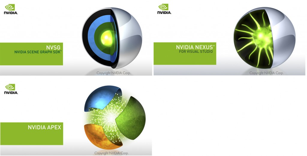
NVIDIA maintains a number of tools to help programmers and artists alike get the most from NVIDIA processors. I designed a system of icons and splash screens for these professional computing tools and SDKs using 3D rendering program Cinema 4D.

These included APEX, a framework where artists can create complex dynamic systems without any programming; SceniX, a scene graph with robust capabilities; and Parallel Insight (originally called Nexus), a parallel computing development environment built into Visual Studio. A shell theme is used across the products to communicate that they are all components of a larger toolset.

NVIDIA Hardware Icons

I created families of icons to represent NVIDIA components for use in installation wizards and software packages. Unlike product branding icons, these icons need to communicate steps and concepts. Particularly tricky is how to represent components that users may never see, like GPU chips. Some of my favorite pieces with 3D icons I created for reusable components, and the colorful GPU icon we’ve used in loading screens and the NVIDIA Optimus UI.

© NVIDIA

Icon sets for various products

Visual designs for a checklist app icon showing an engraved set of 3 checkmarks on a richly rendered clipboard in soft colours
Back in the earlier days of iOS, skeuomorphism was the optimal design language. Icons needed to be rich and dimensional. This icon represents an app concept for a repetition learning app.
Visual designs for a checklist app showing an atomic shape sitting on top of an inbox of to-dos
This icon, also rich and dimensional, was a concept for a to-do app with an “atomic” brand name. The icon was designed as both a 3D version for website usage and as a flattened version for the iOS app. This was created in Cinema 4D with post-processing in Photoshop.
Visual designs for a software component app where the icon looks like pieces in a model creation set
This earlier concept for a developer component library app was fun to work on, but ultimately didn’t make it into the final product due to complexity. However, I enjoy the concept behind it; perhaps one day I’ll take another spin.
Image showing 3 different styles of icons (green magnifying glass one, red target one, and blue toolbox one)
3 icons were needed to represent a family of web-based enterprise products aimed at helping companies manage their online presence. I designed a system of both 2D and 3D icons that could scale from web icons to large homepage illustrations. I conducted an online card sort to see which concepts users most commonly associated with each product’s description. I then sketched and finalized the icons based on this data. Icons were rendered in Cinema 4D with post processing in Photoshop. All product names shown are placeholders.
Mockup of website home page with 3D icon of a magnifying glass hovering over a webpage featured in the main web banner
An example of one of the web tools’s icons shown as both the flattened site brand and a rich 3D rendering for the website header.
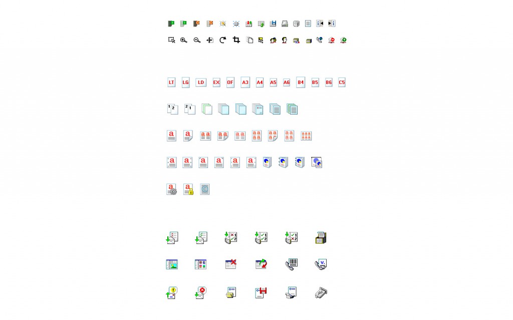
Image showing multiple rows of 8-bit and 16-bit printer settings icons
Not all icons can or should be richly rendered. These icons show a range of 8- and 16-bit aliased color icons, created to be displayed on the limited pixels of printer displays. It’s certainly tricky to communicate page layout variations in limited size and colour, but a fun challenge nonetheless.
Scan of sketches of icons
Sketching is an important part of icon design — first you have to find the right concept to start producing.

I’ve produced multiple icon sets for a variety of platforms and product types, ranging from small app development companies to large enterprise software suites. I enjoy the constraints offered by different platforms and the process of finding visual iconography that makes a strong affordance. I’ve had experience rendering icons from as small and limited as 8-bit color to those that are rendered in 3D software for rich platform displays.