In a past post, I outlined the different levels of user onboarding and encouraged practitioners to find more impactful applications of onboarding expertise. The hope is that we can move beyond instructing users about UI or getting them to sign up for an account (what I call interface orientation, representing the lowest level of onboarding) to building guidance that provides higher levels of value: helping people understand the value of products and services as they relate to creating meaning in their own lives, and helping them understand how their use of a product, service, or system impacts the larger societal system they are a part of.
In the era of AI, we have the opportunity to uplevel onboarding design, but there’s still a tendency for teams to use agents only for rote interface orientation. How might we leverage it for greater benefit?
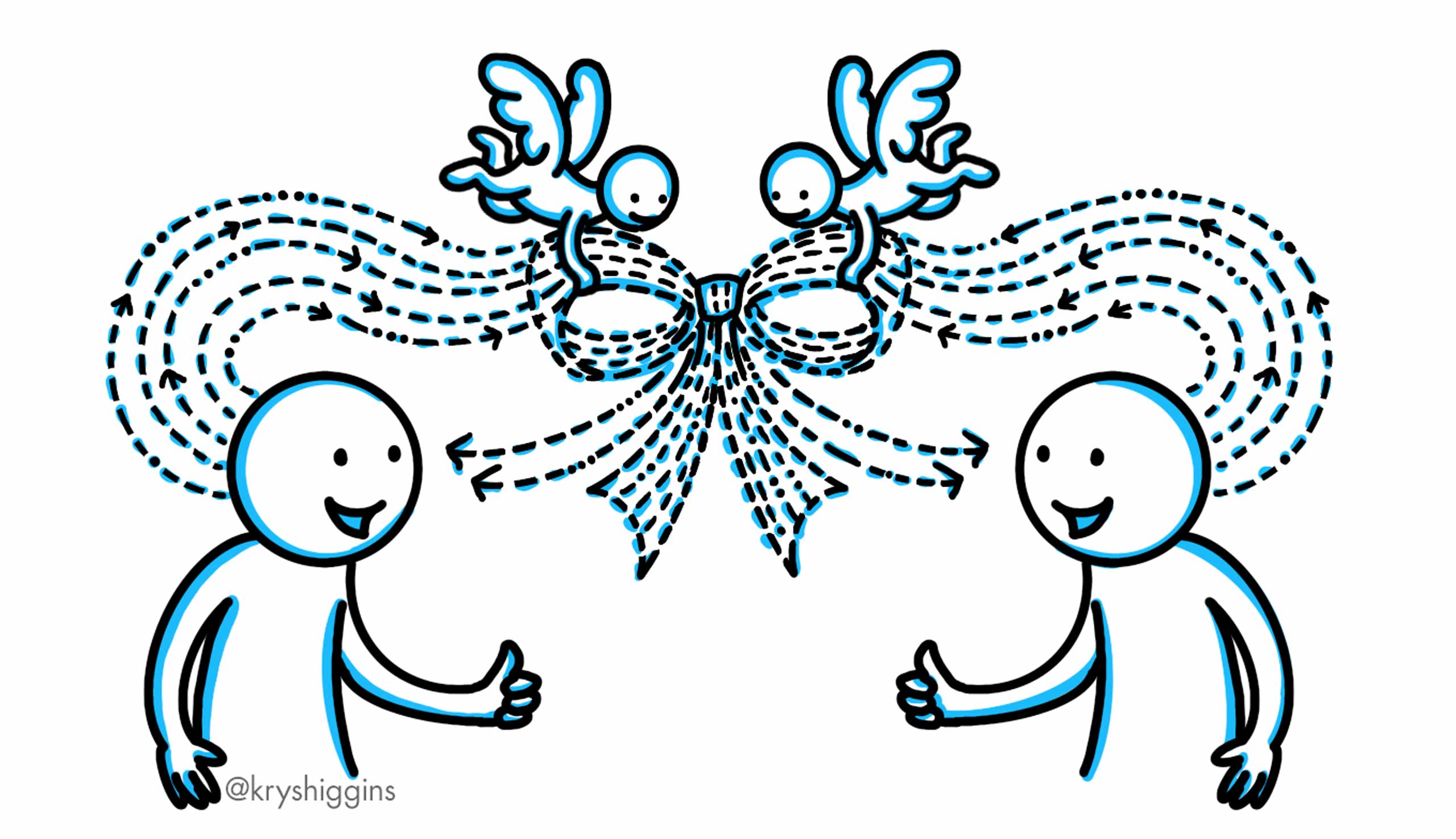
Recently I came across an episode of Inner Cosmos, a podcast that looks at the relationship between our brain and our experiences. The episode, “What does alignment look like in a society of AIs?,” featured host and neuroscientist David Eagleman interviewing cognitive scientist Danielle Perszyk about her work with and vision for more personal, augmentative AI agents. This discussion articulated some clear opportunities for how agents built for “aligning minds” could support this path toward higher-level onboarding.
OS-facilitated PWA installation is one component of a better app model on ChromeOS
As a lead designer on ChromeOS, I established the App Model, an initiative to seamlessly integrate apps from different platforms into the OS.
Background
One of the benefits of ChromeOS is that it allows the installation of apps from many different platforms, such as progressive web apps (PWAs) or Android apps. However, sometimes these apps can behave differently because of their platform differences, resulting in unpredictable outcomes for end-users who shouldn’t need to understand an app’s technical construction to understand how an app will behave. I recognized the need to better unify key app behaviors, capabilities, and system representations to improve user experience and perception.
Task & Actions
In an IC UX capacity, I initiated and led the App Model project from strategy to various streams of execution.
Strategy & defining scope of the App Model
I identified the need to invest in a concerted App Model effort after synthesizing existing user research and customer insights, and pitched and gained support for a dedicated work stream from our leadership team, making it an OKR for the organization.
I then:
Established design principles (for example, to focus on predictability between apps rather than perfect consistency);
Created a working spec that would cover app representation, behaviors, and capabilities;
Defined collaboration models with supporting teams; and
Broke down areas of the spec into smaller projects that could be released independently
Although an ongoing and long-term area of investment, I released several features supporting the goal of making app behavior more predictable and improving upon app capabilities. Many of these features were focused on bringing PWAs (web apps) up to the standards that users expected from installed apps.
Designing native PWA installation
PWAs, one of the primary app types for ChromeOS, allow developers to deploy cross-platform, desktop-ready apps. Apps like Figma, Adobe Express, and GeForce Now are all PWAs.
While PWAs could be installed via an “install” option in the browser on ChromeOS, the installation process did not match what users expected for apps. Web apps, when installed from a website, would appear as if they had opened in a new browser window, rather than making it clear it had been installed to the system. Additionally, it was hard for users to discover where to install a web app from as installation was only able to be brokered via the browser and therefore had a limited visibility entry point via the browser URL bar.
This screenshot, courtesy of web.dev, shows the older method of PWA install on ChromeOS, which relied on triggering a basic dialog via a limited visibility icon in the browser URL bar.
In order to help users perceive web apps as truly installed apps and unlock more installation paths, I identified the need to give them a native-like installation experience that could be triggered from different places apps might be installed from. I explored multiple installation paths before I designed a new install dialog that could be triggered from different contexts. The dialog was designed to look like an OS-generated dialog in order to reassure users that this was a legitimate installation flow no matter where they triggered it from.
I designed the PWA install dialog on ChromeOS to have 3 states: pre-install disclosure state (left), the inline install progress state (middle), and the post-install success state with the next step of opening the app (right). I also had to design various fallback states for the installation dialog. For example, if a developer did not provide application screenshots as part of their web app manifest, then we needed a fallback design that removed the image but still provided enough information to make an installation decision. The dialog color will adjust to match the overall OS color theme set by the user to enhance the feeling that this was an OS-legitimate flow.
This feature improved the perception of web app installation and also enabled the creation of more entry points to initiate installation, such as by unlocking our ability to offer an “Add to Chromebook” button announced at Google I/O 2024 as well as an early app discovery surface called the App Mall.
This screen recording, courtesy of ChromeOS.dev, shows the end-to-end installation flow of a PWA via the “Add to Chromebook” button, a flow that was unlocked by using the contextual system installation flow I designed
Tabbed PWAs
As part of making web apps feel more natively integrated into the OS and to encourage more availability of PWAs, I defined a system-level tabbed element for application window title bars. Our research showed that users view installed web apps, which run in their own window, as more powerful than those running in browsers, but some developers were not making their web apps available to install because they didn’t want to lose the multitasking capabilities of tabs.
I defined the UI and logic for a tabbed mode API, including what options would be available to developers, defaults, and fallback logic. This feature supported a plethora of new developer use cases and enabled apps like Figma, which relies heavily on tabbed workflows, to make their PWA installable on ChromeOS.
GIF of tabbed mode as a native title bar element developers can choose, as shown in the installable Figma app on ChromeOS
Results
The app model has been an ongoing area of consideration and investment for the ChromeOS team thanks to my driving it forward. The individual releases mentioned above also were featured at Google I/O 2024 (video | article) and became key announcements for ChromeOS developers in 2024. And as previously mentioned, these features unlocked important use cases, such as the Add to Chromebook button and enabling Figma to promote an installable PWA on ChromeOS.
This photo from Google I/O 2024 shows how tabbed mode and other app model features were keystone announcements for ChromeOS
ChromeOS is the desktop operating system for Chromebooks. In this project, I designed an OS integration that enables the opening and editing of Microsoft Office (Word, Excel, and Powerpoint) files.
Background
The ability to support different file editing workflows is essential to a desktop OS. One common workflow is for users to download Office (Word, Excel, and Powerpoint) files to their local drive, and then open them in a Microsoft file editor. But while Chromebook users had many options for opening these kinds of files on ChromeOS, such as via the Microsoft 365 app or Google Docs, Sheets, or Slides, these options were difficult to discover and choose from. Users also couldn’t open Office files directly from their local drive into Microsoft 365.
Task
As IC UX lead, I explored multiple strategies for simplifying and streamlining the options users had to choose from, improved the discovery of Office file editing solutions, and solved for the local file opening workflow. I led a cross-functional team through bringing a final design to market.
Actions
Defined strategy
I framed the problem around the number of options users had to contend with compared to the simple workflow they expected: to download a file, click on it, and have it open in a full-featured Office file editing app.
I worked with my PM and engineering counterparts to simplify the options we’d present to users and to improve the discovery of the Microsoft 365 app as a key handler for Office file types. One fixed constraint we had to work with was that the Microsoft 365 app required files to be stored in OneDrive before it could open them.
Then I laid out the pieces we’d need to build:
Integration of OneDrive storage into the ChromeOS file system (via the ChromeOS Files app);
A setup flow to show users their options and, for those that chose Microsoft 365, to help users get the app and to connect it to OneDrive;
The day-to-day file opening flow that would facilitate moving a file to OneDrive; and
User preferences for file handling that could be changed later, with associated backend logic
Conceptual research
I put together conceptual prototypes to test user mental models and comprehension around Microsoft 365 app discovery, files moving to OneDrive before opening, and Office file editing.
Hands-on design of setup & file moving flows
I designed the setup flow directly, partnering with a visual designer to ensure adherence to our OS design system. I chose to have the setup flow be triggered the first time a user clicked to open any Office file type in their ChromeOS Files app. This made the setup experience contextual to the user’s current workflow. This setup flow would give the user the option to select any app that could handle their file. If they opted to use Microsoft 365, setup would install the app, help users add Microsoft OneDrive to their Chromebook’s Files app, and then ask to move their selected file to OneDrive in order to finish opening it.
For subsequent file opens, I designed a gradually reductive approach. The user would be notified again that their file would be moved to OneDrive. They would then have the option to never show the message again, and it would then automatically move and open the file from that point onward.
I also had to define how setup impacted file handling preferences and defaults, and how users could change their preferences later. I guided a supporting UX designer to implement those preferences in Files app settings, to design the OneDrive integration into the Files app, and to design the notifications system used to communicate status & errors during the file move process.
Prototyping & usability studies
Working with a user researcher, and designing clickthrough prototypes myself in Figma, we ran 3 studies to iterate on this flow & find the right balance between disclosure and friction. We wanted to help users understand that their file would move from local storage to OneDrive storage, but not add too much friction that slowed down file editing. The studies helped us hone in on the right balance between these two needs, reflected in the final product.
Go-to-market
I was hands-on in the development of all external-facing communications and promotional content, wrote new and updated existing help articles, and co-planned our rollout strategy.
Results
As a result of my actions, the team launched a user-centered, streamlined solution to a critical user need that increased successful opens of Word, Powerpoint, and Excel files. The press and community reception was positive (article | article). Also, as a side effect of this work, we paved the infrastructure needed for any third-party storage provider to be connected to the ChromeOS Files app.
The team developed multiple photo sharing features during my leadership tenure, including a redesign of the Sharing page (left), integration of shared content in the new Memories area (middle), and a join album flow (right). Images copyright Google.
In this role, I conducted both hands-on work in designing growth experiments and solutions for Sharing, while also defining UX strategy for the cross-functional team and managing a small team of designers and a researcher to work on our initiatives.
UX lead and manager
In my role as UX lead and manager, I worked with my PM and Eng lead counterparts to develop the strategy for sharing within Google Photos. A singular focus on sharing was a big shift for the cross-functional team, as we had originally hired the team to work on a portfolio of discrete problem spaces rather than on one shared problem space. To help the team give input into our strategy, I created an internal research program to learn what everyone on the team was looking for in a new team vision and charter. I then designed and drove a week-long Photos Sharing strategy workshop to co-design a series of project ideas with the larger team, resulting in diverse concepts that fed into our strategy and the completion of a comprehensive competitive analysis.
The team was structured to tackle various parts of photo sharing, including up-leveling the app’s partner sharing feature, improving album sharing, introducing memories sharing, and growth design to explore how to increase engagement with shared media. One of the contributions of the team was integrating shared content and sharing controls into what eventually became a new Google Photos Memories section.
The integration of shared content into the new Memories feature was one of the accomplishment of the Sharing team based in Sydney. Image copyright Google.
Growth design for Sharing
In a hands-on capacity, I established a growth design track for experiments that would lead to improvement in sharing engagement. One outcome from an experiment program I designed was a new “Join album” flow, which appears when someone invites another Google account holder to view an album of photos. The final design, below, includes setting expectations about how many other people might be in the album before a recipient signs in.
I created a new join album page on mobile and web via a growth design experimentation process I established.
High quality video sharing via text message
Outside of growth experiments, I also worked directly with a designer on the Android Messages team to integrate a means to send videos in high quality to non-Android messaging recipients. According to Google’s announcement on the feature, “Today, the RCS standard lets people with Android devices share beautiful, high-quality photos and videos with one another. But unfortunately, without RCS, they look blurry when you share them with your iPhone friends. Now everyone can watch your videos in the same resolution that you do since we’re bringing Google Photos into Messages. You can send your videos as Google Photos links right inside the conversation, preserving their clarity. Coming soon, you’ll be able to send your photos this way, too.” Below is a video, from the article, highlighting how the feature works.
Video from the Google Blog showcasing how Google Photos integration works with Android Messages. Video copyright Google.
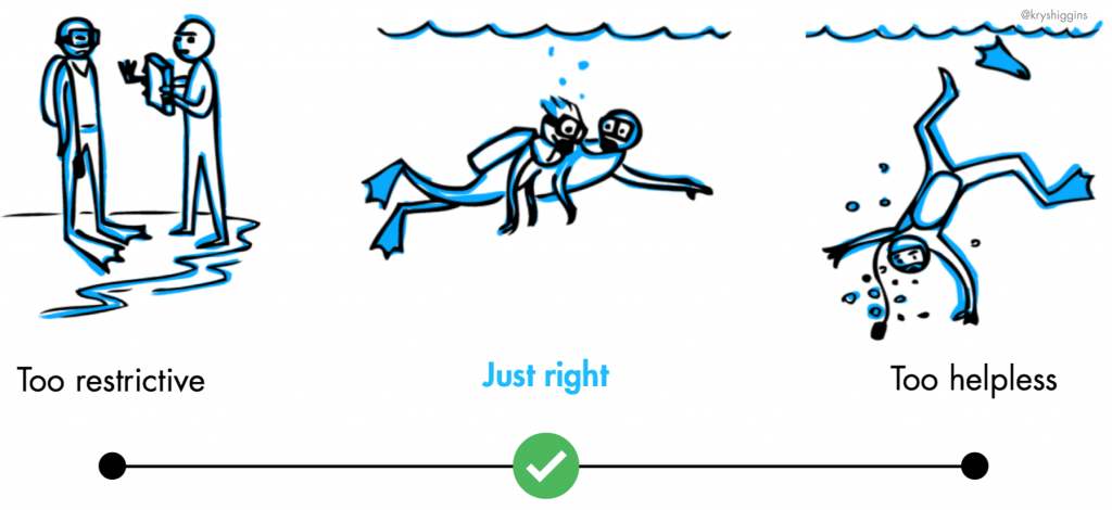
I used to have a graphic in my user onboarding talks that looked something like this:
It used scuba diving as a metaphor to illustrate that good user onboarding finds the happy medium between passive instruction and chucking new users into the deep end of a complicated product. We want to find just the right amount of guidance that allows new users to immerse in a valuable product experience, while letting them have a safe and effective time of it.
The idea of treating onboarding design as the process of finding an optimal balance between two extremes can also be illustrated in other ways. One way might be with a bell curve, inspired by those that accompany texts about the Yerkes-Dodson law.
The new year is the perfect time to explore new ways of building effective and human-centered user onboarding experiences. Here are 5 onboarding design strategies you can explore this year, whether you’re building for devices, apps, services, platforms, or anything in between.
In an earlier post, I wrote about setup wizards with tips on when to use them and how to design them. The guidance I shared in that article is extensible across every type of setup experience, but I’d like to take a moment to show how that guidance relates to a very specific type of setup experience called companion setup. In this post, I’ll introduce companion setup, when it’s useful, and provide tips on how to choreograph the flow within it.
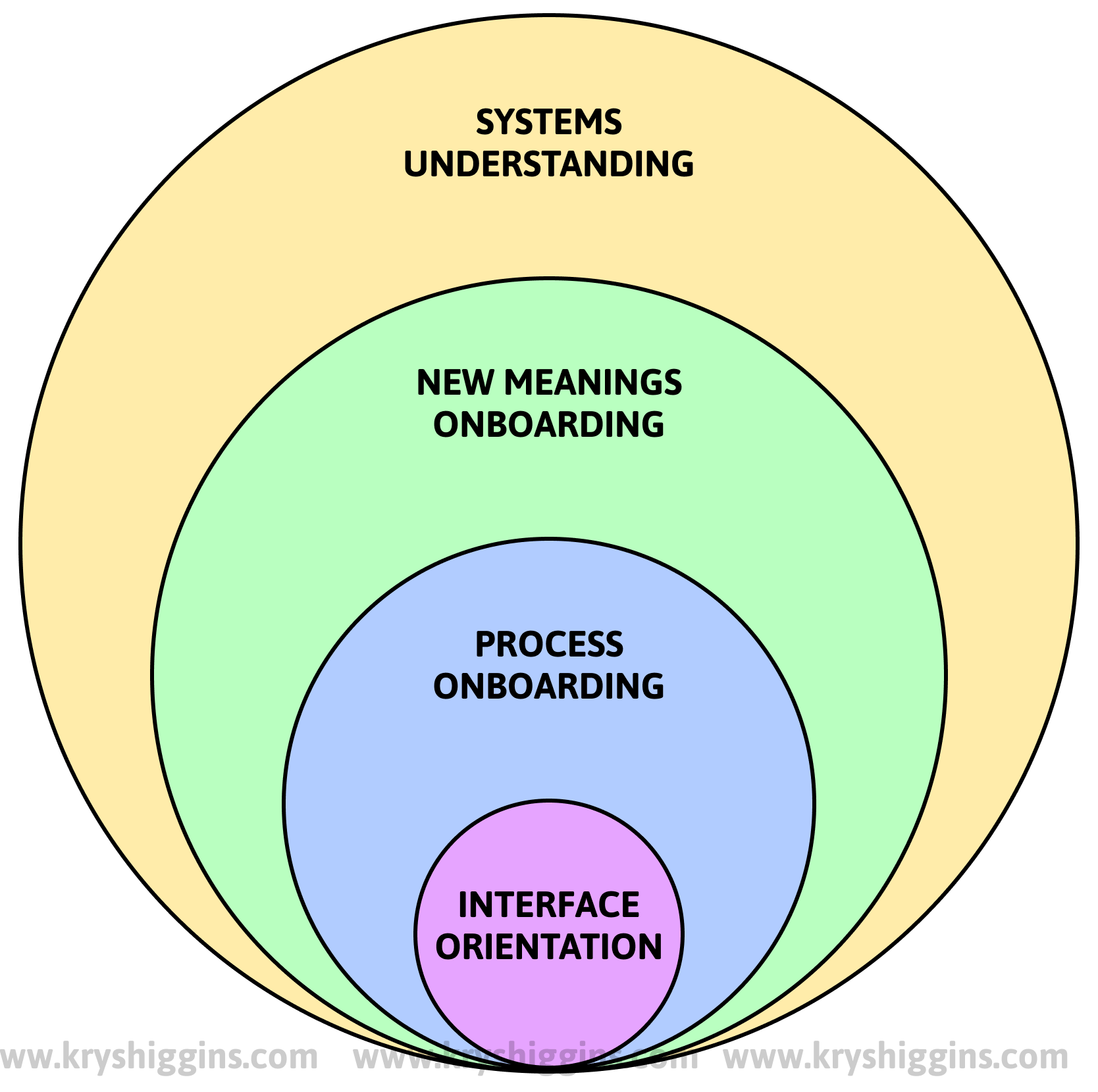
Discussion about user onboarding often focuses on teaching new users how to use a product’s interface. There are dozens of third-party plugins that offer various ways to point out product navigation, features, and affordances. However, this only scratches the surface of what onboarding can be about. The biggest opportunities for onboarding happen at higher levels.
Similar to how The Society for Human Resource Management (SHRM) says that employee onboarding can happen at multiple levels, user onboarding can also be tiered. Here’s the 4 levels of user onboarding that I currently think about, from lowest highest level: interface orientation, process onboarding, new meanings onboarding, and systems understanding.
I often talk about onboarding as having a few jobs: Building trust; familiarizing users with a product’s offerings; setting up logistics; and guiding users toward next steps, until they achieve a steady state.
That third item in the list, setting up logistics, sometimes becomes the responsibility of setup wizards. I’ve worked on and encountered a fair number of setup wizards in my time working on apps, devices, and operating systems. In this post, I’ll give you an overview of what goes into designing one.
On November 19, 1996, Microsoft announced the release of Office 97, and the famously overzealous paperclip assistant was born. Here’s just a little bit about Clippy (full name: Clippit) and it’s relationship to onboarding.
There’s a term used in the product development world that has started to make me cringe, even though I know I’ve used it before. It’s unavoidable if you work on any experience that even remotely touches user onboarding. But it can have a negative impact on human-centered product design. The offending term? “User education.”
This talk and workshop series helps teams understand how to build better user onboarding experiences for their products and services, and includes insights from my Better Onboarding book. This series has been featured at events like PUSH UX in Munich, An Event Apart in San Francisco, UX Fest in London, UX Australia, CPHUX in Denmark, and Button.
Want me to do this talk or workshop for your event? Reach out!
About the talk
A good onboarding experience welcomes new users and guides them from their current situations to lasting success. But it often gets reduced to a one-size-fits-all, front-loaded piece of instruction. This talk covers why teams need to move past front-loaded instruction and instead embrace guided interaction.
Key takeaways from the “Better Onboarding” talk:
Understand what guided interaction is, and why it’s a better onboarding strategy than front-loaded instruction.
Learn the basics about mapping user onboarding journeys.
See how the baseline design of your product and its content creates a foundation for better onboarding.
The “Better Onboarding” talk is available in a 30 min, 45 min, or 1 hour format (not including Q&A). Contact me if you’re interested in having me give this talk.
About the workshop
Photograph from an in-person version of the Better Onboarding Journeys workshop
The workshop, called “Better Onboarding Journeys,” provides strategies for designing user onboarding that guides new users from different situations to a destination of success. It suits UX designers, product managers, content strategists, startup founders, and anyone on a product team. The strategies are flexible to all stages of product maturity, from evolving the onboarding of an existing product to creating onboarding for a brand new one.
Through a mix of presentation and hands-on activities, participants learn how to:
Define the start and end points of onboarding
Map the actions that bridge people between those start and endpoints
Break down each action so that teams can see how guidance can be applied to individual actions while still linking them to a broader journey.
The “Better Onboarding Journeys” workshop has been run virtually and in person, and runs in both a half day and full day format. Contact me if you’re interested!
I’m a User Experience (UX) designer, and I happen to have a penchant for the user onboarding side of it. All UX professionals are onboarding designers, in a way. That’s because UX design involves closing the gap between systems, services, and the humans that use them through thoughtful design of virtual and physical interfaces. Good UX designers work hard to minimize how much time people have to spend on learning and using interfaces, trying to make them as intuitive as possible. This is no small feat given how every new user brings a unique set of mental models with them, and how limited current technologies are in providing perfectly individualized personalisation.
Now let’s shift to the neurotechnology industry; specifically, brain computer interfaces (BCIs). BCIs use sensors, which can range from non-invasive to invasive, to “measure brain activity, extract features from that activity, and convert those features into outputs that replace, restore, enhance, supplement, or improve human functions” (ScienceDirect). That definition can bring up ideas from sci-fi stories like The Matrix, Upload, or Altered Carbon, where characters can download expertise, control machines with their minds, and do other superhuman things.
But alongside these ideas, I worry that a question may also be forming in people’s minds: “Do we need the discipline of UX design to close the gap between humans and systems if we have direct-to-brain interfacing?”
I frequently get asked if onboarding needs to be done differently for products in the enterprise or B2B spaces, so thankfully the folks over at GrowthDesigners.co gave me a space to answer that question. Spoiler: the principles that underpin good onboarding apply to all kinds of products, just like the principles of good product design don’t change just because the audience changes, but there are some specific considerations for the B2B space.
Over the years, I’ve encountered a variety of posts, books, papers, and talks that have expanded my thinking about what goes into good user onboarding. That’s because user onboarding is a blend of many educational, behavioral, human resources, design, and business practices, rather than a separate instance of design.
I sketched this idea of people hanging upside down from floating inner tubes two years ago, without knowing how I wanted to render the piece or what I wanted it to say. Eventually, I realised I wanted to say something about plastic in our oceans…so here we are.
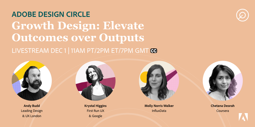
This Adobe Design Circle panel was held in December of 2020. It featured growth design experts such as Molly Norris Walker and Chetana Deorah, and was facilitated by Andy Budd.
This panel covered the burgeoning discipline of Growth Design, how to structure teams around growth, and how it relates to other design activities like user onboarding and product design. You can watch the 1 hour recording here (may require registration).