ChromeOS App Model

Screenshot of an installation dialog for a web app
OS-facilitated PWA installation is one component of a better app model on ChromeOS

As a lead designer on ChromeOS, I established the App Model, an initiative to seamlessly integrate apps from different platforms into the OS.

Background

One of the benefits of ChromeOS is that it allows the installation of apps from many different platforms, such as progressive web apps (PWAs) or Android apps. However, sometimes these apps can behave differently because of their platform differences, resulting in unpredictable outcomes for end-users who shouldn’t need to understand an app’s technical construction to understand how an app will behave. I recognized the need to better unify key app behaviors, capabilities, and system representations to improve user experience and perception. 

Task & Actions

In an IC UX capacity, I initiated and led the App Model project from strategy to various streams of execution.

Strategy & defining scope of the App Model

I identified the need to invest in a concerted App Model effort after synthesizing existing user research and customer insights, and pitched and gained support for a dedicated work stream from our leadership team, making it an OKR for the organization.

I then:

  • Established design principles (for example, to focus on predictability between apps rather than perfect consistency);
  • Created a working spec that would cover app representation, behaviors, and capabilities;
  • Defined collaboration models with supporting teams; and 
  • Broke down areas of the spec into smaller projects that could be released independently

Although an ongoing and long-term area of investment, I released several features supporting the goal of making app behavior more predictable and improving upon app capabilities. Many of these features were focused on bringing PWAs (web apps) up to the standards that users expected from installed apps.

Designing native PWA installation 

PWAs, one of the primary app types for ChromeOS, allow developers to deploy cross-platform, desktop-ready apps. Apps like Figma, Adobe Express, and GeForce Now are all PWAs.

While PWAs could be installed via an “install” option in the browser on ChromeOS, the installation process did not match what users expected for apps. Web apps, when installed from a website, would appear as if they had opened in a new browser window, rather than making it clear it had been installed to the system. Additionally, it was hard for users to discover where to install a web app from as installation was only able to be brokered via the browser and therefore had a limited visibility entry point via the browser URL bar.

Screenshot showing previous versions of PWA install on ChromeOS via a browser URL icon
This screenshot, courtesy of web.dev, shows the older method of PWA install on ChromeOS, which relied on triggering a basic dialog via a limited visibility icon in the browser URL bar.

In order to help users perceive web apps as truly installed apps and unlock more installation paths, I identified the need to give them a native-like installation experience that could be triggered from different places apps might be installed from. I explored multiple installation paths before I designed a new install dialog that could be triggered from different contexts. The dialog was designed to look like an OS-generated dialog in order to reassure users that this was a legitimate installation flow no matter where they triggered it from.

Images showing the 3 states of the web app installation dialog on ChromeOS
I designed the PWA install dialog on ChromeOS to have 3 states: pre-install disclosure state (left), the inline install progress state (middle), and the post-install success state with the next step of opening the app (right).
Image showing two variations of the web app install dialog based on whether an app developer has provided screenshots or not
I also had to design various fallback states for the installation dialog. For example, if a developer did not provide application screenshots as part of their web app manifest, then we needed a fallback design that removed the image but still provided enough information to make an installation decision. The dialog color will adjust to match the overall OS color theme set by the user to enhance the feeling that this was an OS-legitimate flow.

This feature improved the perception of web app installation and also enabled the creation of more entry points to initiate installation, such as by unlocking our ability to offer an “Add to Chromebook” button announced at Google I/O 2024 as well as an early app discovery surface called the App Mall.  

Animated GIF showing the end-to-end installation flow of the Pixlr PWA via the "Add to Chromebook" button
This screen recording, courtesy of ChromeOS.dev, shows the end-to-end installation flow of a PWA via the “Add to Chromebook” button, a flow that was unlocked by using the contextual system installation flow I designed

Tabbed PWAs

As part of making web apps feel more natively integrated into the OS and to encourage more availability of PWAs, I defined a system-level tabbed element for application window title bars. Our research showed that users view installed web apps, which run in their own window, as more powerful than those running in browsers, but some developers were not making their web apps available to install because they didn’t want to lose the multitasking capabilities of tabs. 

I defined the UI and logic for a tabbed mode API, including what options would be available to developers, defaults, and fallback logic. This feature supported a plethora of new developer use cases and enabled apps like Figma, which relies heavily on tabbed workflows, to make their PWA installable on ChromeOS. 

GIF of tabbed mode as a native title bar element developers can choose, as shown in the installable Figma app on ChromeOS

Results

The app model has been an ongoing area of consideration and investment for the ChromeOS team thanks to my driving it forward. The individual releases mentioned above also were featured at Google I/O 2024 (video | article) and became key announcements for ChromeOS developers in 2024. And as previously mentioned, these features unlocked important use cases, such as the Add to Chromebook button and enabling Figma to promote an installable PWA on ChromeOS.

Screenshot from Google I/O video showing speaker announcing tabbed mode & adoption by Figma
This photo from Google I/O 2024 shows how tabbed mode and other app model features were keystone announcements for ChromeOS

All work for this project is © Google

Skills demonstrated

  • Strategy & visioning
  • Project management
  • Systems design
  • Interaction design
  • API design
  • User research

ChromeOS + Office files

Screenshot from the setup of Microsoft 365 file opening support, courtesy of ChromeOS Beta Community blog

ChromeOS is the desktop operating system for Chromebooks. In this project, I designed an OS integration that enables the opening and editing of Microsoft Office (Word, Excel, and Powerpoint) files.

Background

The ability to support different file editing workflows is essential to a desktop OS. One common workflow is for users to download Office (Word, Excel, and Powerpoint) files to their local drive, and then open them in a Microsoft file editor. But while Chromebook users had many options for opening these kinds of files on ChromeOS, such as via the Microsoft 365 app or Google Docs, Sheets, or Slides, these options were difficult to discover and choose from. Users also couldn’t open Office files directly from their local drive into Microsoft 365.

Task

As IC UX lead, I explored multiple strategies for simplifying and streamlining the options users had to choose from, improved the discovery of Office file editing solutions, and solved for the local file opening workflow. I led a cross-functional team through bringing a final design to market.

Actions

Defined strategy

I framed the problem around the number of options users had to contend with compared to the simple workflow they expected: to download a file, click on it, and have it open in a full-featured Office file editing app. 

I worked with my PM and engineering counterparts to simplify the options we’d present to users and to improve the discovery of the Microsoft 365 app as a key handler for Office file types. One fixed constraint we had to work with was that the Microsoft 365 app required files to be stored in OneDrive before it could open them. 

Then I laid out the pieces we’d need to build:

  • Integration of OneDrive storage into the ChromeOS file system (via the ChromeOS Files app);
  • A setup flow to show users their options and, for those that chose Microsoft 365, to help users get the app and to connect it to OneDrive;
  • The day-to-day file opening flow that would facilitate moving a file to OneDrive; and
  • User preferences for file handling that could be changed later, with associated backend logic  

Conceptual research

I put together conceptual prototypes to test user mental models and comprehension around Microsoft 365 app discovery, files moving to OneDrive before opening, and Office file editing.

Hands-on design of setup & file moving flows

I designed the setup flow directly, partnering with a visual designer to ensure adherence to our OS design system. I chose to have the setup flow be triggered the first time a user clicked to open any Office file type in their ChromeOS Files app. This made the setup experience contextual to the user’s current workflow. This setup flow would give the user the option to select any app that could handle their file. If they opted to use Microsoft 365, setup would install the app, help users add Microsoft OneDrive to their Chromebook’s Files app, and then ask to move their selected file to OneDrive in order to finish opening it.  

For subsequent file opens, I designed a gradually reductive approach. The user would be notified again that their file would be moved to OneDrive. They would then have the option to never show the message again, and it would then automatically move and open the file from that point onward.

I also had to define how setup impacted file handling preferences and defaults, and how users could change their preferences later. I guided a supporting UX designer to implement those preferences in Files app settings, to design the OneDrive integration into the Files app, and to design the notifications system used to communicate status & errors during the file move process.

Prototyping & usability studies

Working with a user researcher, and designing clickthrough prototypes myself in Figma, we ran 3 studies to iterate on this flow & find the right balance between disclosure and friction. We wanted to help users understand that their file would move from local storage to OneDrive storage, but not add too much friction that slowed down file editing. The studies helped us hone in on the right balance between these two needs, reflected in the final product. 

Go-to-market 

I was hands-on in the development of all external-facing communications and promotional content, wrote new and updated existing help articles, and co-planned our rollout strategy.

Results

As a result of my actions, the team launched a user-centered, streamlined solution to a critical user need that increased successful opens of Word, Powerpoint, and Excel files. The press and community reception was positive (article | article). Also, as a side effect of this work, we paved the infrastructure needed for any third-party storage provider to be connected to the ChromeOS Files app.

All work for this project is © Google

Skills demonstrated

  • Strategy & visioning
  • Project management
  • Systems design
  • Interaction design
  • Prototyping
  • User research
  • Go-to-market content

NVIDIA Design Garage

Design Garage was a demo application designed to show off the power of NVIDIA’s GeForce GTX 400 series of graphic processors. Car enthusiasts and 3D designers can use this app to quickly set up and customize photo-realistic renderings of some of the most distinguished autos. We designed the interaction to be minimal, and the UI to be collapsible, so as to keep focus on the high quality models and scenes.

I was partnered one-on-one with a developer for this project and produced flows, specifications and final visual assets.

© NVIDIA

Summary of my activities

  • Lead interaction design
  • Information architecture
  • Flows & wireframes
  • Visual design
  • Specs & guidelines

NVIDIA Optimus

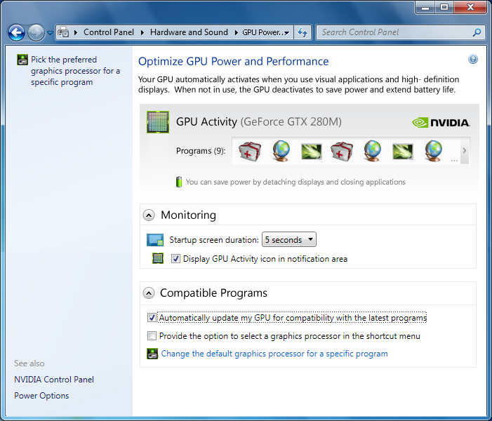
NVIDIA Optimus technology maximizes the battery life on a notebook by automatically switching off the GPU (graphics processing unit) off when it is not needed and switching it on when needed again. The technology requires no user interaction, so all of these changes happen seamlessly without interrupting normal activities. Indicators and a settings panel are available for those who want an indication when the GPU is being turned on or off.

In addition to creating the control panel settings experience and the windows task bar flyout/notification icon experience, I designed the branding icon used in the NVIDIA Optimus badge.

© NVIDIA

Summary of my activities

  • Icon design
  • Flow diagramming
  • Visual design
  • Specifications

Tegra Netbook OS Demo

I created the look and feel and behavioral style for a custom netbook OS demo. The goal was to showcase 3D UI features of a Tegra-driven netbook GUI.

© NVIDIA

Summary of my activities

  • Interaction design
  • Visual design
  • Icon design
  • Specifications