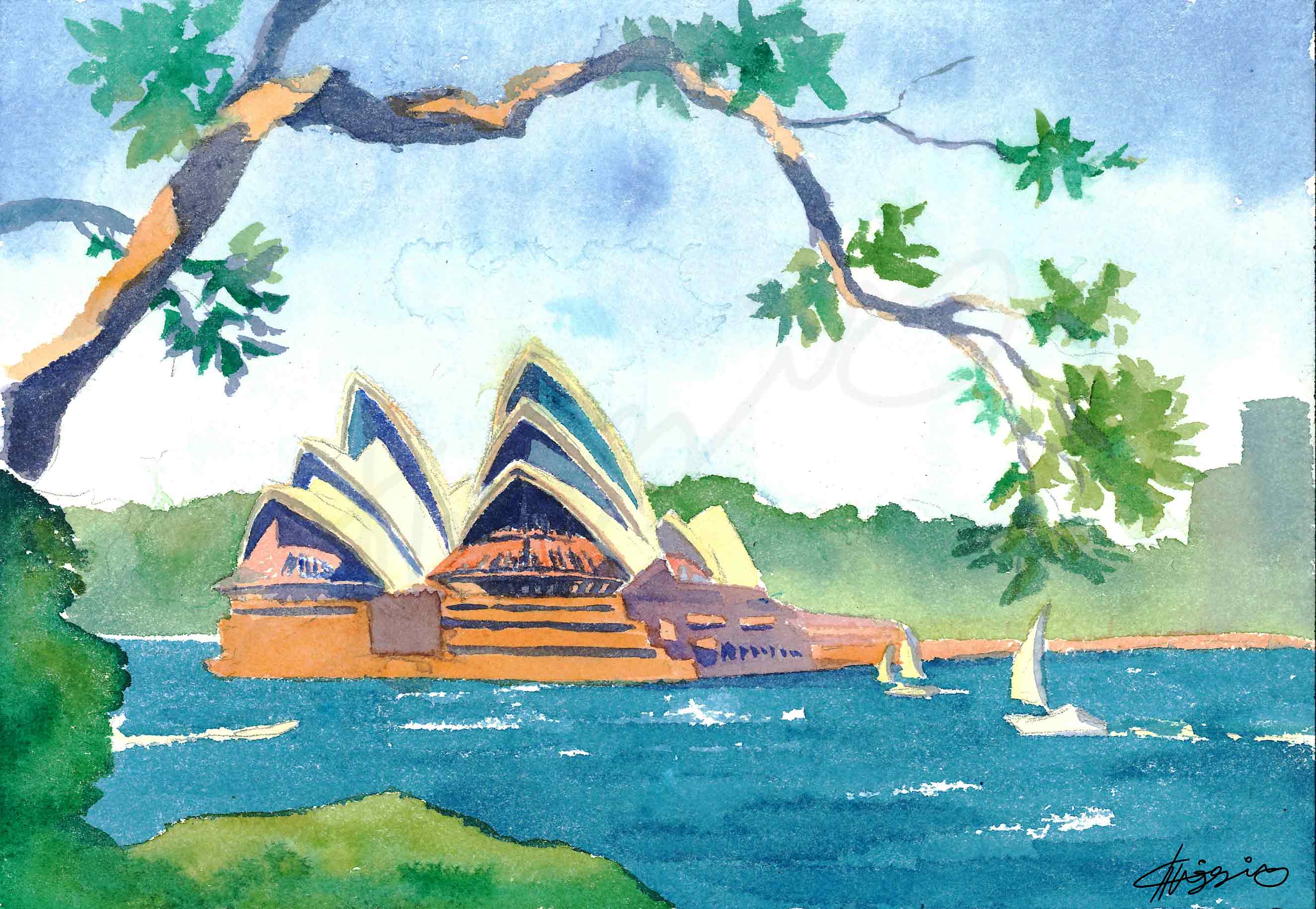
Watercolour painting, 7″ x 9″ (18cm x 23cm)
This is a study of the Sydney Opera House, painted from the perspective of Jeffrey St. Wharf in Kirribilli. Painted on acid free cold press watercolour paper with Winsor and Newton paints.
Watercolour painting, 7″ x 9″ (18cm x 23cm)
This is a study of the Sydney Opera House, painted from the perspective of Jeffrey St. Wharf in Kirribilli. Painted on acid free cold press watercolour paper with Winsor and Newton paints.

“New users aren’t discovering our features. Can we make them watch a video or do a tutorial before they get started?”
This is a question I’ve heard many variations of throughout my career. Chances are, if you work in product design, you’ve heard it too.

Watercolour painting, 10″W X 14″H
This is a scene from deep within the Hobart Royal Botanical Gardens on a sunny, hot day. Painted with high quality Winsor and Newton watercolour paints on 140lb acid-free coldpress paper.
Watermarks are not present on the actual artwork or on prints.
My process for designing workshops is never the same from one event to the next. But one thing I frequently include is storyboarding. I took some notes on why and how I storyboarded for a recent workshop, “Creating a user onboarding compass,” in the hopes that you may find it helpful in your own process.

User onboarding is a journey made up of multiple activities, not a single, linear flow. Onboarding should align guidance independently around each of the “key actions” of its experience so that newcomers can interact with them at the pace and in the order that makes sense for their different situations.
Continue reading
Wear OS by Google (previously called Android Wear) is a smartwatch operating system. The early versions of smartwatches promised hands-free connectivity, but still required people to be tethered to their phones to get many on-watch experiences. This also impacted iOS users from using an Android Wear device as they were entirely prevented from downloading 3P watch apps. These issues impacted the perceived usefulness of smartwatches, evidenced in general industry coverage about smartwatches and in our own research.
When I joined the Android Wear team, I saw the opportunity to transform the smartwatch experience by enabling the devices to go standalone from the phone, and took steps to make it a reality.
I organized and led a strategic workshop with a group of UX, research, PM, and Engineering to explore the potential of a standalone watch. Using inputs from that session, I crafted a pitch that highlighted the opportunity for standalone smartwatches and what pieces we needed to build to go standalone. This included the need for on-watch authentication and permissions, which I took forward.
First I needed to define the model for how Google Accounts were stored on the watch. I drove toward a solution where the watch, like the phone, can store none, one, or multiple Google accounts. Those Google accounts would only be necessary for signing into individual apps, such as Gmail, but not necessary to manage the watch overall.

I then designed the Android Wear setup flow to include a one-time transfer of Google Account and Wi-Fi credentials from the smartphone to the watch. This enabled a person’s watch to be quickly connected to the same Wi-Fi network as their phone, and to be automatically signed in to their Google Accounts (and 1P Google watch apps) straight after setup. I also designed for cases like signing in to multiple Google Accounts, re-authentication due to token expiry, and account errors.

I defined and designed authentication patterns for 3P Wear apps, many of which were first-of-their-kind for smartwatches. On-watch authentication for 3P apps allowed users to download and run apps on the go even if their phones were not available, and store the apps’ account information on the watch.

Standalone watch apps also needed a way to request permissions, such as location, without the user needing to open a permission screen on the phone. I defined on-watch permissions patterns and best practices for apps, including a framework for deciding how and when to request a permission.

Finally, I wrote and created assets for guidelines and best practices for on-watch authentication and permissions for the Android Developer guidelines. Although the visual design of the OS has been updated since I published these guidelines, all of the best practices I defined are still reflected in the current version (see authentication guidelines and permissions guidelines).

Overall, standalone watch functionality was a marquee marketing feature for Android Wear 2.0 and opened up new possibilities for iPhone users to pair their phones and use apps on an Android Wear smartwatch.
All work for this project is © Google

Watercolor paintings, 7″W X 5″H each
These paintings are of a quiet beach on the Fijian island of Taveuni. The beach is overgrown with mangrove trees, and light filters through the leaves in a mesmerizing, dappled pattern.
Watermarks are not present on the actual artwork or on prints.

I’ve long tried to use iPad drawing apps, like Procreate or Photoshop, to simulate my traditional watercolor painting work. And with Procreate 4’s introduction of wet canvas + brush dynamics, an Apple Pencil, and a set of lovely, free watercolor brushes from Abbie at Uproot Jewellery, I’ve been thrilled at how close I can get to the real thing. The only thing missing has been a good set of salt brushes (I use a lot of salt in my paintings to simulate textures like dense fields of coral), so I created 6 of my own. And now you can use them, too!
Continue readingIn an earlier post, I covered how onboarding is more than just a one-time event in a customer’s journey. In this post, I’ll be making the case for applying more than one onboarding method. Just as students will fail to learn if taught with a one-size-fits-all approach, trying to onboard every user in the same way is bound to fail.


Watercolor painting, 9″W X 12″H
Palm Cove is situated just a few miles north of Cairns, Australia, and has a beautiful view over the Pacific Ocean. The jewel-toned colors in this watercolor serve to evoke memories of warm, tropical days spent on the beach.
Painted on Arches 140lb Coldpress with Winsor & Newton paints.
Watermarks are not present on the actual artwork or on prints.

Watercolor painting, 12″H X 9″W
Frederiksted, or F-sted, is a lovely town on the island of Saint Croix. In the early morning, the city takes on bright hues as the sun rises over the buildings. Chickens stroll through quiet streets as residents awake. This watercolor painting attempts to capture the lazy, warm mood.
Painted on Arches 140lb Coldpress with Winsor & Newton paints.
Watermarks are not present on the actual artwork or on prints.


“Onboarding for the long run” was a presentation series about designing onboarding that helps users beyond the first run. While that can sound daunting, I used the presentation to help break things down into actionable chunks. First, I outlined the different opportunities across the customer journey during which onboarding techniques are helpful. Then, I presented a diverse toolkit of onboarding methods that teams could use to help users in different situations, leading to long-term benefit in our products.
This talk was shared at:
Instructional presentations in the design and tech world often benefit when they include examples outside of a speaker’s own work. If you’re a presenter or working towards being one, chances are you’ve realized how helpful 3rd-party screenshots and recordings can be in illustrating a point, and how easy they are to capture from sites and apps. You were probably trained to get permission before adding 3rd-party music, photos, and other creative works that aren’t already in the public domain or under an open-sharing license like the Creative Commons copyright license in your slides. But, have you considered doing the same for screenshots and screen recordings?
Continue readingIn a previous post, we looked at multiple opportunities over time for user onboarding techniques to be useful in our products. If we design for those opportunities ad hoc, we risk unscalable designs and frustrating users with fragmented education. Instead, let’s see how to tackle onboarding design so that it fits into a long-term approach to guidance.
Continue readingI often evangelize the importance of first time user experiences. After all, not all of the users acquired to a product will stick around, but they’ll all experience its first run design. To encourage return use, that first impression must be solid. But it’s also very common for designers to overemphasize the first run experience at the expense of long-term user support.
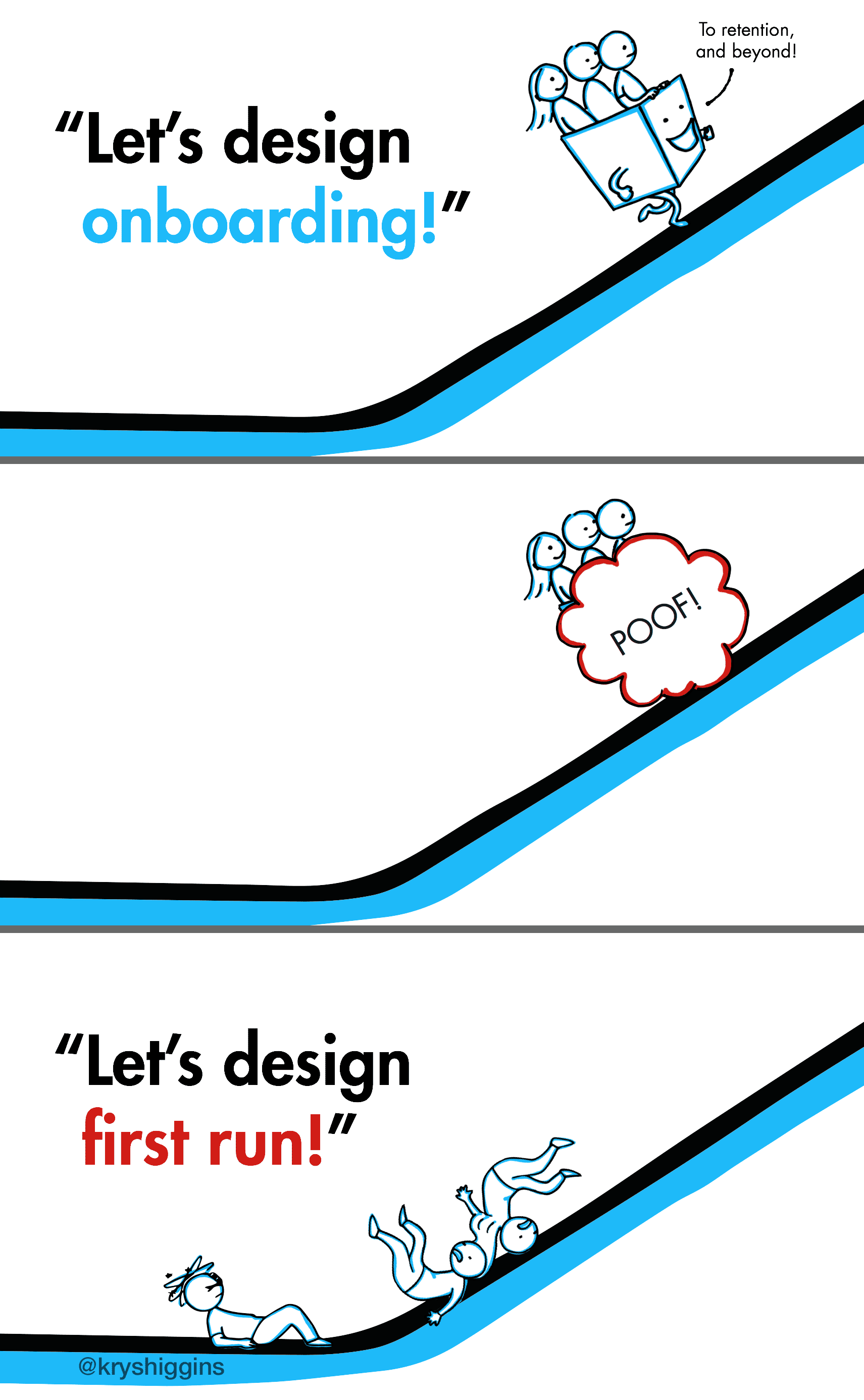
Clippy, the Microsoft Office Assistant, failed partly because it catered to first time users. It didn’t scale gracefully as those users became acclimated to the product. As James Fallows describes “…Clippy suffered the dreaded ‘optimization for first time use’ problem. That is, the very first time you were composing a letter with Word, you might possibly be grateful for advice about how to use various letter-formatting features. The next billion times you typed ‘Dear …’ and saw Clippy pop up, you wanted to scream.”

I used to be intimidated by watercolor. It seemed so unwieldy compared to the acrylic, pencil, ink, and digital media I’d grown accustomed to using during my BFA program. For years I shied away from it, despite the fact that those who could control it made beautiful, airy paintings that were nearly impossible to simulate in Procreate or Photoshop.
As I got immersed in the day-to-day trappings of tech-focused jobs, my fine arts skills got stale. I decided to reinvigorate them with a challenge. In 2011 I took up one of those make-a-thing-everyday-for-a-year projects, choosing watercolor as my tool of choice. By forcing myself to paint watercolor nearly every day, I built up my skills from “sorta bad” to “decently good.” Eventually, I fell in love with it. Today I paint almost exclusively in watercolor.
Continue readingPeople can be shaped by a mix of factors: genes, people, places, events, both the good and the bad. Everyone is a unique blend. As good product designers, we consider these contexts in relation to the users for whom we design, with the intent of creating experiences that suit their needs and expectations. But we don’t often take as much time to understand what has shaped us. Why do we gravitate to the problems and solutions that we do? A little self reflection in uncertain times can help us realign to higher quality, impactful projects and can also remind us, as we approach the Thanksgiving holiday, to thank those that had a positive impact on who we are now.
Continue reading Continue reading
Watercolor painting, 9″H X 12″W
“Party of Blue” was inspired by dives in Western Australia’s beautiful Ningaloo Reef. It depicts a cascade of blue reef fish darting around a patch of staghorn coral. This is a lovely piece with dynamic motion, evocative colors, and energetic textures.
Painted on Arches 140lb Coldpress with Winsor & Newton paints.
Watermarks are not present on the actual artwork or on prints.
Often, teams measure onboarding myopically, like a feature in isolation. Apps measure clickthrough rate in an introductory slideshow. Sites measure how many people sign up. Devices measure how quickly someone gets through a setup wizard. These kinds of measurements are immediate, cheap, and easily automated. But, while they’re easy, they don’t show whether an onboarding design is contributing to or detracting from a new user’s overall success. Continue reading