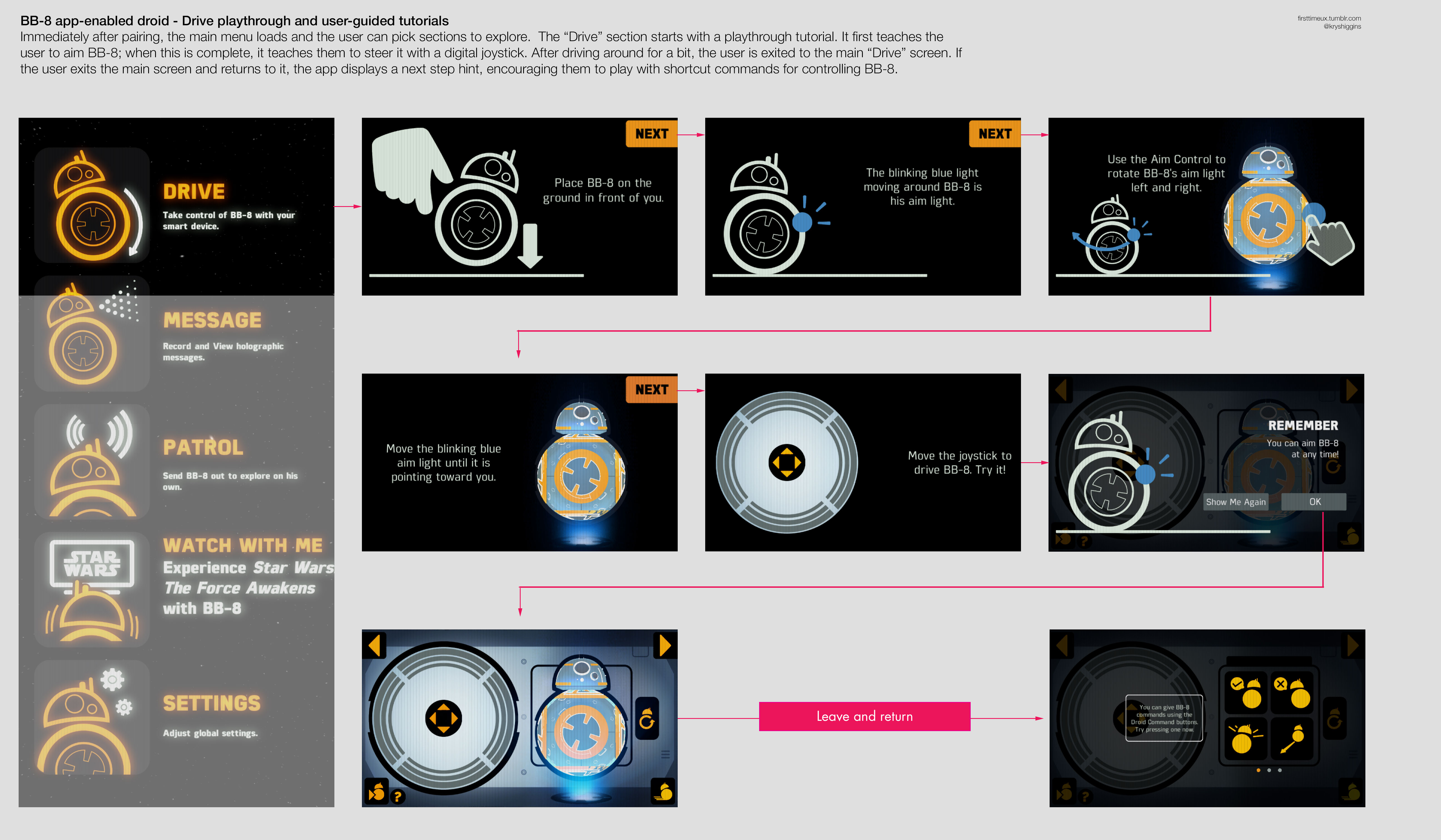
In a previous post, we looked at multiple opportunities over time for user onboarding techniques to be useful in our products. If we design for those opportunities ad hoc, we risk unscalable designs and frustrating users with fragmented education. Instead, let’s see how to tackle onboarding design so that it fits into a long-term approach to guidance.

Start at the end to map key actions
To avoid an onboarding experience that forces all users to follow the same path in the narrow window of the first run experience, we want to focus on finding the key actions that signpost various paths to success. It’s tempting to identify key actions by starting at the beginning of the user’s journey and plotting a path forward. But I prefer the perspective of designer Jonathan Korman who, in a recent thread about first-time use, said:
11
If you know the intermediate-use destination, you can strip stuff away to figure out what essentials to reveal for first-time use
— Jonathan Korman (@miniver) December 8, 2016
By “intermediate,” Jonathan means to focus on core users instead of idealized expert users (since, as Alan Cooper says in his book “About Face,” most users are “perpetual intermediates“). These are the customers that sustain your product with good retention, engagement, or other contributions. These core users are the destination to which onboarding experiences should lead.
We also should look at unsuccessful users—those that churn or otherwise don’t contribute to our bottom line. Because that’s where we don’t want onboarding to lead new folks. Once we’ve defined these destinations, then we can reveal key actions by working back through the paths groups of these users took to get there.
It’s a bit like drawing the solution to a maze. Sometimes it’s easiest to see the solution by starting at the end and working out to the beginning. Similarly, if we start with the current state of core and unsuccessful users, we can work backwards to understand what established their current routines. What actions did core users share? What actions did core users take that unsuccessful users did not, and what actions did unsuccessful users take that core users did not? Many research methods can be useful here, including but not limited to cohort analysis and diary studies. If you have a brand new product, then work backwards from hypothesized core user destinations to map out assumed key actions.

Just be mindful that designing onboarding by starting at the end, after you’ve defined core use, isn’t the same as designing it late. The process of designing onboarding can uncover issues with the core product that you need time to address.
Break down key actions
Once key actions are identified, we can set about guiding users through them. We can break each action down into 3 parts to clarify how guidance should flow through an action. Those parts are the prompt(s), the work, and the follow-up.
The prompt of a key action is about making the case for a new user to take action. We guide someone through the prompt by choosing the right context in which to show it, aligning our messaging to how they’ll benefit from it personally, and setting expectations about what will happen next.
The work of a key action, as its name implies, represents the body of subtasks someone has to do to complete the action. To guide someone through the work, we must ensure there’s continuity across the design of the action, provide support in the context of use, offer alternatives for those that need them, and make any errors they may encounter actionable and informative.
Finally, the follow-up portion of a key action is what closes out the action once someone has completed it. It’s important here to reinforce what was done by acknowledging success, and to use this as an opportunity to connect someone to the next actions they can take in their onboarding journey.

Here’s how we might break down the key action of signing up for a New York Times subscription.

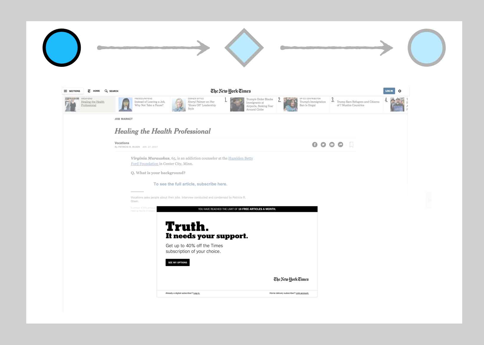


By breaking key actions into modules, we see how the follow-up of one action can link up to prompts for others. Onboarding becomes more about binding together interchangeable links in a chain, and less about creating a single string of actions everyone has to follow in the same order.

I’ve provided a template you can use to help you break down key actions as a storyboard, in this article.
For a deeper dive into the concept of structuring everyday actions, not just those used in user onboarding, check out Microinteractions by Dan Saffer.
Reinforce
Long term guidance also gives onboarding the chance to reinforce the concepts it introduces. One reason we get stuck in a one-time-use mindset is by thinking that people only need to be exposed to something once to retain it. We touched on the concept of spaced repetition in a previous post. It’s the idea that people retain information and form habits effectively by repeatedly engaging in practice over time. Learning something only once is subject to a steep forgetting curve.
So, our onboarding techniques should also have some means of reinforcement to be less lossy.
For example, Facebook reinforces a piece of guidance by varying its presentation. It starts with a proactive blue tip and also reiterates that guidance via the omnipresent cue text in the search field.

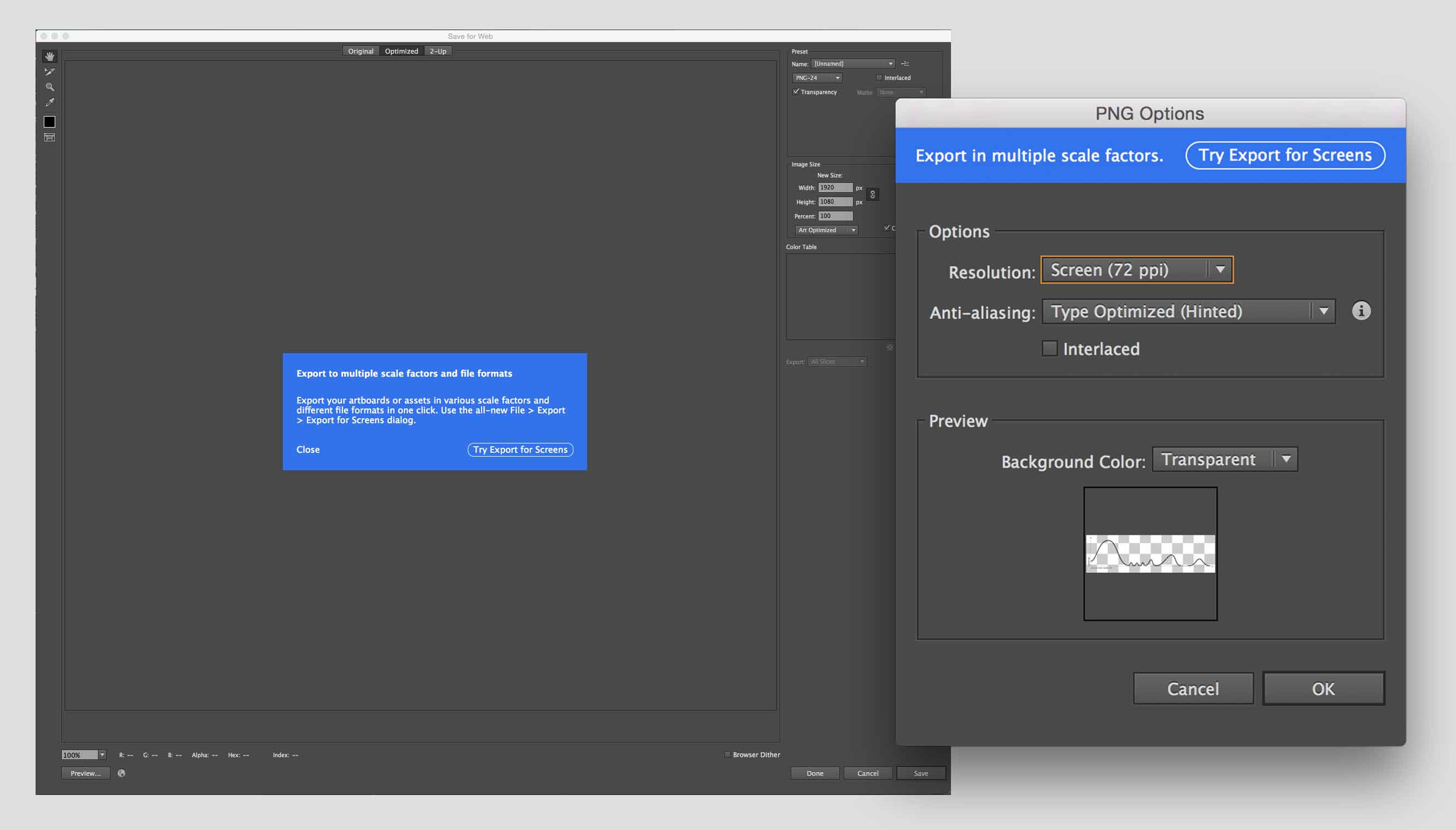
In another example, showing reinforcement of a new feature across multiple apps, Adobe called out their new “Export for screens” feature by presenting an actionable message in both the Photoshop and Illustration “Save for Web” dialogs, at the time when it would be most relevant for the user and in a manner that best suited each app’s display.
User-driven repetition allows the user to control when guidance is next presented. This sense of control naturally provides reinforcement without crossing over into mindless repetition. Etsy proactively offers a product tour to a user. When the user skips or takes the tour, the user can always return to it by clicking on the “Take a tour” link that is a permanent part of their dashboard.

To ensure you are reinforcing concepts instead of mindlessly repeating them, vary how you present each iteration, the location of each iteration, and/or the frequency of repetition. For guidance presented proactively (like tooltips in an app or voice tips on a home speaker device) define an end condition: stop repeating them after n times; stop after the user demonstrates repeatable engagement with an action; include a dismiss function; and/or stop showing repetitions after n times with no user engagement.

Building for reinforcement is a great way to break teams out of a one-time-use mindset. When creating an educational moment, ask, “How can I reinforce this concept a second, third, even fourth time? Can the user revisit this?” When faced with making assistance useful multiple times, it helps steer us away from ad-hoc solutions like first run slideshows.
Choose appropriate methods
With a sense of where to apply and reinforce guidance, we can gather the best methods to our onboarding toolkits. The methods we build need to be appropriate for the user’s situation and the product’s (or new feature’s) situation.
Consider whether the user is in an exploratory situation when they arrive at the action requiring guidance, or on a mission. For example, a new user who leisurely browses to your website’s home page, or downloads your app from a promoted apps list, may be exploring and browsing. Meanwhile, someone accessing a shared document from a colleague is likely on a mission, and wants only guidance relative to that task.
Consider the product or feature’s situation, too. Users may expect prominent assistance for a new product type, like a VR headset or a bitcoin trading service. On the other hand, people probably prefer a lighter touch for established products like email. Typically, the more novel the value proposition or interaction space, the more prominent guidance may need to be.
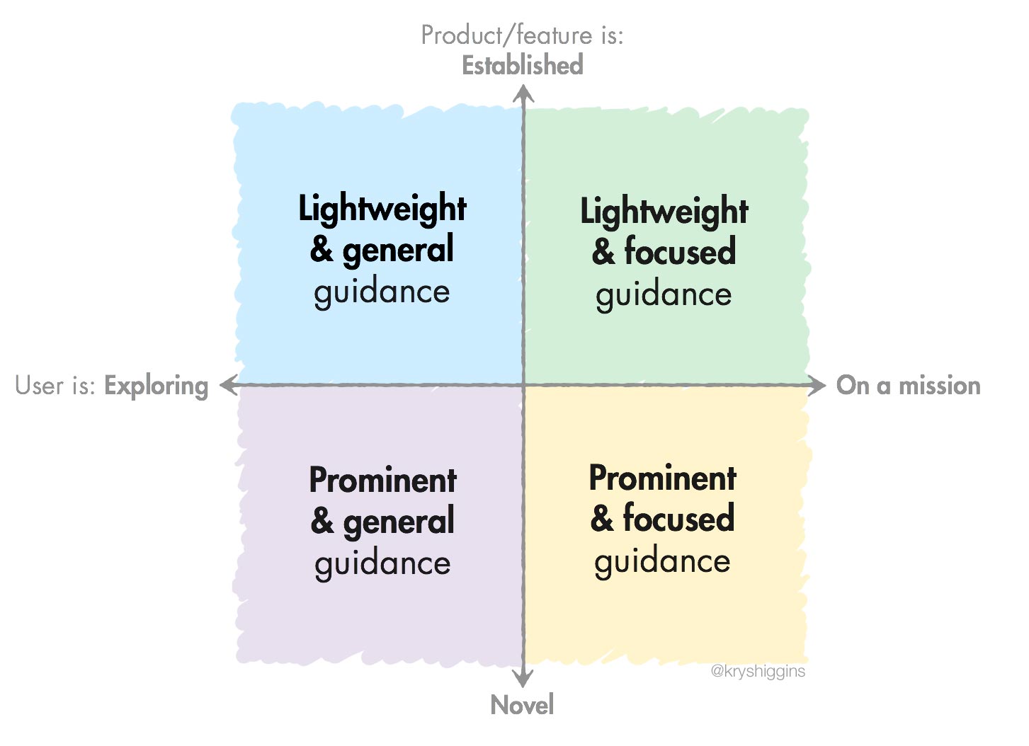
When in doubt, stick to lightweight guidance.

Be appropriate for your product
In addition to being appropriate for the situations of your users and your general product type, all methods in your onboarding toolkit should act like they’re playing for the same team. Anything not matching up to your product’s identity will be disruptive or, worse, ignored.
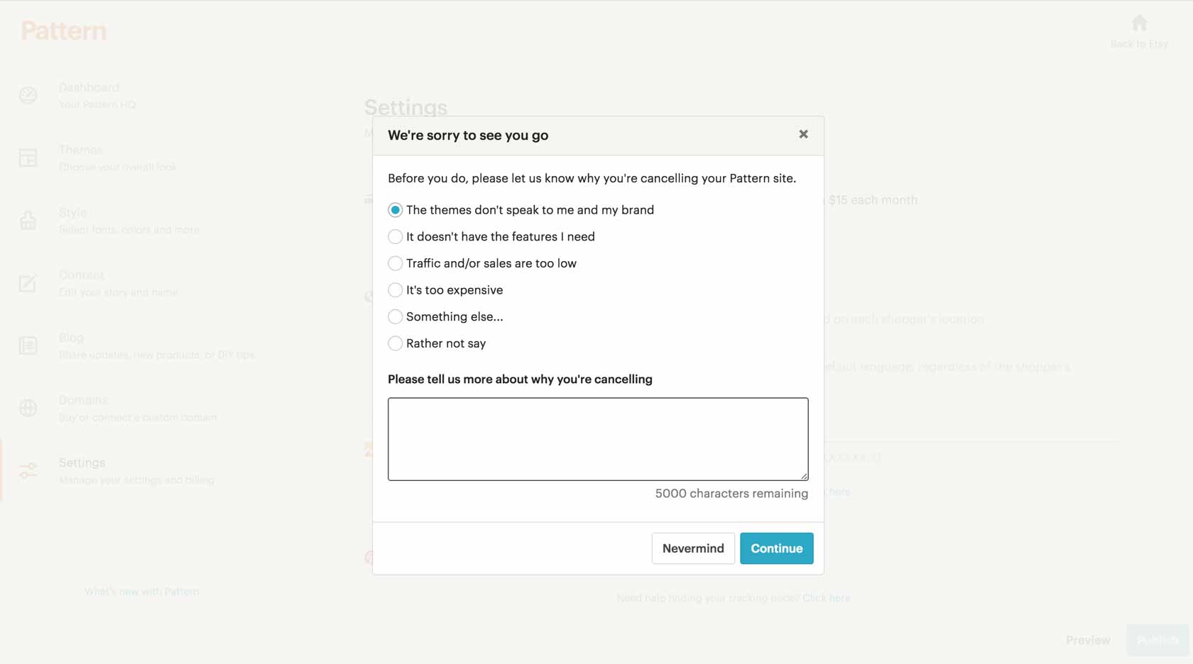
Relying on third party onboarding or user education plugins can lead to inappropriate guidance. There are a growing number of onboarding tools out there, some specializing in walkthroughs, others offering tooltips and overlays. They might be OK for prototyping some ideas for prompts. But these tools often don’t provide solutions that feel like a natural extension of your design language.
Often, educational content gets left out of design system and pattern library work. Perhaps that’s because it’s highly stateful. As product designers, we should develop an onboarding philosophy as part of our design systems and include user education and onboarding elements (tooltips, default states, inline guidance, on-demand help, reactive messaging, user feedback mechanisms, etc.) in our libraries and audits.

Set up learning checkpoints
The previous activities help us structure guidance for our users. But we should also give them the opportunity to guide where we take our onboarding experiences. We can, and should, use a variety of research techniques like diary studies and cohort analyses to evaluate our progress, and I covered how to evaluate onboarding in another post. But we can also learn directly from users by making feedback checkpoints a part of their onboarding experience.

Making learning part of our onboarding process ensures that we stay apprised of new situations, and feeds into our discovery of key actions on the path to success.
Summary
We can add these considerations to our design process to help onboarding fit into a long-term approach for guidance. At the very least, such considerations help us move away from a mindset that onboarding is a one-use experience. And, by thinking about onboarding as part of a larger system of guidance, we create techniques that can be reused across the customer journey.