This is the last post in the 3-part “Engaging new users” series. Part 1 covered guided interaction, the practice of educating users in a realistic context, and how it is more compelling than slideshows, videos or static instruction. In part 2, we learned how to use free samples to demonstrate a product’s value proposition and build the trust needed to encourage sign-up.
And in today’s post, part 3, we’ll examine how giving new users a personal focus is the key to making these onboarding techniques stick.
A selection of screens from the Android Wear 2.0 version of setup, showing how phone and watch setup states were choreographed.
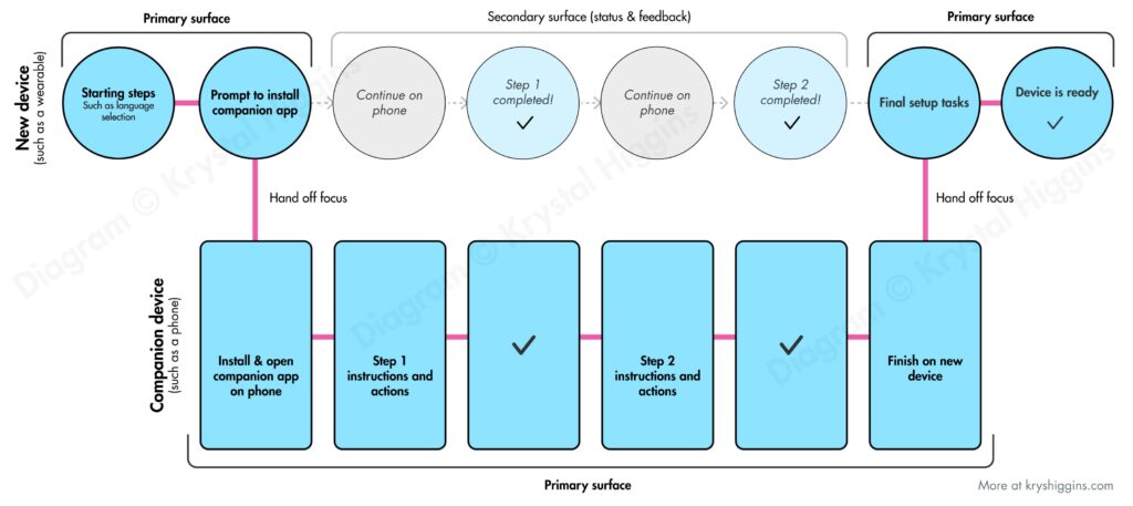
Wear OS, previously called Android Wear, is a smart watch operating system from Google. As staff interaction designer on the Wear OS UX team, I designed the setup and onboarding experiences for the watches, along with leading the mobile phone companion app experiences for Android and iOS users from versions 1.3 through 2.0. For context, Android Wear smartwatches at the time required a mobile app to help facilitate the setup experience and manage the handover of settings, preferences, and more to the watch.
Watch setup and onboarding
I designed and oversaw multiple iterations of the setup flow, which included choreographing states between the watch and phone in a manner that I describe in my article “The choreography of companion setup.”
A generalized diagram I designed showing how a wearable and companion app can have their interactions choreographed during setup
I established principles and techniques for post-setup, on-watch onboarding and user education, and designed educational features such as a wrist gesture playthrough tutorial. I also designed an interactive (and optional) welcome tutorial for new users of the watch that utilized new visual interface cues such as swipe and hardware button indicators.
Selection of images from an interactive, opt-in on-watch welcome tutorial in Android Wear 2.0, copyright Google.
Companion apps
I designed versions 1.3 – 2.0 of the Android mobile companion apps for Wear watches, as well as the first version of the iOS companion app to enable iOS support for Android Wear form factors. Of the features I updated in the Android-side companion app was the addition of the ability to connect to multiple watches, so that someone with different watch styles could swap them for different outfits or use cases without having to disconnect one and connect another each time.
Left side: Android Wear companion app 1.3 that supported pairing multiple watches. Left side: Android Wear companion app for iOS.
Each of these projects involved collaborating with visual and motion designers, engineers, product managers, devrel, legal, privacy, and the larger Android platform team.
In the first part of this series, I shared how guided interaction introduces users to the authentic context of your product with just the right amount of education to ensure they find success. Today, we investigate how the 2nd of the 3 pillars of better onboarding, the use of free samples, gets those new customers using your product in the first place.
There are 3 overarching best practices when it comes to engaging and educating new users:
In the past I’ve covered patterns and anti-patterns for onboarding new users and principles for first time user experiences. In this post and the two that will follow, I’ll be digging into each of the 3 ways we can better engage new users:
Guided interaction
Free samples
Personal focus
Today’s post is focused on guided interaction. So let’s jump into what it means, discover patterns for making guided interaction a reality and see a few examples.
Sometimes I like to take a step back from UX design and do graphic illustration work. Lately I’ve been enjoying Gravity Falls, a TV show with A+ storytelling that engages the audience by hiding codes hidden in each episode. So with Halloween approaching, I’ve created free jack-o-lantern stencils for one of the show’s most iconic characters, Bill Cipher. I’ve got a few options for Bill, so get ready for a rundown after the break.
If you’ve been following my first time UX work, you know I advocate the creation of onboarding experiences that provide guided interaction, free samples and a personal focus. The value of this educational effort doesn’t stop at new customers. When we build onboarding experiences with other user states in mind, we can create a versatile platform for continued education and engagement. This makes it easier to convince your team to invest in onboarding, and beyond.
Inspired by the Ningaloo Reef in Australia, this painting depicts a whale shark protecting a school of fish from a cloud of jellyfish. This painting is a departure from some of my richer landscape paintings, using bright, airy colors and negative space to illustrate a happy-go-lucky scene.
Painted on Arches 140lb coldpress paper with Winsor & Newton paints.
“New Users Matter Too” was a presentation series I created as part of First Time UX, my personal research project on onboarding design. I gave this talk in a variety of lengths, from 15 minutes to 60 minutes, and occasionally as a 90 minute workshop.
I’ve presented and run workshops on this topic at An Event Apart, Webdagene, SXSW, UX Australia, the Bentley University in San Francisco, Groupon, and Google.
Last year I started playing with the Procreate app for iPad. My first sketch was inspired by Game of Thrones, showing key characters dressed up for Halloween as their house sigils and trick-or-treating at the home of a very special man.
This year, I cleaned up the sketch and decided to share it as a free illustration for your Halloween enjoyment. Read on for a full-size version you can print or use as a wallpaper!
In this tranquil watercolor painting, captured on a winter trip to Shelly Beach (outside of Sydney, Australia), a woman rests on an overturned boat to catch a break from a long walk. The clouds have parted momentarily, providing some sunshine to the afternoon.
Painted on Arches 300lb Coldpress with Winsor & Newton paints.
Inspired by a visit to a few Caribbean islands, I painted this fanciful pairing of an iridescent rooster and a blue iguana. These two probably wouldn’t work together in real live, but it’s fun to imagine them as partners in crime.
Painted on Arches 140lb Coldpress with Winsor & Newton paints.
A late winter sunset over the canals is observed by a couple in Amsterdam. This is an original, vibrant watercolor, inspired by my personal travels to this lovely part of the Netherlands.
Painted on Arches 300lb Coldpress with Winsor & Newton paints.
This light-hearted quirky watercolor painting depicts an iguana with a horn, like the mythical unicorn. It’s inspired by the blue iguanas of the Cayman Islands.
Painted on Arches 140lb coldpress paper with Winsor & Newton paints.
I recently gave a talk about designing better first time user experiences for mobile apps, with examples gleaned from my collection of first time user experiences.
In this presentation and in my other work, I stress how we need to move from a mode of telling new users about our value proposition, to a mode of letting users experience it for themselves. We want to show interact, not tell.
Here are 3 ways we can engage new users and get them interacting early:
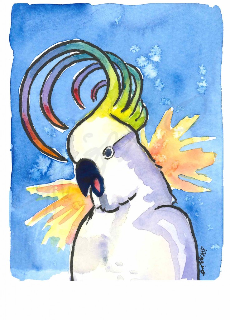
My interpretation of a sulphur-crested cockatoo when it screeches. This is painted in ode to a particularly noisy cockatoo that likes to scream outside my window early on summer mornings. Painted on 90lb watercolour paper with Winsor and Newton paints.
In a recent presentation, I discussed the role that guided interaction and coaching can play in onboarding new users to a product. Playthroughs and user-guided tutorials are some examples of guided interaction. Guided interaction allows users to start playing with a new product quickly in an authentic context (instead of wading through abstracted coachmarks, instructions or intro tours), but also gives them enough coaching so that they’ll be motivated by an early success.
To help teams explore the right cadence of guided interaction for their product’s new user experience, I created a template to help with judging that interaction between a product and a new user. I’ve been calling it the coaching cadence worksheet. This can be used to audit an existing experience, or to explore variations for a revision or completely new first time ux. The worksheet follows.
After checking out the design principles of Android Wear, I found myself thinking particularly about the third principle, “Helpful”. Certainly in UX design a product needs to be helpful before anything else. But what does it mean to build helpful experiences for wearables, specifically?
<>To me, it seems that helpful wearable devices or wearable apps would do the following (the “6 R’s”):
Continue reading →
I’ve been keeping an ongoing collection of first time user experiences (FTUEs) at http://firsttimeux.tumblr.com/. In this post, I’ve distilled the most common approaches I’ve observed being used today into a list of 8 design patterns and anti-patterns.
Each pattern has a description, pros/cons list, design considerations, and an example. You may recognize a few of these because many are modern takes on well-established UX patterns. My hope is for this to serve as a helpful reference as you develop your own first time user experiences.
Continue reading →
eBay’s app for the Pebble smart watch allowed eBay users to browse through the latest items matching their interests via the eBay feed, and watch an item so they can bid on it or buy it later.
As the design lead for eBay’s wearable products, I worked with a very small, passionate team to launch the initial eBay experience on the Pebble smart watch. I collaborated directly with employees of Pebble and, in addition to designing the full end-to-end experience as well as creating all the design assets, I also pitched in to do QA, marketing and even a little product management. One of the most fun parts of this project was determining the best way to render an item image in bitmap for the watch (which, even at the low resolution, was still a helpful way for users to know they were looking at the right type of item).