I recently downloaded a calculator app. This app greeted me with a series of first-run tooltips explaining various parts of the app. It was an example of an “explicit” first-run experience—when guidance is provided on temporary layers or in one-off flows—that was unnecessary. Let’s quickly run through some of the issues with applying an explicit educational approach to this calculator app, in the hope it can help you decide if implementing an “explicit” onboarding experience for your new users is the right way to go.
Continue readingAuthor Archives: kryshiggins
What other product folks said about user onboarding
Over the last few months, I asked different people who work on products in services, in a variety of industries, to share their perspectives on user onboarding. While I’ve heard from many people over the years, I wanted to ask a few pointed questions. Via questionnaires and interviews, 48 people* shared with me the challenges they faced in trying to create a good user onboarding experience, the goals they felt user onboarding needed to achieve, and how they defined the scope of it. My goal was to understand the range of perspectives different people have about user onboarding, and find common themes. In the spirit of sharing, this post is a lightweight recap of what stuck out most from these conversations (and I’d love to hear if your perspective is similar or different!).
Continue readingBookending with good beginnings & ends
This piece was written together with Joe Macleod and also published as part of UXLX 2020.
When we design products and services, we focus a lot on the core user experience, or what we envision seasoned users to be doing day to day. But a good product or service will be bookended by a strong beginning, and a strong end.
Continue readingUser education as Pokemon evos
When people think of user education in products, they’re often thinking of certain set of UI patterns. In some cases, these patterns can be helpful. But, in most other cases, the patterns are overused and applied inappropriately to many situations. They quickly become anti-patterns.
I’ve illustrated that slippery slope by drawing these “patterns” as if they were Pokemon evolutions. You know, when a seemingly harmless pattern can turn into a formidable beast.
Continue readingGoogle Photos Portfolio
Reply

I co-founded the Google Photos Portfolio team in Sydney as its sole designer and partnered with a PM lead and small engineering team to define new products and services that would expand the Google Photos ecosystem. I identified and led the pursuit of new opportunities through research, running team ideation workshops, and creating vision storyboards and other artifacts to rally excitement around our opportunities.
Ultimately we defined what became 3 main areas of work, ranging from short to longer-term bets: Google Photos Partner Program and Library APIs, which drove multiple partnerships and implementations; a 2 year international “schoolfood” program in the education space; and a lightweight photo gallery app for NBU users called Gallery. Eventually, I built up a small team of 3 designers and a researcher to scale these efforts.
One of our first launches was the Google Photos Library API and Partner Program, introduced at Google I/O 2018. The API was built to support the increasing need for people to be able to use their photos across the different apps and devices they use. I defined the first round of UX principles that informed the API’s acceptable use policy for the Partner Program. I created the initial version of the UX guidelines as well as the frontend UI for a sample application for the GitHub repository.

Through our investment in multiple project bets, we scaled the Photos Portfolio team from just 8 people in the starting days to more than 40 by 2021. In addition to hands on design work and a focus on mentoring my design reports as we grew, I also worked hard to help everyone on the team understand the value of UX design, and built a relationship with product managers that empowered them to contribute to design as much as anyone else. Members of our team were featured in the 2019 issue of Careers with Stem with a focus on women in tech.

Summary of my activities
- Problem space definition
- Strategy & visioning
- Concept design & storyboarding
- Research
- Prototyping
- Information architecture
- Interaction design
- UI / visual design
- Guideline publication
- Technical documentation
- Go-to-market
- Hiring
- Management
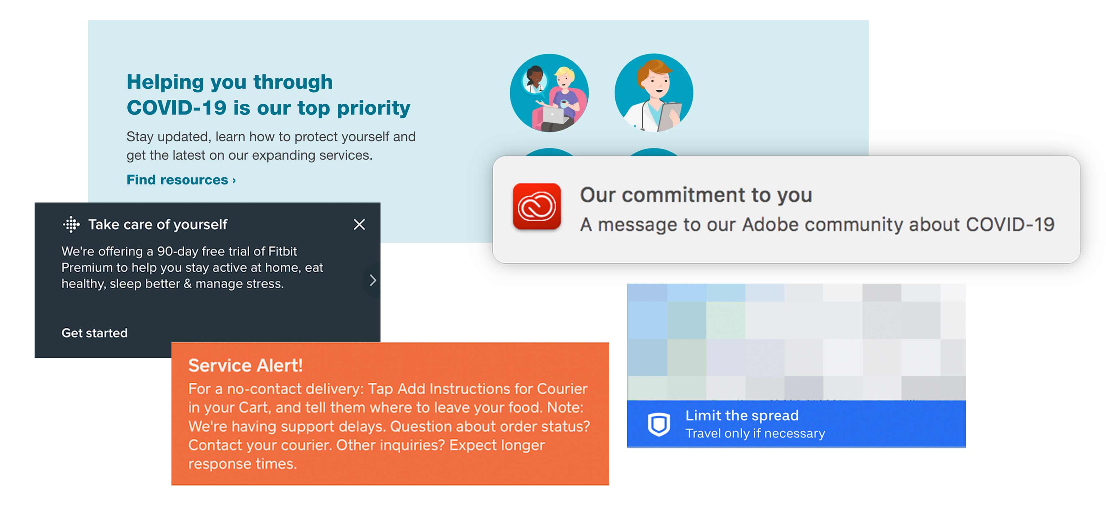
In-product COVID guidance & messaging
This is a time when we’re seeing thousands of products and services trying to give users guidance about a single community issue: Coronavirus, or COVID-19. I’ve included a few brief considerations for designing this kind of in-app messaging, along with examples.
User onboarding pitfalls and how to avoid them
If you’re designing a new user onboarding experience, or trying to redesign an existing one, you’ll want to know what it takes to make it effective. In a guest post for the InVision design blog, I detail common pitfalls that onboarding designers can stumble into and how to address them. Read the post on the InVision design blog
Plotters, pantsers, and user onboarding

The final seasons of fantasy TV series Game of Thrones were considered a complete flop, with character arcs reaching conclusions that seemed rushed and contrary to the paths they were on in prior seasons. Of the many discussions about why the end of the series felt so wrong, one critique from Twitter user @DSilvermint caught my eye. He attributed the cause to two different writer archetypes: “plotters” (those who start with a detailed outline and clear ending before writing a story, but which allows for less organic character development), and “pantsers” (those who “fly by the seat of their pants” by developing the characters and story as they write, seeing where it takes them, but because of that it can feel like the story doesn’t have a planned endpoint).
Continue readingOnboarding people to AI experiences
With artificial intelligence and its many variants becoming core parts of our products, we need to think about how to onboard users to automated experiences. The principles that underpin good user onboarding for AI aren’t that different from the principles that underpin good user onboarding for anything else. But, because of the unpredictable nature of AI, we must embrace interactive, multi-part guidance more than ever before, instead of the information-heavy approaches that still dominate onboarding for traditional products today.

Glaçage du grotte

Watercolour painting, 7″ x 9″ (18cm x 26cm)
This is an interpretation of a cave visited in Broome, Australiae. The many layers of the cave’s interior had been smoothed down by the tide’s comings and goings, causing for many vibrant color sections to emerge. A hole punched in the top of the cave adds a secondary light source for a multi-toned effect. Painted on cold press watercolour paper with Winsor and Newton paints.
Graphic Watson’s Bay

Watercolour painting, 9″ x 12″ (23cm x 31cm)
A very graphic watercolour painting showing a view from Watson’s Bay out across the Sydney Harbour. A dark purple tree looms in the foreground and encircles the Sydney city skyline with its branches, complete with suggested lorikeet shapes. Painted on acid-free cold-press watercolour paper with Winsor and Newton paints.
Three Sisters

Watercolour painting, 12″W X 7.1″H
This is a painting of the scene from an overlook in the Blue Mountains outside Sydney, Australia. The rock formations in the foreground are called the Three Sisters. Painted with high quality Winsor and Newton watercolour paints on 140lb acid-free coldpress paper.
Watermarks are not present on the actual artwork or on prints.
Manta Entanglement

Watercolor painting, 8″W X 10″H
This graphic painting attempts to capture the experience of scuba diving at night with manta rays. The rays carve circular orbits around lights set up on the bottom and surface of the ocean, scooping up plankton attracted to the columns of illumination. It’s a magical, surreal experience, and this piece only scratches at the surface of it.
This painting took multiple rounds of sketching to figure out how the concept should be visualized.
The final piece was painted on Arches 140lb Coldpress with Winsor & Newton paints.
Watermarks are not present on the actual artwork or on prints.
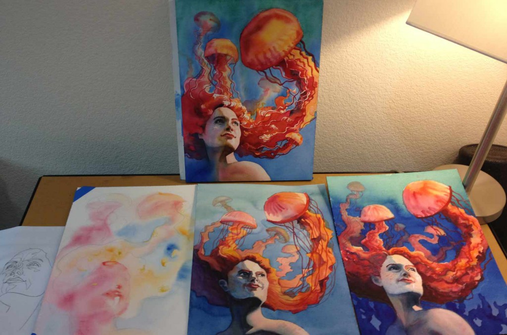
Jelly Hair No. 1
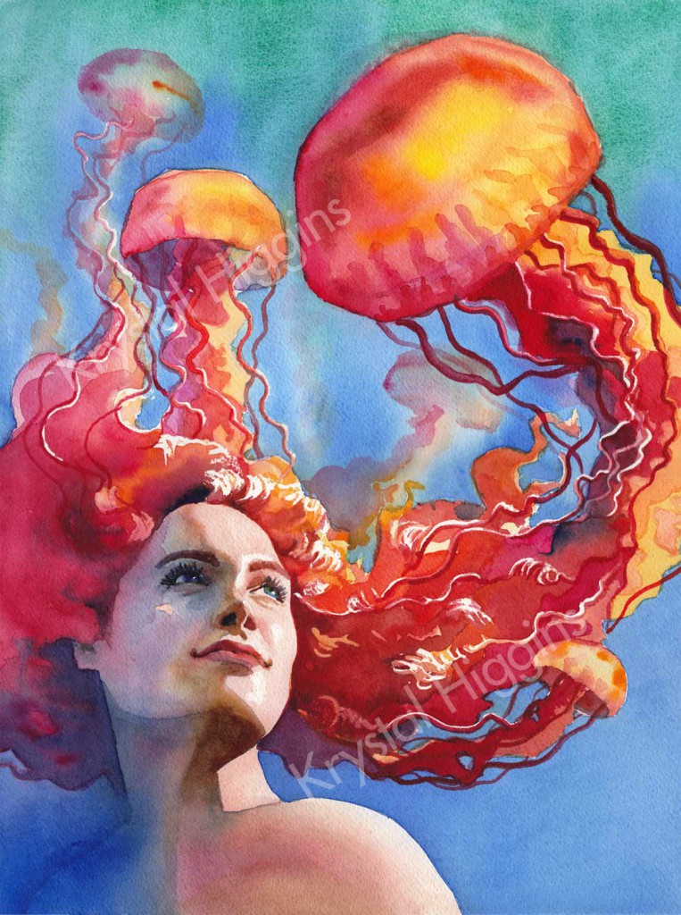
Watercolor painting, 12″W X 16″H
This is a fanciful watercolour illustration of a mythical-like creature that has orange jellyfish for hair. Soft, contrasting colours give this an ethereal, calm tone. I conducted a number of studies before producing the final piece; you can see several of them shown here.
Painted on Arches 300lb Coldpress with Winsor & Newton paints.
Broome mudflat paintings

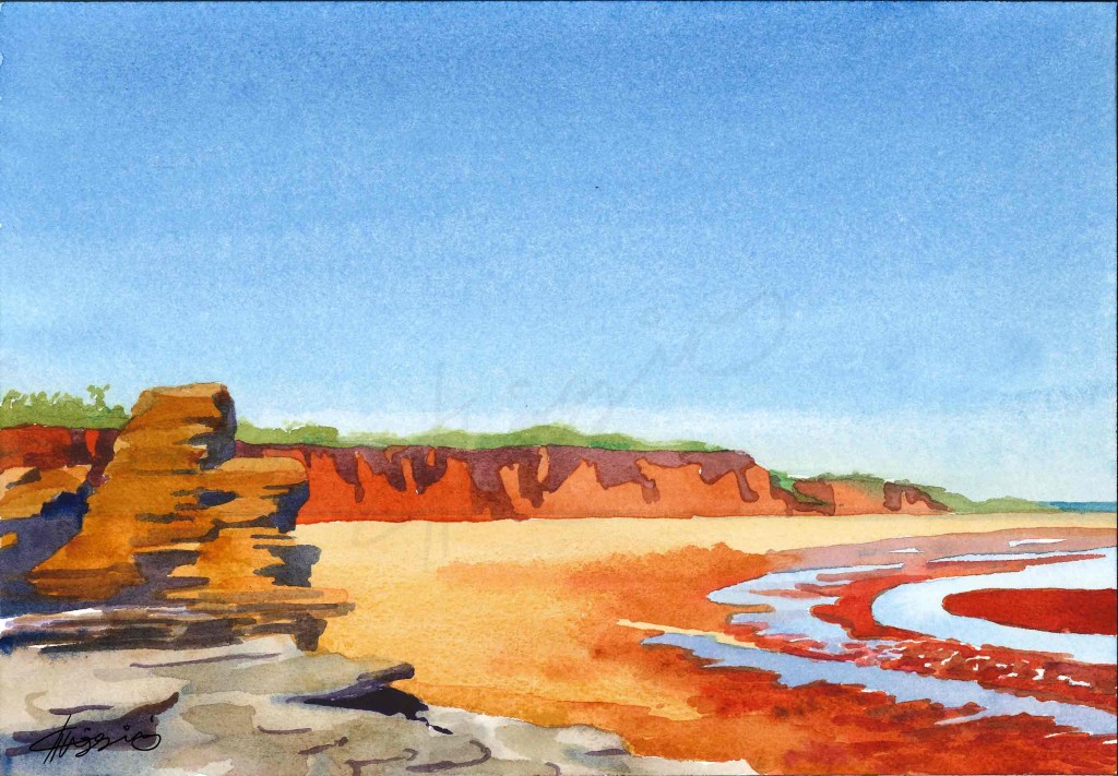
Watercolour paintings, 10″ x 7″ (26cm x 18cm) each
Two separate renditions of the mudflats in Broome, Australia. Painted on acid-free cold-press watercolour paper with Winsor and Newton paints.
Watermarks are not present on the actual artwork or on prints.
Bridge within a Bridge
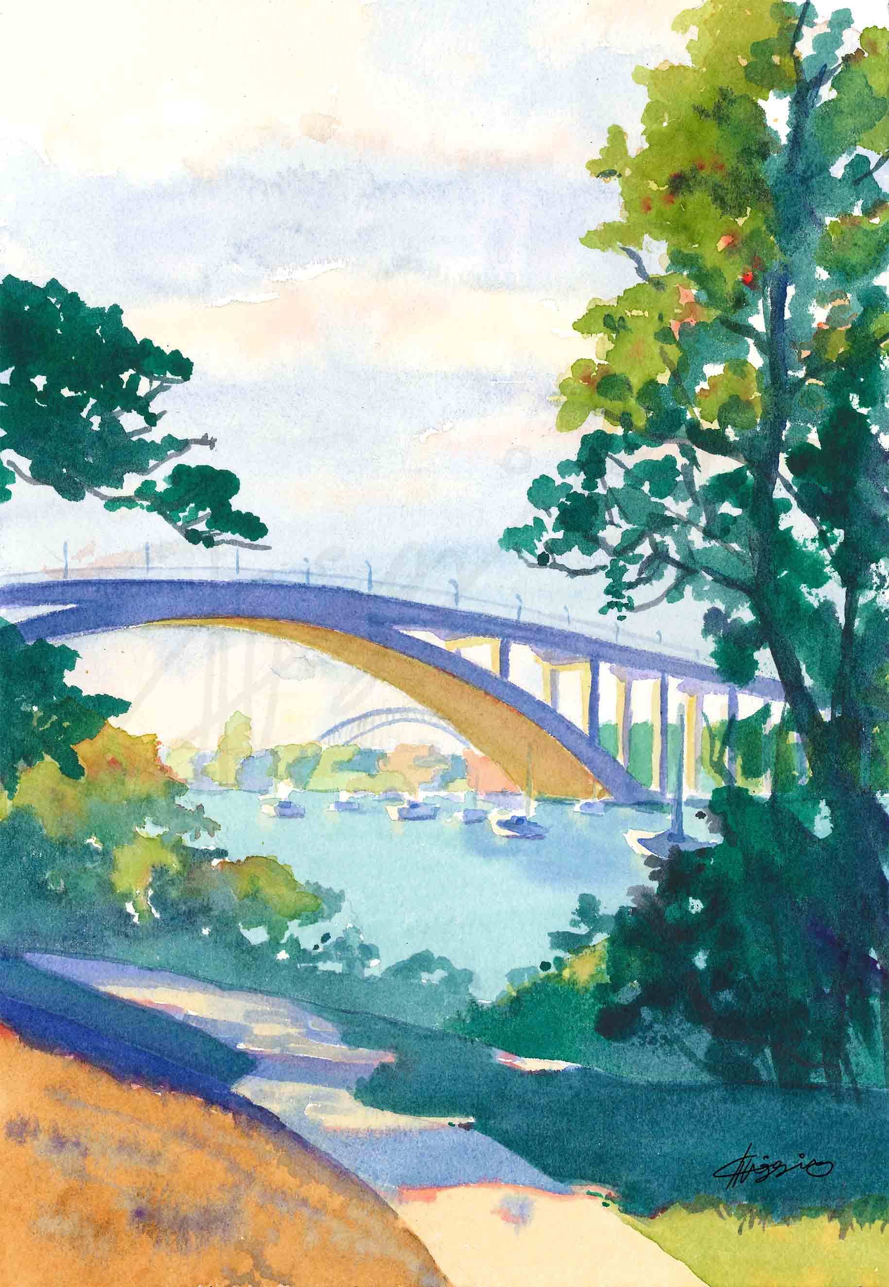
Watercolour painting, 7″ x 10″ (18cm x 26cm)
This painting captures a view of the Gladesville Bridge at morning, framed by shaded trees. Off in the distance, underneath the Gladesville Bridge’s arches, we can see a hint of the Sydney Harbour bridge. Painted on acid-free paper with Winsor and Newton paint.
Watermarks are not present on the actual artwork or on prints.
Gunners Barracks Overlook
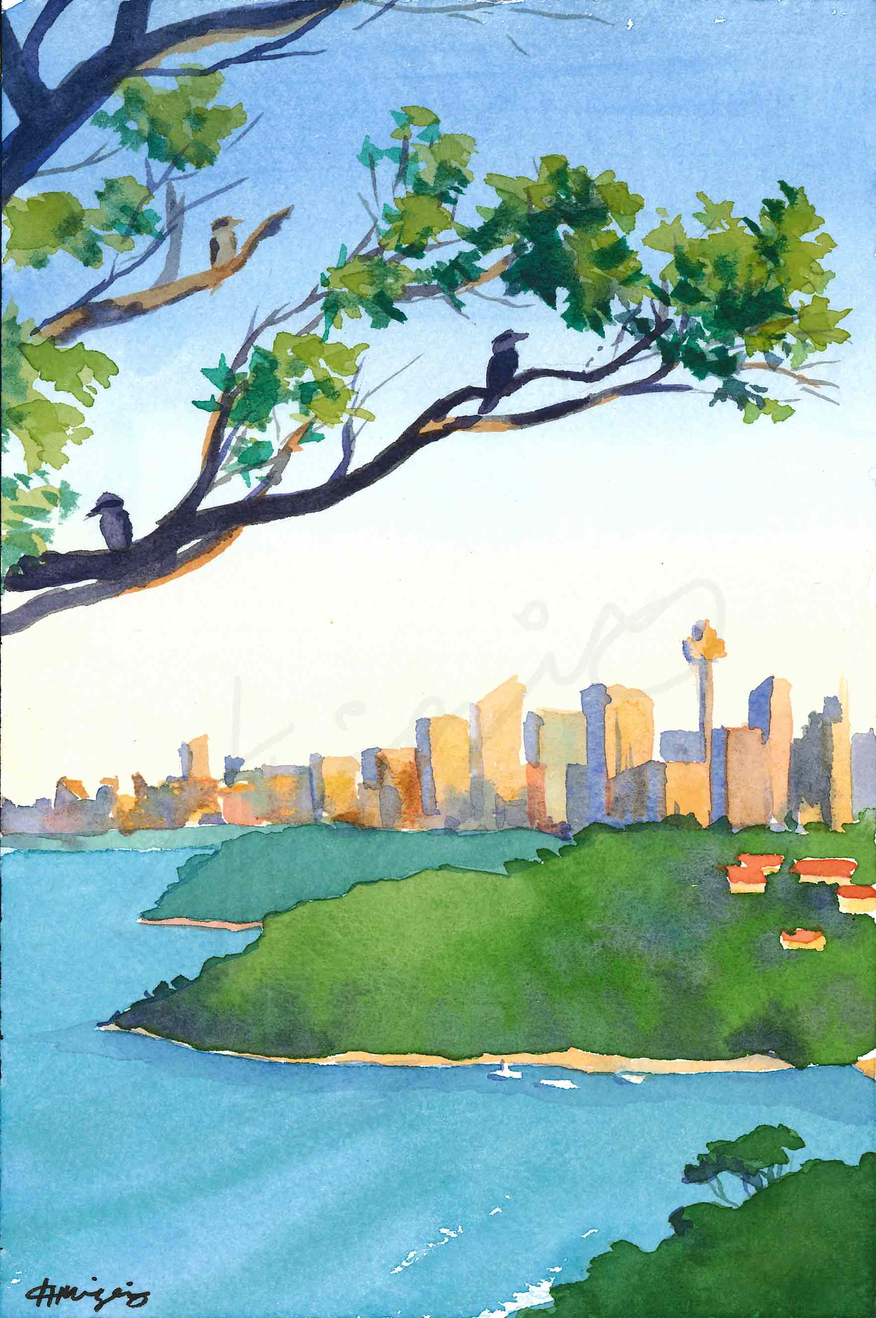
Watercolour painting, 6″ x 9″ (15.5cm x 23cm)
This painting is done from the vantage point of Gunners Barracks in Sydney. 3 kookaburras staying cool in the summer heat look out at Sydney city skyline in the background. Painted on acid-free cold-press watercolour paper with Winsor and Newton paints.
Watermarks are not present on the actual artwork or on prints.
Industrial Syd

Watercolour painting, 9″ x 6″ (23cm x 15.5cm)
A watercolour painting that captures the view from the Balmain, NSW White Bay worksite to the Harbour Bridge. Sunset casts a copper tone on the bridge contrasted against dark telephone pole silhouettes. Painted on acid-free cold-press watercolour paper with Winsor and Newton paints.
Watermarks are not present on the actual artwork or on prints.
Underbelly of the Iron Cove
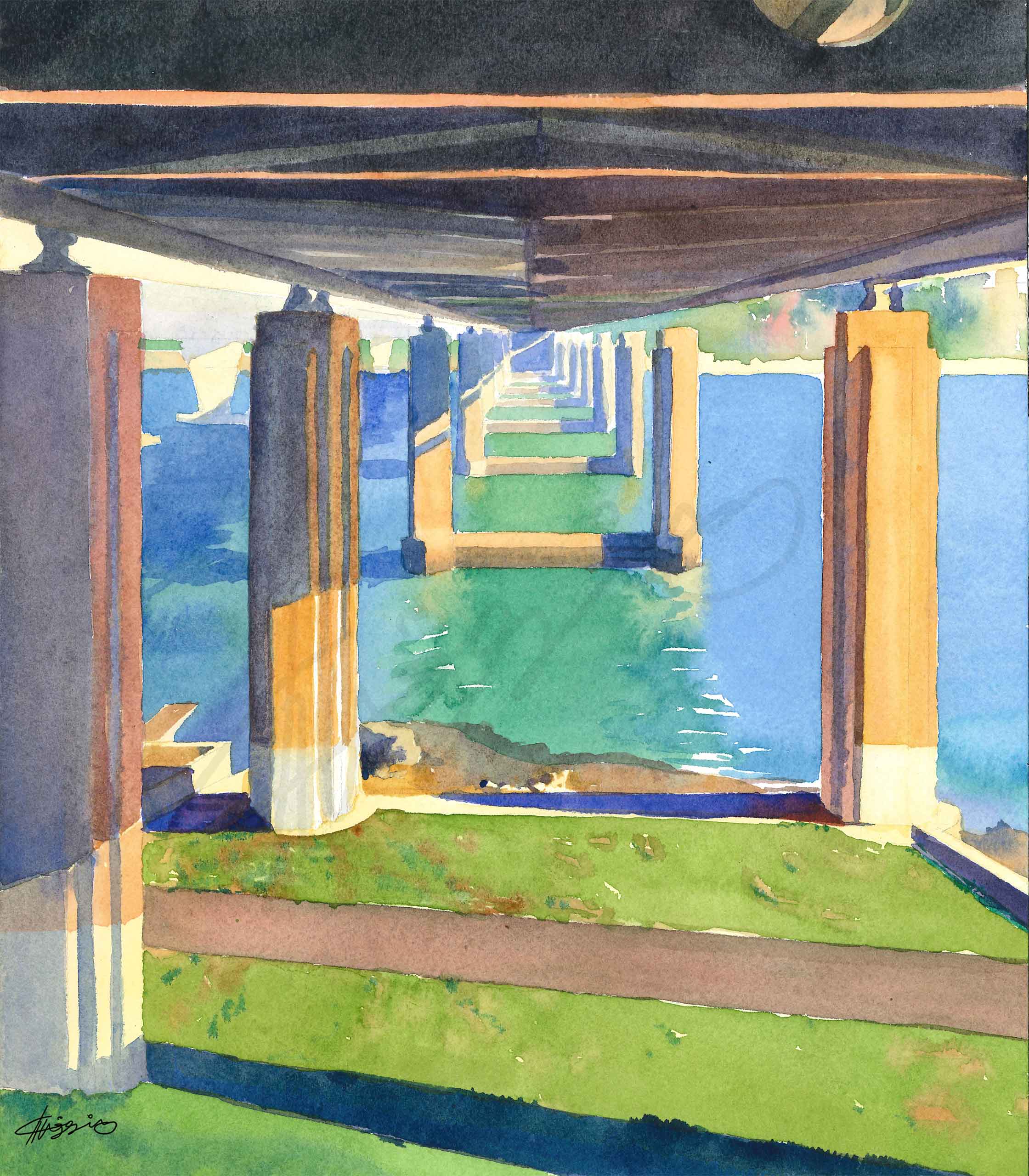
Watercolour painting, 9″ x 12″ (23cm x 31cm)
A painting that captures the underside of the Iron Cove Bridge in Sydney. Strong sunlight filters through the pylons, creating stark shadows on the grass and water below. Painted on acid-free cold-press watercolour paper with Winsor and Newton paints.
Watermarks are not present on the actual artwork or on prints.
Hermitage Overview

Watercolour painting, 9″ x 12″ (23cm x 31cm)
A painting from the Hermitage Foreshore walk, capturing the view out over Sydney harbour towards the Opera House and Harbour Bridge. Painted on acid-free cold-press watercolour paper with Winsor and Newton paints.
Watermarks are not present on the actual artwork or on prints.