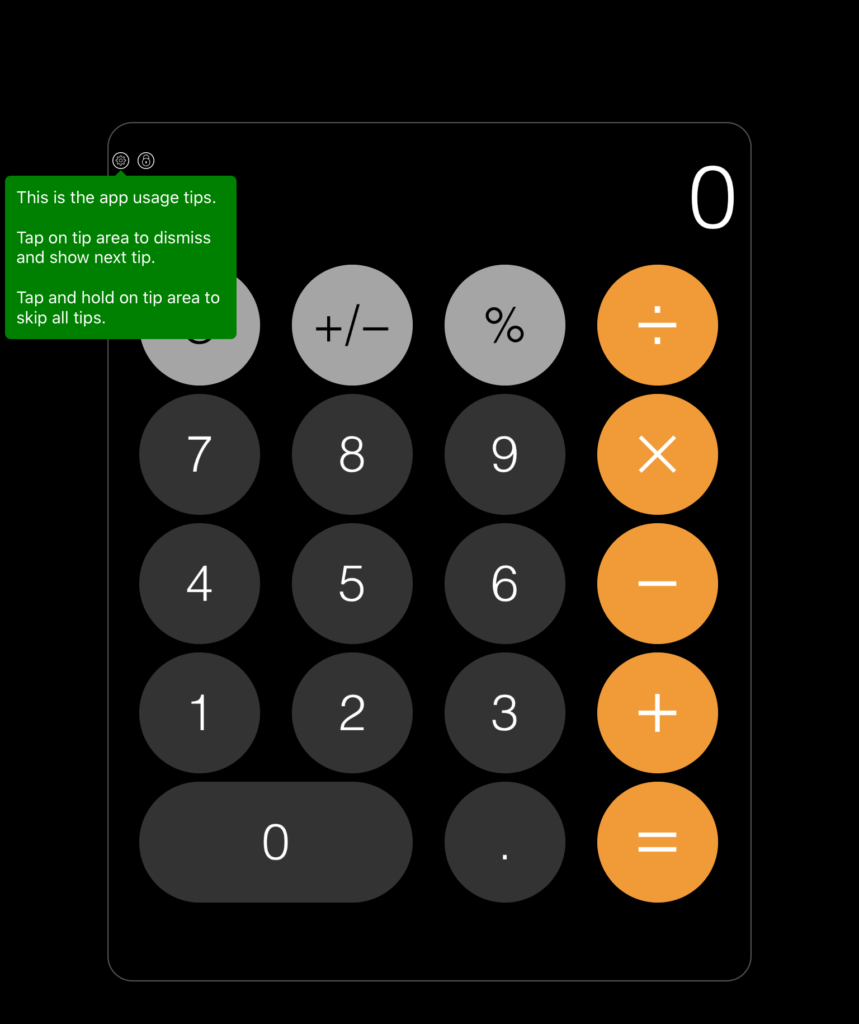
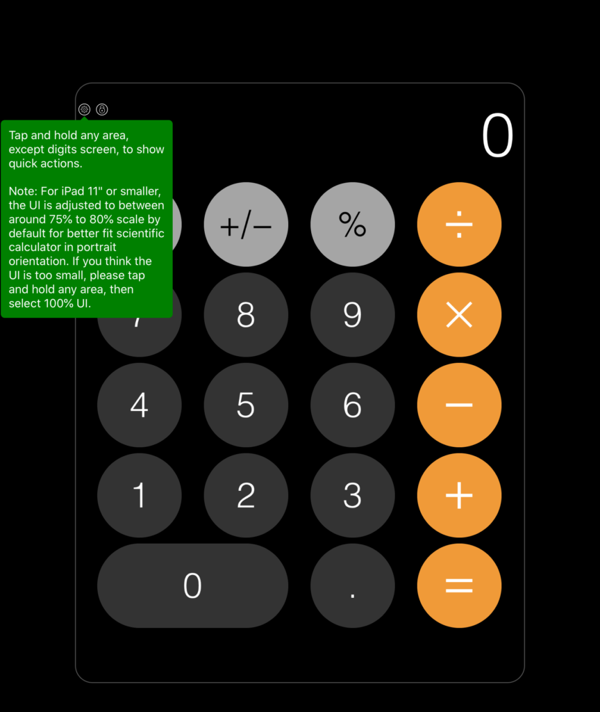
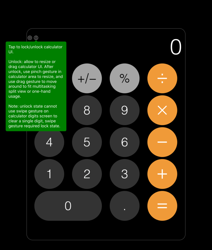
I recently downloaded a calculator app. This app greeted me with a series of first-run tooltips explaining various parts of the app. It was an example of an “explicit” first-run experience—when guidance is provided on temporary layers or in one-off flows—that was unnecessary. Let’s quickly run through some of the issues with applying an explicit educational approach to this calculator app, in the hope it can help you decide if implementing an “explicit” onboarding experience for your new users is the right way to go.
First: a calculator app has become somewhat of an established concept. Most people have deeply ingrained expectations based on other calculator-type experiences they’ve used before, so they don’t expect to need to be “educated” about something established. Adding tooltips to an experience like this signals that you’ve changed something that should be standard, and can make someone worry that your experience is more complicated than it is. Additionally, because folks don’t come in expecting to need to re-learn something that should be established, they may dismiss these kinds of explicit onboarding patterns that actually may contain valuable help.
Second: Now, you can shake up established concepts like calculator apps with new stuff; that’s how we evolve experiences. For those cases, an onboarding experience should use explicit guidance to highlight just key differentiators, while leaning on existing interaction paradigms to do the talking. But the second issue with the calculator app’s approach was that its tooltips tried to cover so many different topics that such differentiators weren’t easily discoverable. Coverage of constraints (“Note: unlock state cannot use swipe gesture on calculator digits screen”) and meta-instruction (“Tap on a tip to dismiss and show next tip”) overwhelmed mentions of special features like “quick actions.” Explicit forms of guidance need to be extremely focused on the most important things new users should know about the product itself. If you find yourself trying to cover constraints or instructions about the mechanism on which you’re delivering guidance, you need to improve those experiences at their core, first, or shift to explaining them once an error or issue is encountered.
Third: Tooltips and other forms of explicit guidance are often fleeting. Once someone dismisses them, there’s a large chance they won’t recall what they read. You can improve the odds someone can remember introduced concepts by reducing and focusing their content. But also consider how someone can recall that information later. This calculator app had a few features it was highlighting, but the feature wasn’t made prominent in the UI at all. A way to reinforce the importance of a new concept introduced at first run, without re-explaining it every time, is to make sure it’s emphasized in the interface of your product. And if it’s not something you or your team are willing to emphasize in your core UI design, consider if that means it’s not important enough to call out to new users.
Finally: The tooltip tour created a barrier between guidance and calculator use; it was unskippable. If someone downloads a calculator app, they’re likely looking to, well, calculate as soon as possible. For those people, being forced to click through verbose tooltips may lead to frustration and eventual app uninstalls.
“Implicit” onboarding
Now, I don’t want to dwell on this app example for too long. I’m sure this app’s creator(s) had good intentions. Plenty of the rest of us are guilty of putting tooltips, tutorials, or tours where and when they shouldn’t be. But you must consider whether you’re using “explicit” onboarding patterns for the right reasons, and whether you’re actually using them to communicate the right things. If you’re not, go back to understanding the expectations of your new users when they come into your product and resolve core issues in its core design, first. Implicit onboarding–where you guide people inherently through the way your product is organized, designed, and in how it behaves—is always where you should start, before you think of adding more layers.


