When people think of user education in products, they’re often thinking of certain set of UI patterns. In some cases, these patterns can be helpful. But, in most other cases, the patterns are overused and applied inappropriately to many situations. They quickly become anti-patterns.
I’ve illustrated that slippery slope by drawing these “patterns” as if they were Pokemon evolutions. You know, when a seemingly harmless pattern can turn into a formidable beast.
Carouhell > Autopuh-lays > Sideshow
From carousels, to auto-playing videos, to lengthy slideshows, we often see products increasingly attempting to serve up attention-grabbing content. The more aggressive and front-loaded these things get, the less appealing they become.

Ghoultip > Drooltips > Crueltips
The occasional tooltip can be helpful, if it appears at the right time and place. But too often they show up when they’re not needed, attempting to address issues with discoverability in the core UI design. Sometimes they come in packs, in the form of serialized walkthroughs, or clumped together as a blocking overlay with multiple tooltips showing at once. These things force someone to memorize UI instructions without addressing the underlying issues.

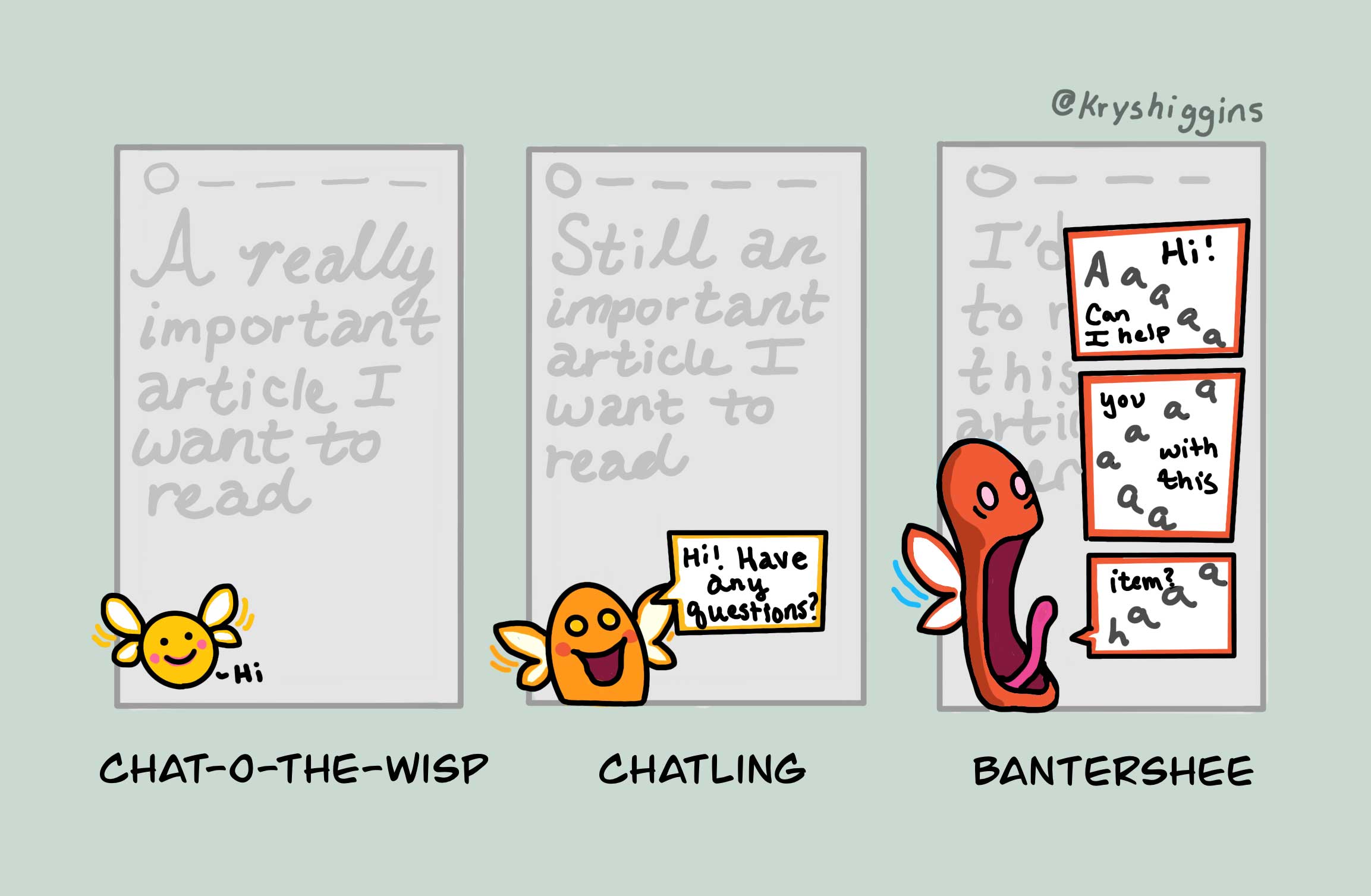
Chat-o-the-wisp > Chatling > Bantershee
Many different plugins make it easy for businesses to add customer service bots to their websites that float at the bottom of the user’s screen. While exposing an entry point to a help agent can get customers to information faster, these things have evolved to proactively push messages.

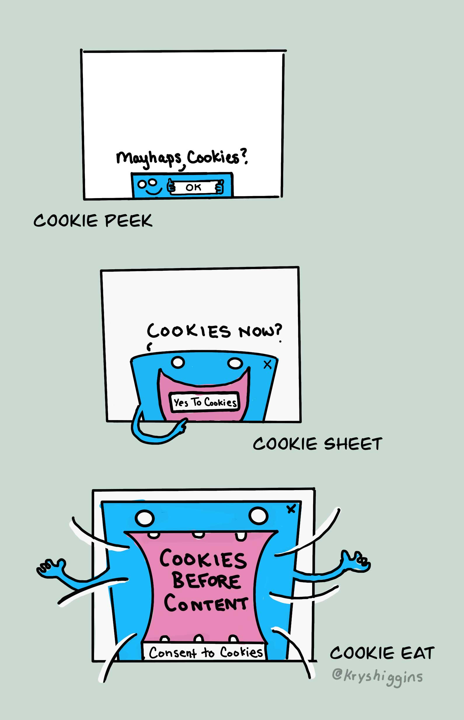
Cookie peek > Cookie sheet > Cookie eat
We want to make sure people are aware of websites that want to use cookies to track web activity. However, these cookie notices are pushing for consent at the detriment of all other content. Navigate to https://bda.org/ on your mobile device, for example, and check out the resulting prompt.

Overlay > Overload
And, finally, overlays. Easy to implement, but oh-so-easy to lose track of until they all suddenly collide at one time. There’s not often an in-between state.

