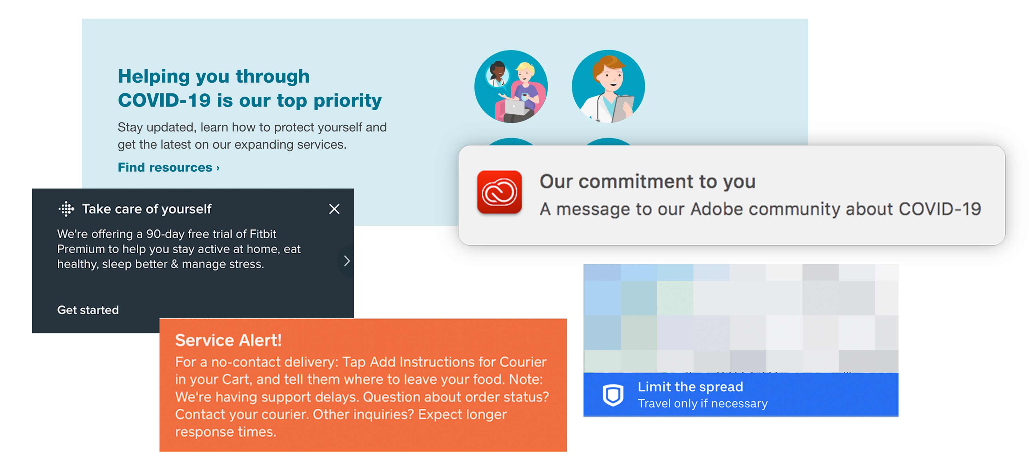
This is a time when we’re seeing thousands of products and services trying to give users guidance about a single community issue: Coronavirus, or COVID-19. I’ve included a few brief considerations for designing this kind of in-app messaging, along with examples.

Make it actionable
Effective guidance requires messaging that’s actionable. In many cases actionable COVID-19 messaging is about getting people to take a preventative action, whether it be to wash hands, stop hoarding, or reconsider a trip out of the house. The better approaches have been from products and services making their messaging relevant by tying the action to their normal use cases. For example, transportation apps are at the front lines of preventing spread, so well-positioned messaging during travel planning flows can reduce unnecessary travel. If the product provides shopping or fulfillment services, informational messaging about order or item status can become actionable by adding links to customer support channels, order status pages, or alternative services. And general informational messages can become more actionable when put in relevant flows instead of just dropped haphazardly on a home screen or in a pop-up. A social media app, for example, could link to COVID-19 information from any post tagged “#coronavirus.”
Be direct
Observing different COVID-19 messages can really highlight the importance of using well-known words and an empathetic tone. u/Hybrid_User_Research posted a great comparison between vague “social distancing” messaging and a more direct message that says, “Stay at home. Get groceries once per week.” When building concise copy for an in-app message like this, focus on the outcome you want to see and strip unnecessary phrases out. For example, Uber’s COVID-19 messaging states, “Stop the spread” in it’s headline (screenshot further down this page). Then, directly connect that outcome to your product, so people understand what the message is getting at without clicking to learn more. If you have a store and people might be checking on the status of deliveries, a message that says “Some deliveries may be delayed up to 8 hours. Click here to check your order status” will be more direct than, “Click here for Coronavirus updates.” Additionally, the latter is much more stressful than the former; people might be worrying about the updates being more serious than they are. For even more UX writing tips, check out articles from UX writer Georgina Laidlaw.
Be forgiving
Some apps are using pop-up messages to announce COVID-19 updates. Modal popups, which require a user to close them before they can interact with underlying UI, are incredibly disruptive. And, while they seem like a great way to grab attention, they’re possible more likely to be ignored. Although this might be an exception where some dialogs are acceptable (often because they are the easiest things to implement on short notice), people are currently getting hammered by emails and pop-ups can be adding to that fatigue. If pop-ups contain important information, ensure that information is also made available inline or in a non-blocking, persistent way at other key points in the experience. And, choose the right presentation mode for the content: The less immediately relevant and actionable the message, the less prominently it should be displayed. If you’re going to interrupt people, or block portions of their UI, it should be for a really obvious reason.
Examples
Transportation
Uber has a banner docked on top of the destination picker sheet saying “Limit the spread. Travel only as necessary.” This messaging is a bit more empathetic than Transit app’s (follows this image) “Stay at home!” statement. As someone interacts, the banner reduces in size and remains visible, but non-blocking, throughout the rest of the ride-sharing setup flow.

Transit app has a modeless banner hovering at the top of the screen, also encouraging people to stay home. The message is somewhat alarming, and also contradictory, which may limit its effectiveness (“Stay home! But if you need to go…”).

Social Media
Social media apps are where many people appear to be going in order to keep in touch with loved ones and stay apprised of the situation. Some apps are intercepting hashtags of posts related to COVID-19 to provide explicit links, while others are taking a more general approach.
Instagram has leveraged it’s “New!” story announcement slot to remind people about self-isolation. This is an inline method that doesn’t disrupt people, which is appropriate given the general framing of the message.

Tiktok has added a small, inline link to learn more about COVID-19 at the bottom of every video tagged #covid, #coronavirus, or similar. This ensures the messaging only appears on COVID-relevant videos.

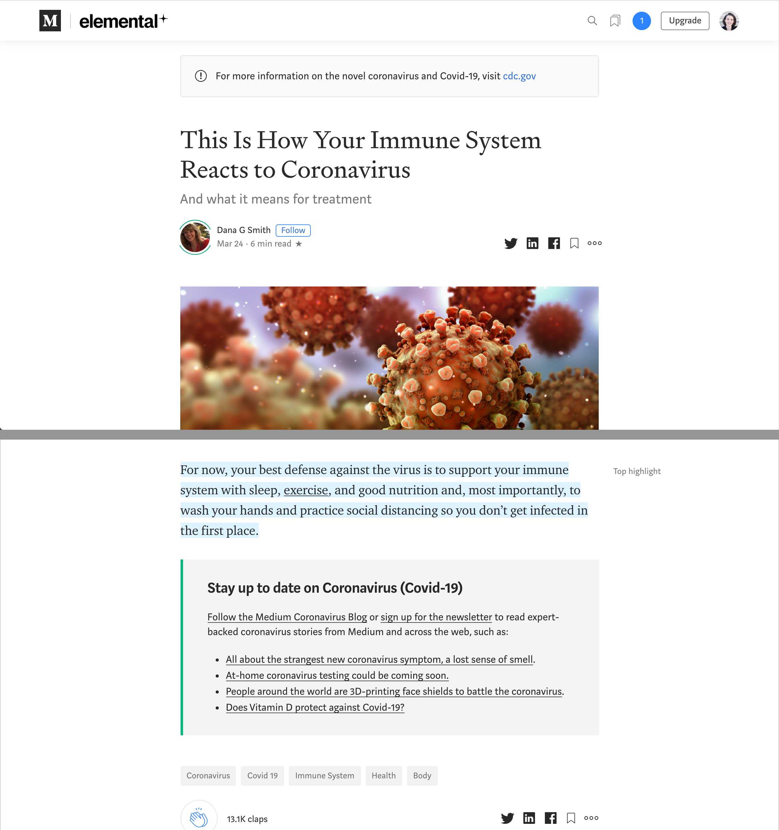
On top of individual posts, Medium has a small inline banner with a link to the CDC’s COVID-19 site. At the bottom, they have a further breakdown of COVID-19 related links and stories.

Shopping
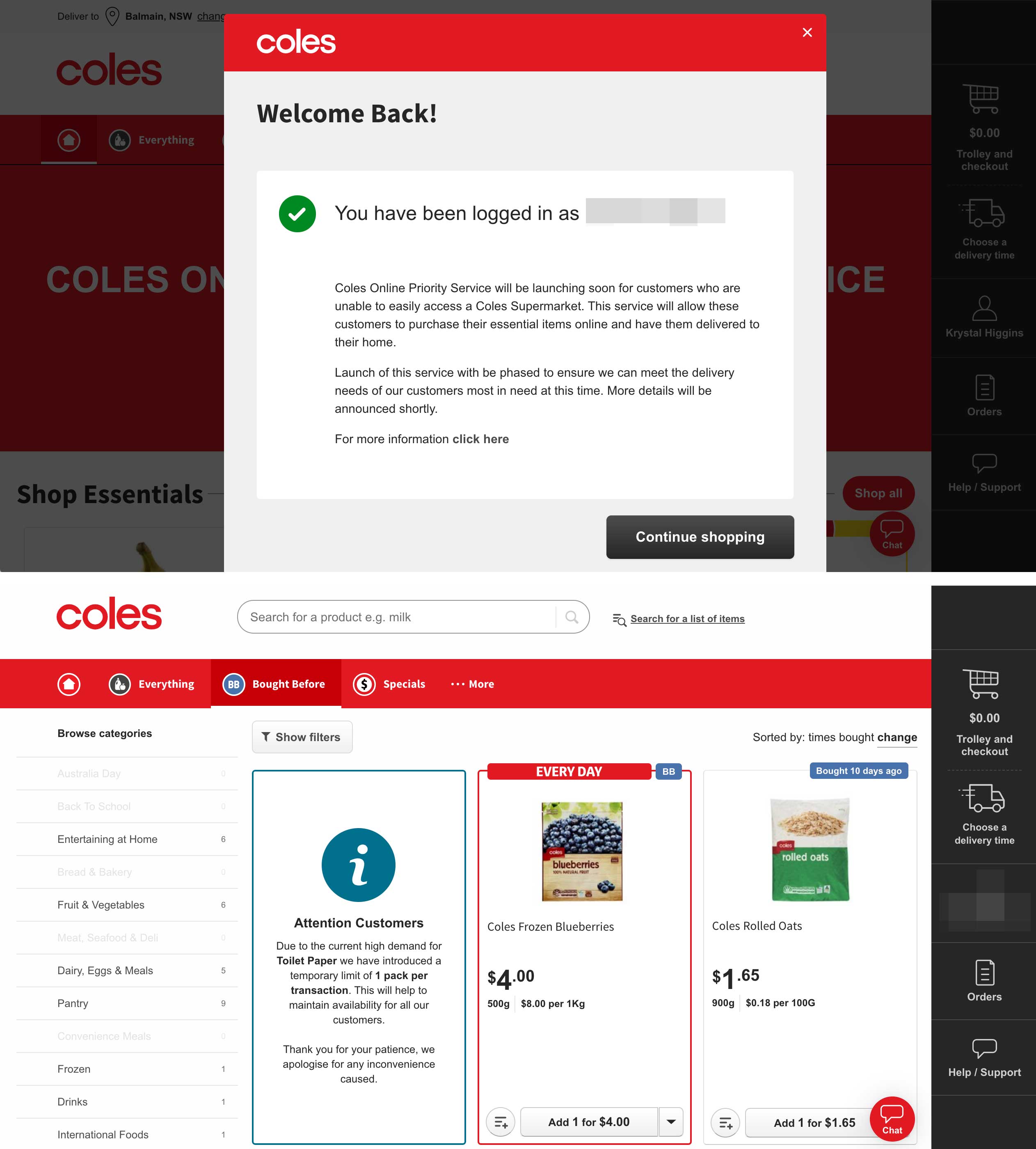
Grocery chains and pharmacies are highlighting restrictions on items, as well as promoting any changes they’ve made to delivery and store hours, to support people who urgently need food or supplies. Coles’s grocery website shows a detailed pop-up message as soon as a user logs in with information on delivery suspension and limits, but also puts relevant inline reminders in a user’s search results to point out supply limits.

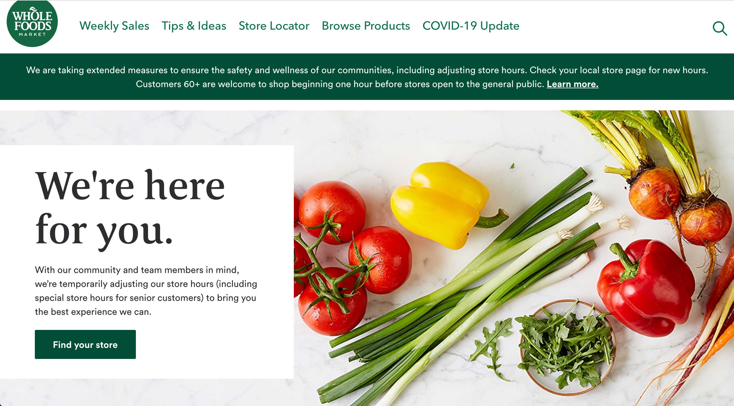
Wholefoods has both a banner message right above their home screen featured imagery, and has also added a link to their default site navigation.

Walgreens has dedicated the entire top half of its home page to fixed, detailed messaging about COVID-19 and their extended services.

Fitness & Health
Knowing that people may be self isolating, fitness & health products are promoting workout-at-home features, or are offering free versions of typically paid offerings. The messaging on these needs to find a balance between being superficially promotional and meaningfully promotional.
Fitbit offers to extend people’s free trial access to Premium membership to 90 days, framing it around “Take care of yourself.” However, the message appears in an inline banner that pushes dashboard content down until dismissed. As they often reuse this area for frequent messaging, it could mean this kind of message will get more ignored than if this area was used only sporadically.

Utility & Productivity
Adobe has more generic messaging; it pushed desktop notification through Creative Cloud with the abstract, “Our commitment to you. A message to the Adobe community about COVID-19.” Not only can this be unnecessarily stressful (“Are they going to stop my services?!”), we should be avoiding interruptive methods that don’t carry an actionable message.

