Often, teams measure onboarding myopically, like a feature in isolation. Apps measure clickthrough rate in an introductory slideshow. Sites measure how many people sign up. Devices measure how quickly someone gets through a setup wizard. These kinds of measurements are immediate, cheap, and easily automated. But, while they’re easy, they don’t show whether an onboarding design is contributing to or detracting from a new user’s overall success. Measuring CTA in a slideshow doesn’t tell us whether it caused users to engage with the illustrated features. Measuring a setup wizard’s time to completion doesn’t guarantee comprehension. Measuring number of signups alone doesn’t show correlation to user retention. Evaluating new user experiences with shallow metrics and methods causes teams to double down on anti-patterns and end up in a vicious cycle of bad design.
The new user experience isn’t a single feature to be measured, but a sequence of events that help them accept a product into their life. In this post, I’ll share best practices and methods for evaluating onboarding’s effect on a customer’s long-term relationship with your product.
Know the value of good onboarding
The human resources industry came up with the term onboarding to describe the process of acclimating a new employee into a new company over time. Good HR departments care about onboarding because well-onboarded employees tend to stay with their current company for 3+ years, create high-quality work sooner, and evangelize the company to their network. A good training process helps new hires gain the confidence to reach their personal career goals, which furthers their commitment to the company.
This is true for apps, sites, and other products as well. When onboarded well, our new users return more often, engage with key features, and happily refer our service to their friends.
Having clear goals for onboarding relative to engagement, retention, and satisfaction will help you measure the value of your designs. First, define what it means to be an engaged, retained, and satisfied user in your product. If you’re a social site, an engaged user may be one that posts content at least once a day. If you’re an e-commerce company, an engaged user may be one who buys $100 worth of goods every week. Then translate these into appropriate new user experience goals. Examples include “increase customer retention by 10%,” “have a less than 10% return rate,” or “5% of users engage at least once a day for their first 6 months.” Having clear goals, even if they’re hypotheses for now, prevents wasting time on irrelevant measurements.

It’s all about retention, engagement, and satisfaction
Look at the journey
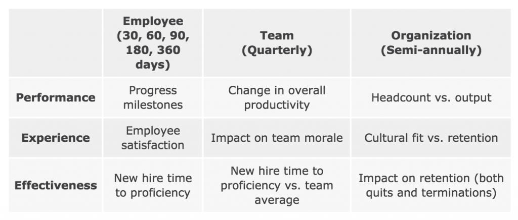
Have you ever started a new job and felt like an expert on your first day? The answer is probably no, and that’s OK. Until we can get information downloaded into our brain Matrix-style, even the simplest jobs will present a learning curve. HR professionals know that, depending on the complexity of a role, it can take 90+ days for a new hire to reach full productivity. A good employer doesn’t judge success by the number of new hires that complete orientation, just as a smart employee doesn’t judge if a job is a good fit based on the amount of information they get on the first day of training. Orientation is just a small part in a larger process.

What human resources may measure during new hire onboarding, and the intervals at which they’re measured. From Kyle Lagunas at Software Advice.
A new user’s onboarding experience is a journey. Depending on the purpose and audience of your product, this period could be as short as 7 days or as long as 90. Only thinking of day 1 as the new user window means you miss out on long-tail insights. Instead, measure actions and behaviors across critical onboarding windows.
One critical onboarding window is during day 0, the day when a user first opens your app, visits your site, or unboxes your product. This is the moment of first impressions, and when we see the biggest risk of abandonment. Other common, critical onboarding windows include days 1-7 (the second most important window), 7-14, 14-30, and 30-90.
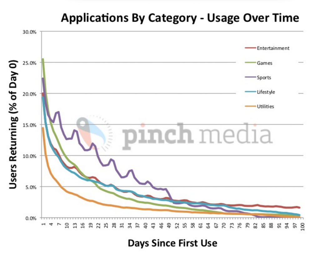
If you have an existing product and want to understand your specific onboarding windows, try looking at your retention curves. Retention curves are graphs that plot the frequency with which users return to your product after their first day with it. They allow you to visualize your periods of greatest attrition; the earlier in the customer’s lifecycle these dropoffs are, the more onboarding is likely to address them. For example, you might see a large number of users making it past day one, but then a steep drop-off around day 4. This would indicate that you have a critical window of days 1-4 during which to retain users.

What companies will measure in new hire onboarding, and the intervals at which they’re measured
Retention curves and similar measures are generated using cohort analysis, which is a method illustrated in the next section.
Look at your most and least successful users
To find the right behaviors to measure and to understand the typical paths of your users, consider your most successful (retained, engaged, satisfied) users, as well as your least successful ones (most churned, least engaged, unhappy).
Did your most engaged users share a common experience within a critical onboarding window? Perhaps you noticed that people who interacted with a promotion by day 5 were more likely to purchase again from your site on day 10. This would make a case for measuring the percentage of users who interacted with a promotion within days 1-5. Observing the behaviors of your most valuable users can also give you insights into your critical onboarding windows, because you might see that it typically takes ~n time to start being at critical engagement levels.
Your failures can teach just as much, if not more than, your successes. Were there things your most churned users didn’t experience in their initial usage of your product that your most successful users did? Did they experienced something in their onboarding experience your most successful users did not? For example, perhaps they encountered a forgot password flow that kept them from signing up. This would indicate a need to measure the number of users who entered a forgot password flow and design ways to avoid this state, even postponing signup flows until the user is in a more stable position. The team over at Groove calls these “red flag” triggers.
While correlation doesn’t necessarily mean causation, comparing these two ends of the audience spectrum will help you determine the best things to measure.
Create onboarding metrics
Metrics help teams break down a goal into more specific evaluation criteria so that they can track progress over time. They can be quantitative or qualitative. When working on something as complex as onboarding, metrics of both types are crucial. Below are some common onboarding metrics.
Quantitative
- D1, D7, and D30 retention: The percentage of users who are active after day 1, day 7, and day 30. Higher is better.
- Ratio of daily active users (DAUs) to monthly active users (MAUs): Requires a meaningful definition of an “active” user. A higher ratio is desired, because that shows that users are active for many days in a month. Here’s an overview at Popcorn Metrics.
- Frequency of engagement with key tasks
- Signup rate versus retention: High signup rate but low retention is a red flag that the onboarding experience may be forcing signup prematurely.
- Bounce rate: The lower, the better. According to RocketFuel, a website bounce rate between 41-55% is considered average.
- Frequency of help requests/support calls in days 1-30: Lower is generally better. A high frequency could indicate information missing in your onboarding experience.
- Session length
- New feature adoption: How soon after new features are introduced does an existing user start using them? Because onboarding can still apply for existing users.
- App ratings
Qualitative
- Product reviews
- Customer satisfaction and feedback
- Ability to discover key features
- Time to value: How long does it take for the user to achieve perceived value in your product?
Methods for testing: The user journey
We’ve already touched on the importance of measuring the user journey longitudinally, over time. Before you start testing detailed screens, you need to validate that the overall flow is right. This section covers two good longitudinal evaluation methods.
Cohort analysis
In this method, you split users that share a common trait into groups (cohorts) and, using analytics tools, measure their interactions over a period of time. Comparing and contrasting cohorts allows you to identify trends and determine whether a specific trait correlates to differences in behavior. It’s more reliable than taking an average from your combined audience, because that average could include irrelevant input (like existing users) or anomalous events (like the week when you had a critical bug that caused your app to crash on launch).
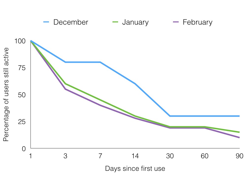
Onboarding cohorts are typically created by segmenting users by start date and observing them for a fixed number of days afterward. For example, a travel booking site might decide to observe 3 groups of users from the day they first visit through the end of their first month. The cohorts are users with a start date of December 1st, users with a start date of January 1st, and users with a start date of February 1st. The site’s team would measure each group’s retention, reservations made, cart abandonment, and other key metrics over each cohort’s first month to see how onboarding could be affecting these values. It would also help that team rule out any influence from the holiday travel season, seen in the December cohort, that would have made their onboarding experience look more successful than it truly is.

A sample retention curve graph showing the percentage of users active 90 days after their first visit to a website, with cohorts based on start dates
Cohorts don’t need to be sliced just by start date. They can also be sliced by behaviors, like whether a key action was completed and how frequently it is completed; variations in the experience they’re shown, like comparing groups who see your new onboarding flow against groups who do not; and external factors, like entry points or holidays.
What you can learn from cohort analysis:
- Baseline correlations between key actions and positive behaviors, or between key actions and negative behaviors
- Baseline rates for retention, churn, and feature adoption
- If an onboarding experience appears to be influencing behavior
- Which external factors are influencing behaviors and should be considered in the onboarding process
What you can’t learn from it:
Cohort analysis is a quantitative method. You won’t be able to confirm causation between what you observe and the results, you won’t be able to know why users behaved the way they did, and you won’t get a sense of user satisfaction.
What to test with:
High fidelity, stable, and fully functional prototypes, or a live product, are required, and analytics tracking needs to be wired up.
Resources for using cohort analysis:
(Credit goes to Faisal Al-Khalidi for part of this list)- About cohort analysis and how to do it in Excel
- Cohort Visualizer by Brett Slatkin
- Google Analytics
- Cohort.ly
- RJMetrics
- Mixpanel
- KISSMetrics
Diary studies
Just as how good onboarding takes place in an authentic context, so should its research. In an onboarding diary study, participants are given your design to use at home, over the span of a week or more, and are asked to log, at intervals, their experiences with it. Logs can be recorded in a variety of media including paper diaries, email, text messages, and recordings. Sophisticated diary studies will even track analytics as the participant uses the design. Diary studies allow you to qualitatively evaluate how a user interacts with your design over time, in a natural environment, and without much influence from a researcher.
What you can learn from diary studies:
- How people interact naturally upon first use
- Whether users discovered, used, and were satisfied with key features without the aid of an onboarding experience (indicates education you don’t need to provide)
- If the user reached out for help (indicates education that was missing)
- Whether the user found value in the product over the course of the study
- Memorability of the onboarding experience
- Before and after comparisons: for example, a user’s mental model on day 1 vs. on day 7; user expectations before and after use; adjectives a person would use to describe their experience after day 1 and again after day 7.
What you can’t learn from them:
You won’t get statistically significant results for retention, engagement, or similar performance metrics. You also may not be able to dig into detailed usability issues. And at the end of the day, the participant knows they are being observed, so there will be some effect on their behavior.
What to test with:
Stable, high fidelity prototypes or live products are required, as participants need to use them in their own homes without technical support.
Resources for conducting diary studies:
Today there are many tools that put diary studies within reach of even the most cash- or time-strapped team. Here are a few options:- Dscout
- Contextmapp
- Ethosapp.com
- nativeye
- For added inspiration, check out this presentation by Etsy researcher Brenna Lynch as she discusses Etsy’s process for diary studies
Methods for testing: The details
When you have validated the big pieces of your onboarding journey, you’ll need to iterate on the components. The methods below allow you to test first impressions and the performance of signup flows, hints, inline cues, setup wizards, tours, customization steps, and more.
A/B and multivariate tests
These tests are conducted by pitting variables against a control. In an A/B test, you split your audience equally between two or more versions of a screen or state and compare the performance of the designs to find a winner. In a multivariate test, you compare variations of the same screen that have different combinations of its elements. Both A/B and multivariate tests require a large audience size and need to be observed over a period of time in order to produce statistically significant winners.
What you can learn from A/B and multivariate tests:
- The best time to show a signup prompt
- What version of copy or visual treatment of a hint, tutorial screen, or inline cue had the highest clickthrough rate
- Which version of a hint, tutorial, or setup wizard was ignored (cancelled, dismissed without action) most frequently
- What version of a signup screen drove the most conversions
- Which setup wizard screens had highest/fastest completion rates
What you can’t learn from them:
A/B and multivariate tests are great at getting statistically significant results for very specific variables. But, they can’t tell you what the downstream effects of a solution might be, or why users favored one direction over another.
What to test with:
As long as they look polished and you have the right testing tools, you can get away with comparing static mocks or a simple clickthrough prototype, as well as live products.
Resources for conducting A/B and multivariate tests:
- Optimizely
- Kissmetrics
- Google Analytics Experiments
- VWO
- The ultimate guide to A/B testing – Smashing Magazine
Usability studies
Usability studies evaluate a user’s performance qualitatively, relative to scripted tasks. Tests look at the tasks success rate, errors encountered, time to task completion, and the user’s feedback about their experience. Usability testing can be done in a lab or done remotely, and can be moderated or unmoderated. Often, sessions are recorded so that your team can refer to participant feedback over the course of your onboarding design work.
What you can learn relative from usability studies:
- The learnability, memorability, and ease of use of a design
- Whether there are core usability issues that undermine new user education
- A user’s comprehension and interpretation of onboarding content
- Areas of confusion or concern on a signup form, setup wizard, hint, or inline cue
- Initial user reactions and expectations
- User preferences for design options
What you can’t learn from them:
Usability tests will not give you comprehensive feedback on the long-term onboarding experience and do not replace the statistical significance of other quantitative measures.
What to test with:
Any fidelity, from paper prototypes to live sites, can be adapted for a usability study.Resources for conducting usability studies:
- Usabilla
- Usertesting.com
- Usability 101 – Nielsen Norman Group
Participatory design
As summarized by Christian Rohrer over at the Nielsen Norman Group, participatory design allows “users to interact with and rearrange design elements that could be part of a product experience, in order discuss how their proposed solutions would better meet their needs and why they made certain choices.” One participatory technique I’ve used for onboarding is the coaching cadence exercise. In this exercise, the researcher plays the role of the product and acts out a first time user experience with a research participant, who plays the role of a new user. The goal is to frame the process like a conversation, learn from a real person’s natural response to certain prompts, and actively make adjustments to the onboarding “script” as it feels necessary. Typically, the sessions are recorded and design artifacts kept.

The coaching cadence exercise is tool that can be used in participatory research
What you can learn from participatory design:
- First impressions
- Feedback on the pacing, ordering, and quantity of onboarding interactions on day 0
- User preferences for design options
What you can’t learn from it:
Participatory design asks the user to imagine an experience and design it their way, instead of testing the performance of an existing experience. Therefore, you can’t get detailed usability results, results over time, or significant quantitative results from this method.
What to test with:
Low-fidelity work. Typically you conduct participatory design using Improv-like exercises or providing the participants with a toolkit of components they can rearrange into a design.
Resources for participatory design:
Surveys and customer feedback requests
HR departments regularly send their new hires surveys to gauge satisfaction and engagement. While constantly bombarding your users with feedback requests will surely irritate them, asking for it at opportune times is a healthy way of gathering information and showing users you care. Plus, when done well, it’s another avenue for engaging new users.

Google and Google Now occasionally ask for user feedback when new UI elements are shown

eBay asks for customer feedback via a placement on its home screen
What you can learn from surveys:
- Perceived value of your experience after the first day or week
- What kind of expectations onboarding set for your experience
- Why people came to, or are leaving, your experience
- What new users like or don’t like about a particular onboarding element
- Top pleasures and pain points after the first week
What you can’t learn from them:
What people say and what they do are often different things. Don’t rely on surveys to measure usability or performance metrics like retention or engagement.
What to test with:
Surveys and feedback requests can be presented in any scenario: during a usability test, diary study, to existing users, to churned users, after a few days of use, etc. Therefore, fidelity is much less important than figuring out the right question and most opportune time to show it (those annoying overlays that appear when someone is trying to hit the back button on your website? Those aren’t appearing at an opportune time.).
Resources for running surveys:
- Better User Research Through Surveys – UXmastery.com
- The 7 best ways to gather customer feedback – Help Scout
From myopic to meaningful
Clear onboarding goals and effective evaluation methods allow you to craft an ongoing education platform that increases user retention, engagement, and satisfaction over time. Longitudinal methods like diary studies and cohort analysis give us meaningful insights about the customer journey, help us realize the big pieces we need in our onboarding flow, and prevent us from creating designs in reaction to myopic metrics. Detail-oriented methods like usability studies, A/B tests, participatory design, and surveys help in validating the individual elements that make up those big pieces. A mix of both longitudinal and detailed approaches ensure we design onboarding as part of the customer journey.
