The 6 R’s of helpful wearable design

After checking out the design principles of Android Wear, I found myself thinking particularly about the third principle, “Helpful”. Certainly in UX design a product needs to be helpful before anything else. But what does it mean to build helpful experiences for wearables, specifically?

<>To me, it seems that helpful wearable devices or wearable apps would do the following (the “6 R’s”):

Continue reading

Patterns for new user experiences

I’ve been keeping an ongoing collection of first time user experiences (FTUEs) at http://firsttimeux.tumblr.com/. In this post, I’ve distilled the most common approaches I’ve observed being used today into a list of 8 design patterns and anti-patterns. Each pattern has a description, pros/cons list, design considerations, and an example. You may recognize a few of these because many are modern takes on well-established UX patterns.  My hope is for this to serve as a helpful reference as you develop your own first time user experiences.

Continue reading

Special Edition Greyjoy Free Game of Thrones Valentine!

It was pointed out to me that I’d forgotten House Greyjoy in my Free Game of Thrones-inspired Valentines patterns. Instead of making another that matched the set, I created instead a DIY printable Valentine which you can give to your loved one (or enemy) for some interactive fun!

Continue reading

Free Valentines heart patterns inspired by Game of Thrones

NEW! I created a special edition print-at-home Greyjoy pattern card. See it here.

Winter crafting wouldn’t be complete without some artistic activities for Valentine’s Day. Following in the theme from the Game of Thrones-inspired snowflake patterns, I’ve created heart-shaped paper cutouts using interpretations of the Lannister lion, Baratheon stag, Targaryen dragon, and Stark direwolf sigils. And, like the snowflakes, I’m sharing these patterns for free! Read on for instructions and downloadable patterns.

Continue reading

Free snowflake patterns inspired by Game of Thrones

NEW! Check out Game of Thrones-inspired Valentine’s Day heart patterns here!

It’s almost the holidays, and I’ve been itching to make some kind of Game of Thrones-themed Christmas craft. I came up with GoT-inspired snowflake patterns. I’m sharing them as free, printable JPGs so everyone can enjoy them!

Read on for the patterns and instructions.

Continue reading

A collection of first time user experiences

Recently, I started a collection of first time user experiences at http://firsttimeux.tumblr.com/.

Related to a post I wrote in 2012 about designing good first time user experiences in mobile apps, my hope is that this collection of onboarding experiences can show off the good and the bad, and encourage designers to think more about these oft-underused moments in time.

Do you have a first time experience you think should be included in my collection? Send me some photos, videos or a link to the product and I’ll do my best to include it!

Common threads: A perspective on multi-device continuity

How can we create seamless product experiences for a multi-device world? Design for continuity is relatively new in the mobile space, but I’ve been inspired by how other disciplines, especially the health industry, tackle the concept. This piece explores how healthcare’s continuity of care model (informational, relationship and management continuity) might be used to reveal best practices for designing multi-device experiences.

Continue reading

Mailbox’s waiting game

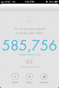
If you’ve downloaded Orchestra’s Mailbox app, you’re probably familiar with this queue screen.

Mailbox is designed to make email simple and manageable with a beautiful, gesture-driven design. So, why the waiting list? According to the company, it’s to prevent servers from crashing and providing a bad experience. The reservation system itself has generated quite a bit of hype, which has in turn increased the number of people getting in line.

So, is this going to be successful for Mailbox? Does this mean all apps should ask users to reserve their service in advance? Here are 4 things, both good and bad, about Mailbox’s approach and what you need to consider before doing it with your app.

Continue reading

iPad Stylus Review: Sensu vs. Bamboo pocket

For the past month I’ve been using 2 different styli, the Wacom Bamboo Stylus pocket and the Sensu, with the goal of finding the best one for sketchnoting on my iPad. I wanted something hardy enough to tote from event to event and comfortable enough for drawing in long stretches. It would be an added plus to find one for creating polished digital paintings.

For my comparisons, I used the styli with Procreate and Paper on an iPad 3. Here’s how they stacked up:

Continue reading

Free homemade jack-o-lantern stencils based on Angry Birds Space

2 years ago I was inspired to create jack-o-lantern stencils based on Rovio’s original Angry Birds game. Now, Angry Birds Space is my new favorite and I couldn’t resist drafting up a few more!

These stencils are modeled on Space’s extra terrestrial cast of characters: Lazer Bird, Super Red Bird, Terrence (green), Lightning Bird, Ice Bird, Bomb Bird, Atomic Bird and the Space Eagle. I love spreading Halloween cheer, so I’ve shared the templates out so that you and your families can carve your own pumpkins.

I’ve also updated the original cast stencils with three new characters: “Bubbles”, the orange bird; “Stella”, the pink bird, and “Al”, the boomerang bird.

Continue reading

First time user experiences in mobile apps

Designing good first time user experiences (FTUE) is not a project unique to mobile.  It has history in out of the box experiences, software installs, even workplace new hire onboarding. But designing the first time experience for a mobile app does present additional challenges.  It’s an important exercise for mobile product teams because it:
  • Refines the elevator pitch. Going through the exercise from a newbie perspective forces teams to think hard about their app’s value proposition. Products only have a short period of time—and limited real estate—to answer, “Why would I use this?”.
  • Affects brand perception A person’s first impression sets the tone for their perception of an app’s brand.
  • Impacts customer support Good out of the box experiences have been shown to reduce customer support costsSimilarly, good first time app experiences may reduce customer support emails and improve reviews in the app store.
  • Improves odds that new users will become returning users With 26% of users deleting an app after first use, the first time use scenario is your only opportunity to give them a reason to return.
Some mobile apps are rehashing mistakes that have already been recognized and overcome in other domains, so I’m covering 4 FTUE best practices that are especially important in the context of mobile apps.

Continue reading

December Watercolors & New Series

It’s a new year, and we’ve come to a final installment of watercolor sketches based on the watercolor sketch resolution I made last January.  Who would have thought 12 months would pass so quickly?

I plan to take my learnings from the sketch exercises from 2011 to create more exhibition- and sale-worthy pieces throughout the next year.  In fact, I’ve even started a new series in the last week.  Check out “Killer Poms” below and after the jump.  Many of these will be available for sale.

Manic Grin - Here's a look at one painting from a series called "Killer Poms" (5"x7" - Contact for pricing). Check out the others after the jump!

Continue reading

November Watercolors

We’re coming up on the end of the year. I was lucky to get watercolor sketches done this month, between the holidays, travel, and general busy-ness. I also hit a snag when I ran out of watercolor paper and tried to supplement with some general purpose drawing paper until the art store opened the next day. Kids, don’t try this at home: it’s never worth it to use crappy paper, even if you’re desperate.

In November I also upgraded from my 5×7 Moleskine Watercolor Notebook to a 10×7 Strathmore 400 Series Field Watercolor Notebook. So far, I’m loving the Strathmore much more than the Moleskine because the spiral binding provides more flexibility, the paper and cover are sturdier, and the aspect ratio of each page is more comfortable.

I had some fun with simple lines and angles in this piece.

Continue reading

October Watercolors

Trick or treat!  It’s Halloween, and also the day for a watercolor update.  Oddly, I did no pumpkin, ghost or zombie paintings this month. I did some traveling this October so, instead of 16+ quick paintings in my sketchbook, I used my vacation time to create more refined, professional pieces.  I’ve also included a scan of one of them in progress to show a bit of my technique.  Feel free to inquire about purchases of the originals or getting prints made. I’ve been asked how I deal, space-wise, with the large amount of watercolors that I’ve generated this year.  While many of them are nicely tucked away in sketchbooks, the singular, larger pieces are displayed clothesline-style on my walls.  I’ve found this to be the most nondestructive and space conscious way to display watercolors.  Then I only need to frame my favorites.   It’s much cheaper than purchasing frames for everything!

Twine and mini-clothespins are a quick, easy and non-destructive solution for displaying mulitple watercolors.

Enjoy the watercolors from this month, and I’ll see you all in November with another update.

Continue reading

The “Focal Button”: A Pattern for Emphasizing Key Features in an iPhone App

As iPhone apps mature, designers are exploring new navigation structures that can support an increasing breadth of content while keeping simple tasks accessible.  There are now many examples of custom navigation, such as TweetBot’s flyout menus and Twitter’s label-less, contextual tab bar.

A budding navigational design pattern that is growing in use is the custom center tab button.  In this approach, app designers centralize their app’s primary tasks or content under the middle-most button of a standard 3- or 5-button iPhone tab bar.  This “focal button” provides a way to indicate and drive users to the primary functionality of the app, allows for top-level awareness of secondary content sections, and doesn’t require as much re-learning as a completely custom navigation design.

To differentiate the focal button from the other tabs, it is typically given a special visual treatment and an action label (ie, “Check In” or “Scan” vs. “News” or “Featured”).  Its visual emphasis helps users quickly recognize the core action they need to take, while its location, directly above the iPhone’s hardware home button, gives it a natural physical reference point.

Continue reading

September Watercolors

I’m pleased to announce month 9 of watercolor sketching. This batch from September is more impressionistic than last month’s illustrative bunch. Many of these paintings were spontaneous and unplanned. For several of them, I didn’t even bother to add blue tape for clean borders. This gave them a very gestural feel.  I also created several vigorous “action” paintings. Enjoy and, as usual, please contact me with technique questions or purchasing inquiries. Cheers!

This turned out to be a lovely portrait sketch. While, in real life, the subject was coyly smirking, I gave her a more

Continue reading

August Watercolors

Installment 8 of watercolor sketching! After a lighter showing last month, I’m happy to say I’m back to the normal array of paintings for August. Contrary to the usual landscape/realism style, these are primarily surrealist. I’m really quite happy with the “Jellyfish Hair” series, even if it is a tad on the trippy side. I happily welcome your thoughts and any questions about technique.

As a side note, I’ve been asked by a few folks about whether my watercolors are for sale. While there are a few pieces that I do plan to keep for myself, if you are interested, send me a note at kryshiggins at kryshiggins dot com and we can chat.

This is how the month started off. Just some simple pretzels with frisket spatter for salt. Who knew I'd end up with Dali-esque jellyfish paintings later?

Continue reading

July Watercolors

This month turned out to be quite a boondoggle, and I did not get through a full slate of 16+ watercolor sketches as part of my watercolor sketch resolution. As unfortunate as that was, I still have artwork I produced during the month to share.  I painted 3 detailed watercolors and also had fun creating digital, graphic posters inspired by vintage racing artwork.

I’ll be back next month with watercolor sketches, as usual.  I hope you see you then!

3 12 x 16 Watercolors

These 3 watercolors are based on pencil sketches I did last summer in Italy. This is of a view from Taormina, in Sicily, looking towards the Ionian Sea. I used an incomplete sky on this one to bring some focus to the flowery ruins on the left.

Continue reading

June Watercolors

6 months into my watercolor sketching resolution, and still going strong.  June had me working on an eclectic array of subject matter, from the abstract to the ridiculously illustrative, and utilizing different paper sizes and media (salt, frisket, and more).  Some of these pieces took me the full hour, and others took a scant 5 minutes.  Which ones do you think took the longest?

A linear abstract using frisket and broad washes

Continue reading

Post navigation