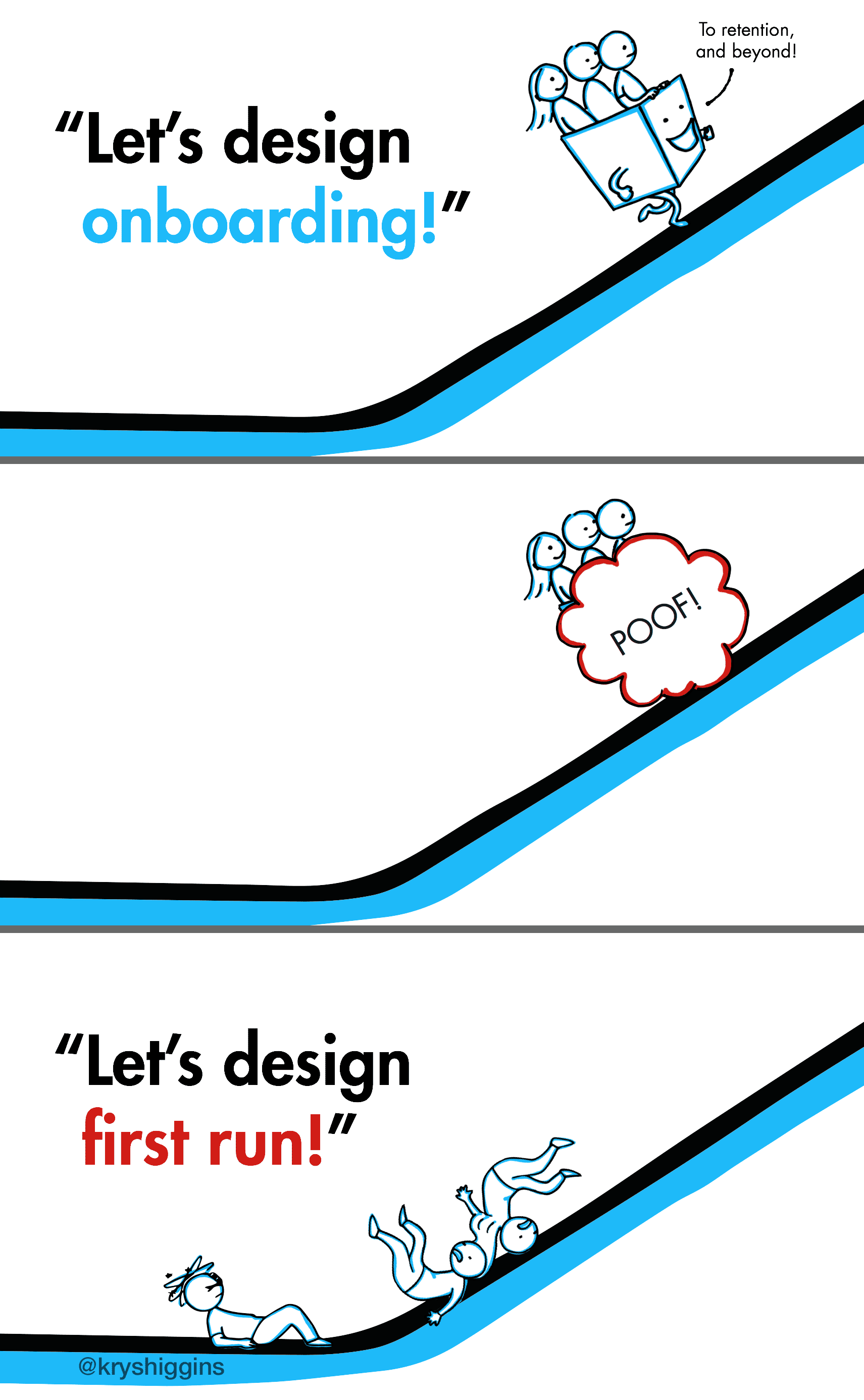
User onboarding is a journey made up of multiple activities, not a single, linear flow. Onboarding should align guidance independently around each of the “key actions” of its experience so that newcomers can interact with them at the pace and in the order that makes sense for their different situations.
I’ve long tried to use iPad drawing apps, like Procreate or Photoshop, to simulate my traditional watercolor painting work. And with Procreate 4’s introduction of wet canvas + brush dynamics, an Apple Pencil, and a set of lovely, free watercolor brushes from Abbie at Uproot Jewellery, I’ve been thrilled at how close I can get to the real thing. The only thing missing has been a good set of salt brushes (I use a lot of salt in my paintings to simulate textures like dense fields of coral), so I created 6 of my own. And now you can use them, too!
In an earlier post, I covered how onboarding is more than just a one-time event in a customer’s journey. In this post, I’ll be making the case for applying more than one onboarding method. Just as students will fail to learn if taught with a one-size-fits-all approach, trying to onboard every user in the same way is bound to fail.
One-size-fits-all onboarding experiences rarely carry all of our new users.
Instructional presentations in the design and tech world often benefit when they include examples outside of a speaker’s own work. If you’re a presenter or working towards being one, chances are you’ve realized how helpful 3rd-party screenshots and recordings can be in illustrating a point, and how easy they are to capture from sites and apps. You were probably trained to get permission before adding 3rd-party music, photos, and other creative works that aren’t already in the public domain or under an open-sharing license like the Creative Commons copyright license in your slides. But, have you considered doing the same for screenshots and screen recordings?
In a previous post, we looked at multiple opportunities over time for user onboarding techniques to be useful in our products. If we design for those opportunities ad hoc, we risk unscalable designs and frustrating users with fragmented education. Instead, let’s see how to tackle onboarding design so that it fits into a long-term approach to guidance.
I often evangelize the importance of first time user experiences. After all, not all of the users acquired to a product will stick around, but they’ll all experience its first run design. To encourage return use, that first impression must be solid. But it’s also very common for designers to overemphasize the first run experience at the expense of long-term user support.
Clippy, the Microsoft Office Assistant, failed partly because it catered to first time users. It didn’t scale gracefully as those users became acclimated to the product. As James Fallows describes “…Clippy suffered the dreaded ‘optimization for first time use’ problem. That is, the very first time you were composing a letter with Word, you might possibly be grateful for advice about how to use various letter-formatting features. The next billion times you typed ‘Dear …’ and saw Clippy pop up, you wanted to scream.”
I used to be intimidated by watercolor. It seemed so unwieldy compared to the acrylic, pencil, ink, and digital media I’d grown accustomed to using during my BFA program. For years I shied away from it, despite the fact that those who could control it made beautiful, airy paintings that were nearly impossible to simulate in Procreate or Photoshop.
As I got immersed in the day-to-day trappings of tech-focused jobs, my fine arts skills got stale. I decided to reinvigorate them with a challenge. In 2011 I took up one of those make-a-thing-everyday-for-a-year projects, choosing watercolor as my tool of choice. By forcing myself to paint watercolor nearly every day, I built up my skills from “sorta bad” to “decently good.” Eventually, I fell in love with it. Today I paint almost exclusively in watercolor.
People can be shaped by a mix of factors: genes, people, places, events, both the good and the bad. Everyone is a unique blend. As good product designers, we consider these contexts in relation to the users for whom we design, with the intent of creating experiences that suit their needs and expectations. But we don’t often take as much time to understand what has shaped us. Why do we gravitate to the problems and solutions that we do? A little self reflection in uncertain times can help us realign to higher quality, impactful projects and can also remind us, as we approach the Thanksgiving holiday, to thank those that had a positive impact on who we are now.
Attendees of my “New Users Matter, Too” talks have graciously brainstormed ideas for free samples–experiences that allow new users to interact with a portion of a product’s value proposition before committing to an account. These methods can increase valuable signups and reduce the walls that prevent conversion. Use these ideas to kickstart your team’s exploration of a free sample that’s right for your product.
If you’re designing your product’s first onboarding flow or improving an existing one, you’ll need to evaluate its performance. A good assessment process helps you find opportunities for improvement and justifies the resources you need to make the new user’s experience awesome.
Often, teams measure onboarding myopically, like a feature in isolation. Apps measure clickthrough rate in an introductory slideshow. Sites measure how many people sign up. Devices measure how quickly someone gets through a setup wizard. These kinds of measurements are immediate, cheap, and easily automated. But, while they’re easy, they don’t show whether an onboarding design is contributing to or detracting from a new user’s overall success.
This is the last post in the 3-part “Engaging new users” series. Part 1 covered guided interaction, the practice of educating users in a realistic context, and how it is more compelling than slideshows, videos or static instruction. In part 2, we learned how to use free samples to demonstrate a product’s value proposition and build the trust needed to encourage sign-up.
And in today’s post, part 3, we’ll examine how giving new users a personal focus is the key to making these onboarding techniques stick.
In the first part of this series, I shared how guided interaction introduces users to the authentic context of your product with just the right amount of education to ensure they find success. Today, we investigate how the 2nd of the 3 pillars of better onboarding, the use of free samples, gets those new customers using your product in the first place.
There are 3 overarching best practices when it comes to engaging and educating new users:
In the past I’ve covered patterns and anti-patterns for onboarding new users and principles for first time user experiences. In this post and the two that will follow, I’ll be digging into each of the 3 ways we can better engage new users:
Guided interaction
Free samples
Personal focus
Today’s post is focused on guided interaction. So let’s jump into what it means, discover patterns for making guided interaction a reality and see a few examples.
Sometimes I like to take a step back from UX design and do graphic illustration work. Lately I’ve been enjoying Gravity Falls, a TV show with A+ storytelling that engages the audience by hiding codes hidden in each episode. So with Halloween approaching, I’ve created free jack-o-lantern stencils for one of the show’s most iconic characters, Bill Cipher. I’ve got a few options for Bill, so get ready for a rundown after the break.
If you’ve been following my first time UX work, you know I advocate the creation of onboarding experiences that provide guided interaction, free samples and a personal focus. The value of this educational effort doesn’t stop at new customers. When we build onboarding experiences with other user states in mind, we can create a versatile platform for continued education and engagement. This makes it easier to convince your team to invest in onboarding, and beyond.
Last year I started playing with the Procreate app for iPad. My first sketch was inspired by Game of Thrones, showing key characters dressed up for Halloween as their house sigils and trick-or-treating at the home of a very special man.
This year, I cleaned up the sketch and decided to share it as a free illustration for your Halloween enjoyment. Read on for a full-size version you can print or use as a wallpaper!
I recently gave a talk about designing better first time user experiences for mobile apps, with examples gleaned from my collection of first time user experiences.
In this presentation and in my other work, I stress how we need to move from a mode of telling new users about our value proposition, to a mode of letting users experience it for themselves. We want to show interact, not tell.
Here are 3 ways we can engage new users and get them interacting early:
In a recent presentation, I discussed the role that guided interaction and coaching can play in onboarding new users to a product. Playthroughs and user-guided tutorials are some examples of guided interaction. Guided interaction allows users to start playing with a new product quickly in an authentic context (instead of wading through abstracted coachmarks, instructions or intro tours), but also gives them enough coaching so that they’ll be motivated by an early success.
To help teams explore the right cadence of guided interaction for their product’s new user experience, I created a template to help with judging that interaction between a product and a new user. I’ve been calling it the coaching cadence worksheet. This can be used to audit an existing experience, or to explore variations for a revision or completely new first time ux. The worksheet follows.
After checking out the design principles of Android Wear, I found myself thinking particularly about the third principle, “Helpful”. Certainly in UX design a product needs to be helpful before anything else. But what does it mean to build helpful experiences for wearables, specifically?
<>To me, it seems that helpful wearable devices or wearable apps would do the following (the “6 R’s”):
I’ve been keeping an ongoing collection of first time user experiences (FTUEs) at http://firsttimeux.tumblr.com/. In this post, I’ve distilled the most common approaches I’ve observed being used today into a list of 8 design patterns and anti-patterns.
Each pattern has a description, pros/cons list, design considerations, and an example. You may recognize a few of these because many are modern takes on well-established UX patterns. My hope is for this to serve as a helpful reference as you develop your own first time user experiences.