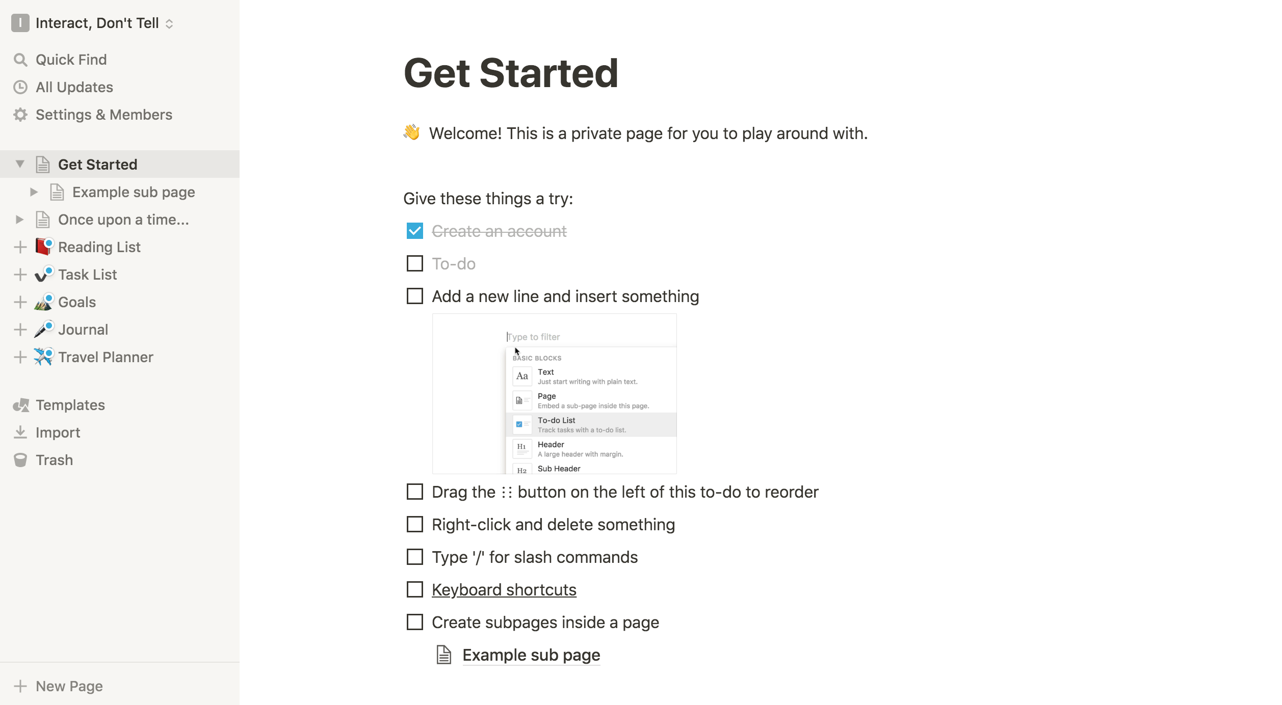
I used to have a graphic in my user onboarding talks that looked something like this:
It used scuba diving as a metaphor to illustrate that good user onboarding finds the happy medium between passive instruction and chucking new users into the deep end of a complicated product. We want to find just the right amount of guidance that allows new users to immerse in a valuable product experience, while letting them have a safe and effective time of it.
The idea of treating onboarding design as the process of finding an optimal balance between two extremes can also be illustrated in other ways. One way might be with a bell curve, inspired by those that accompany texts about the Yerkes-Dodson law.
The Yerkes-Dodson law describes a relationship between stress and performance, originally developed by psychologists Robert M. Yerkes and John Dillingham Dodson in 1908. The Yerkes-Dodson law describes how physiological or mental stress will lead to an increase in a person’s performance up to a point, after which their performance will start decreasing as levels of stress get too high (with the exception of some simple, rote tasks that can still be performed even at high stress levels). Therefore, there is an optimal level of stress needed to ensure peak performance.
Psychologist Donald Hebb built on the work of the Yerkes-Dodson team, such that the concept is commonly illustrated as a single bell curve plotting stress (“arousal”) against performance:

This framework can help one think about various aspects of life; for example, when considering growth and performance in a career, where you seek to find a balance between getting out of your comfort zone so you’re not bored, while avoiding complete overwhelm that burns you out.
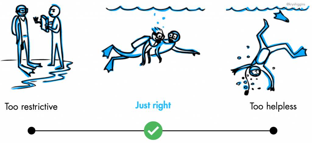
And it might also be an interesting framework for user onboarding design. For example, a user’s ability to realize the most value out of a new product (“performance”) might be correlated to the amount of friction (“stress”) involved in onboarding to it, leading to representing an optimal onboarding experience as the peak of a bell curve graphed along those two measures:
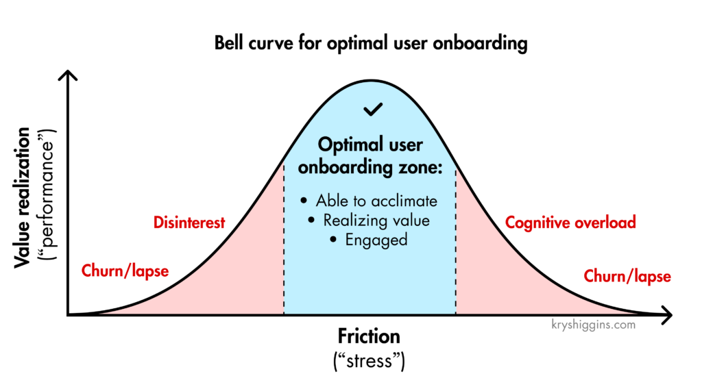
If there’s not enough good friction—such as if the onboarding experience is too passive, or the new user is hand-held even through the most basic tasks—you risk that they won’t realize the personal value they can gain from the experience, and will quickly lose interest. This represents the far left of this graph. One of my most memorable examples of an experience that tried to hold the hands of new users too much was an older iOS game called “Whale Trail.” The game required newcomers to play a tutorial level, during which instructional overlays popped up every few seconds. This interrupted the free-flowing gameplay that would have better engaged new users, by giving them agency to learn through direct interaction. Instead, it rendered them passive.
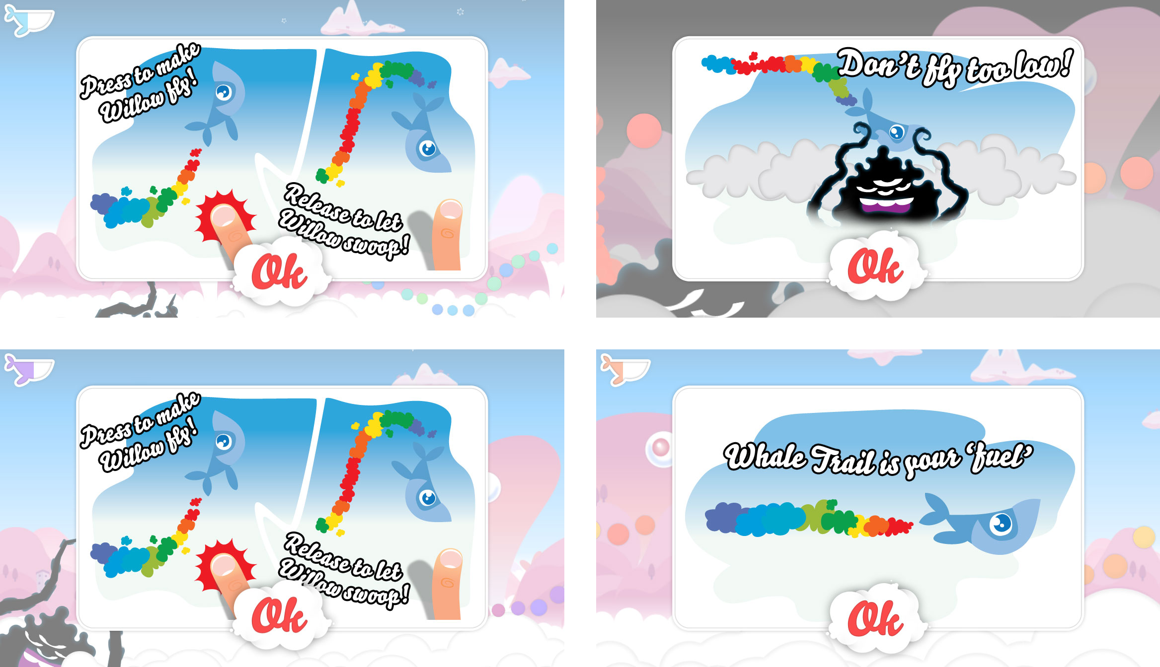
However, if you chuck newcomers straight into too much complexity or friction, they’ll get cognitive overload and churn or lapse from your product. This is what the right hand side of the graph illustrates. An example of such a high-friction experience might be productivity tool Notion’s “Getting Started” page that greets new users. This is the first view new users have when they arrive in the Notion product, showing a long and complex checklist of features on a page that new users might not realize is a single document in the larger content structure of the product. This can lead to overwhelm as users try to figure out where to go from here.*

Instead, you want to look for the right amount of friction that strikes a balance between these two extremes. In onboarding, this will mean pairing the right kind of learning-by-doing activities supported by guided interaction, alongside a usable product design. For example, Spotify lets new users of its website freely explore its content player while being gradually coached into the signed-up experience, an experience that the team at Spotify says helped increase signups, subscriptions, and retention as compared to just making people sign up straight away.

While there’s no single mathematical formula that can be applied to every person, in every product, every time, you can use this as a conceptual framework to inspire onboarding design that finds a balance between friction and value realization in user onboarding design. Where might your onboarding experience end up, if visualized on a graph like this?
Read more about the idea of guided interaction in this post and in my book, Better Onboarding.
* I once used Notion’s “Getting Started” page as an example of a good empty state for new users, because earlier versions made it clear that it was a sample document, with a line at the top stating “Welcome! This is a private page for you to play around with.” The newest version loses that context, so it’s much less clear what you’re looking at and where you are when you land in the app for the first time. Also, the checklist of items on the page has gotten longer and more complicated, adding to the information overload. Here’s what the earlier version looked like.