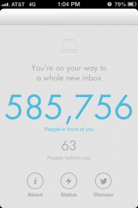
If you’ve downloaded Orchestra’s Mailbox app, you’re probably familiar with this queue screen.

Mailbox is designed to make email simple and manageable with a beautiful, gesture-driven design. So, why the waiting list? According to the company, it’s to prevent servers from crashing and providing a bad experience. The reservation system itself has generated quite a bit of hype, which has in turn increased the number of people getting in line.
So, is this going to be successful for Mailbox? Does this mean all apps should ask users to reserve their service in advance? Here are 4 things, both good and bad, about Mailbox’s approach and what you need to consider before doing it with your app.
1) It doesn’t let people use the product before signing up
Consider Mailbox’s experience from download to queue screen:There are several assumptions built into this flow: that users have seen the pro-Mailbox reviews & tweets before downloading; that they aren’t swayed by the negative App Store reviews; that the short blurb about what it does is enough to answer “why do I care?”; that they feel there’s enough value in the app to ask their friends to get in line; and that tweets from friends who have made it to the front of the line are enough to keep them hanging on.
Mailbox is benefiting from such strong evangelism in the community and many customers are already “sold” before they even download the app. But few products can depend on this kind of blind trust.
As I make note in a previous post about first time user experiences in mobile apps, most products should aim to show interact, don’t tell and provide free samples. One of the best ways for customers to understand your value proposition is to let them play around with it, instead of forcing them to commit to something they haven’t experienced. We’ve seen this behavior with shopping carts and checkout for years. And more recently, the folks working on Buffer wrote a post on this. By removing the requirement to subscribe up front and letting customers use the product first, they reduced their churn rate and increased sign-ups and subscription upgrades.
This really comes down to your measure of success. If you’re only measuring number of downloads or sign-ups, then you probably don’t care what happens after. But if you want to create a long-term customer that generates revenue (Mailbox indicates they’d like to offer paid upgrades in the future) you should consider letting customers play with your product first.
2) The longer the wait, the higher the expectations
Customers perceive time spent waiting as an investment. The more you ask of your customer, the greater the debt you have to pay off.
From website loading times to in-store wait lines, we know customers hate to wait. The longer we wait, the more time we spend asking ourselves “Do I still want this thing?” and “Why was it I wanted this thing in the first place?” (here’s a great research study on this stay-or-renege decision making process).
Mailbox tries to mitigate this feeling of investment in a few ways. First, waiting in line for the app is passive. You will receive a notification the moment your number is up. Also, your place remains reserved even if you delete and reinstall the app so that you don’t get sent to the back of the line.
But anytime a customer reopens the app to check the status of their queue is another opportunity for them to question the value proposition. This makes it just that much harder for Mailbox to meet, let alone exceed, customer expectations.
Assuming that the queue length will decrease or completely disappear as the service becomes more stable, I’d love to see Mailbox compare the churn of users who waited for the product against the churn rate of users who didn’t have to wait.
3) It uses Twitter as an onboarding tool
One of the things Mailbox is doing quite well is harnessing the power of Twitter. As people you’re following post comments and screenshots of the app, they are revealing features, UI tips and other elements that gradually teach you about the app. This is a great alternative to a tutorial or coach marks and definitely beats needing to read the manual.
4) Mailbox’s transparency helps build trust
The other thing that the company is doing very well is being transparent about the reservation system. Through a number of blog posts and tweets Mailbox has made it clear what their process is and why they’re doing it. This level of communication helps build trust with customers and can offset some of the frustration in waiting for the app.
I doubt we can expect many apps to successfully use a reservation system, especially given some of the potential tradeoffs with user retention and expectations, but Mailbox has taken a thoughtful approach to it. I’ll be interested to see if they track and publish any learnings.
Related reading
First time user experiences in mobile apps: My post about 4 ways to improve mobile app experiences for new users
The Psychology of Decisions to Abandon Waits for Service: A research study about the stay-or-renege waiting decision process.
Lessons We Learned from Our Biggest UX and Design Mistakes: The folks at Buffer discuss removing an upfront sign-up requirement.

