In the past I’ve covered patterns and anti-patterns for onboarding new users and principles for first time user experiences. In this post and the two that will follow, I’ll be digging into each of the 3 ways we can better engage new users:
- Guided interaction
- Free samples
- Personal focus
Today’s post is focused on guided interaction. So let’s jump into what it means, discover patterns for making guided interaction a reality and see a few examples.
Set aside the user manual
In 2000, St. Michael’s Grammar School initiated the Great Barrier Reef project, taking Biology students out of their classroom in Southern Australia and up to Queensland. The goal was to teach the students with hands-on marine biology activities in the context of a real aquatic ecosystem. The pilot was a success and the school continues offering this curriculum because of its efficacy in giving them practical skills. This is an example of situated learning (or “learning by doing”), where guidance is provided in an authentic context.
When new customers come to our products, they’re expecting to jump in and get started, not take part in a classroom lesson. Learning by doing an activity itself is often more effective than trying to teach someone to do something by relying solely on books, videos, or other informational formats. And several studies have already shown that people just don’t read the manual.

Unfortunately passive educational techniques like introductory slideshows or videos are still how the majority of sites and apps greet these new folks. While these elements might be great at appeasing internal stakeholder qualms about users not discovering all the features of the product, they are anti-patterns because they keep those users away from direct interaction. Website slideshows (sometimes called carousels) often fail at teaching users information that sticks.

An authentic context
When we force people to read or watch something before they can interact with our products, we’re not letting them get their feet wet. But we also don’t want to toss them into the deep end with no hope of survival. Instead, we want to provide just the right amount of guidance so that they can get started with the real product, but have a successful time of doing it.
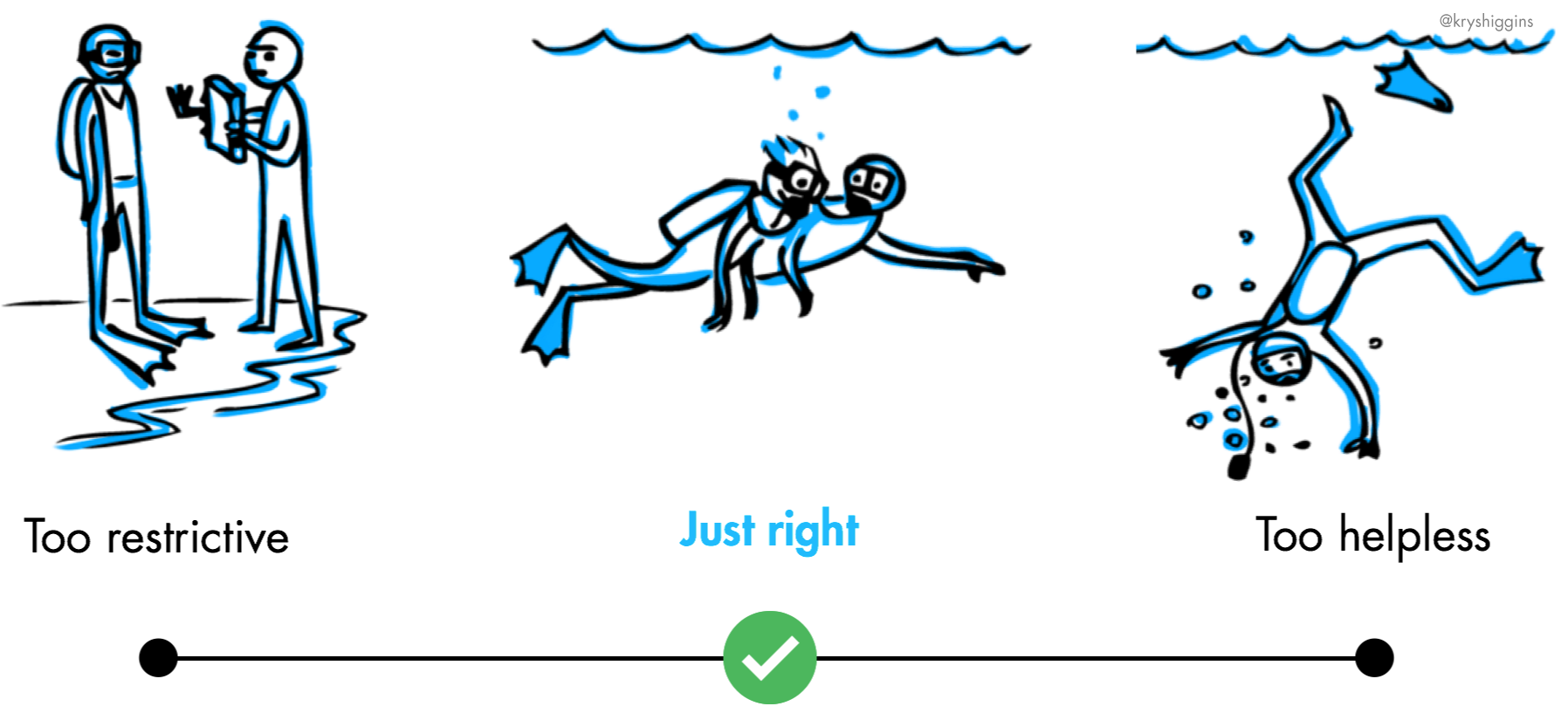
Guided interaction provides a scaffolding of support as someone engages with a new product, eventually tapering off after someone acclimates.
Good guidance will:
- Facilitate exploration in an authentic space
- Gradually engage
- Provide clear next steps
What are some ways this might surface in digital products? Let’s take a look.
Putting guidance inline
Inline guidance is when hints, suggestions, or tips are embedded into the surrounding UI, as opposed to appearing above it, or in an up-front tutorial or experience. Such inline cues provide lightweight guidance without interrupting the user’s interaction. They can appear in the form of empty states (where guidance is “inline” by being embedded on the empty Tate of a screen or tab) or they can be interspersed with normal content. Inline cues also exist in the physical world; for example, icons on paths that indicate which side is for cyclists and which side is for walkers. They don’t require your attention, but serve as occasional, gentle reminders.
Wacom’s Bamboo iPad drawing app has an image on the first empty sketchbook page that invites the user to doodle atop it, but also uses its default drawing as subtle education about zooming and tapping to find the color picker.

Meanwhile, voting app Polar (now deprecated) mixed instructional and interactive voting cards inline with its feed of active polls, providing supplemental, non-blocking education as the user scrolled.

Inline guidance in digital products is best when contextual to the user’s state. For example, if an inline cue suggests an action, and the user completes that action, that suggestion shouldn’t keep appearing. And an inline cue that reflects what the user has already seen or done will be even more powerful.
Because they are seamlessly woven into surrounding content, inline cues are best for empty states, and supplemental, “what’s next?” education, making them great for content-browsing experiences that don’t have a lot of mandatory steps. However, ensure that these suggestions and hints are limited in frequency and not designed to distract someone from content — if they are, people will just think of them as ads and ignore them (or get frustrated, and leave!).
Taking a cue from playthroughs
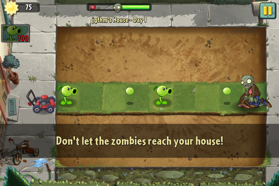
In the gaming world, there’s a concept known as a playthrough tutorial. It’s an authentic introductory level where beginners can explore and learn core skills, and the best ones seamlessly lead users into the larger game world. Players move at their own pace within the playthrough, triggering text, audio or visual guidance as they complete certain types of tasks for the first time. Once they are complete, the playthrough moves the user into the wider game, maintaining any winnings or points earned, while reducing the extra guidance provided for first time play.
For example, Plants vs. Zombies 2 was an iPad game with a playthrough tutorial. That tutorial was designed like any other level in the game, introducing new players to its core concepts and helping them earn initial winnings, while still creating a fun place to play.
We product designers can learn something from game playthroughs when it comes to onboarding. Namely, that providing some additional structure to interaction that gradually leads people into a new space or feature can be better than just dropping them right in. This kind of structured approach is not right for familiar kinds of products or established interaction paradigms, but can be right for complex tools or novel technologies and interactions.
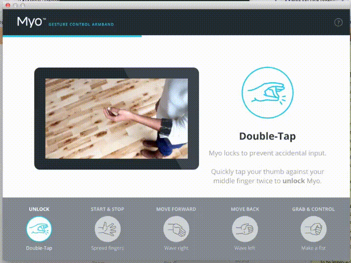
When the Myo gesture-control armband was introduced, it needed to help new owners learn its novel gesture interaction system. As part of its setup flow, it included a playthrough tutorial, meant to be done while the user was wearing the armband. It guided the wearer through trying individual gestures and eventually how to combine gestures to control sample apps.
When your product is built on familiar ground but has a few new concepts sprinkled about, a full play through tutorial at the beginning won’t make sense.
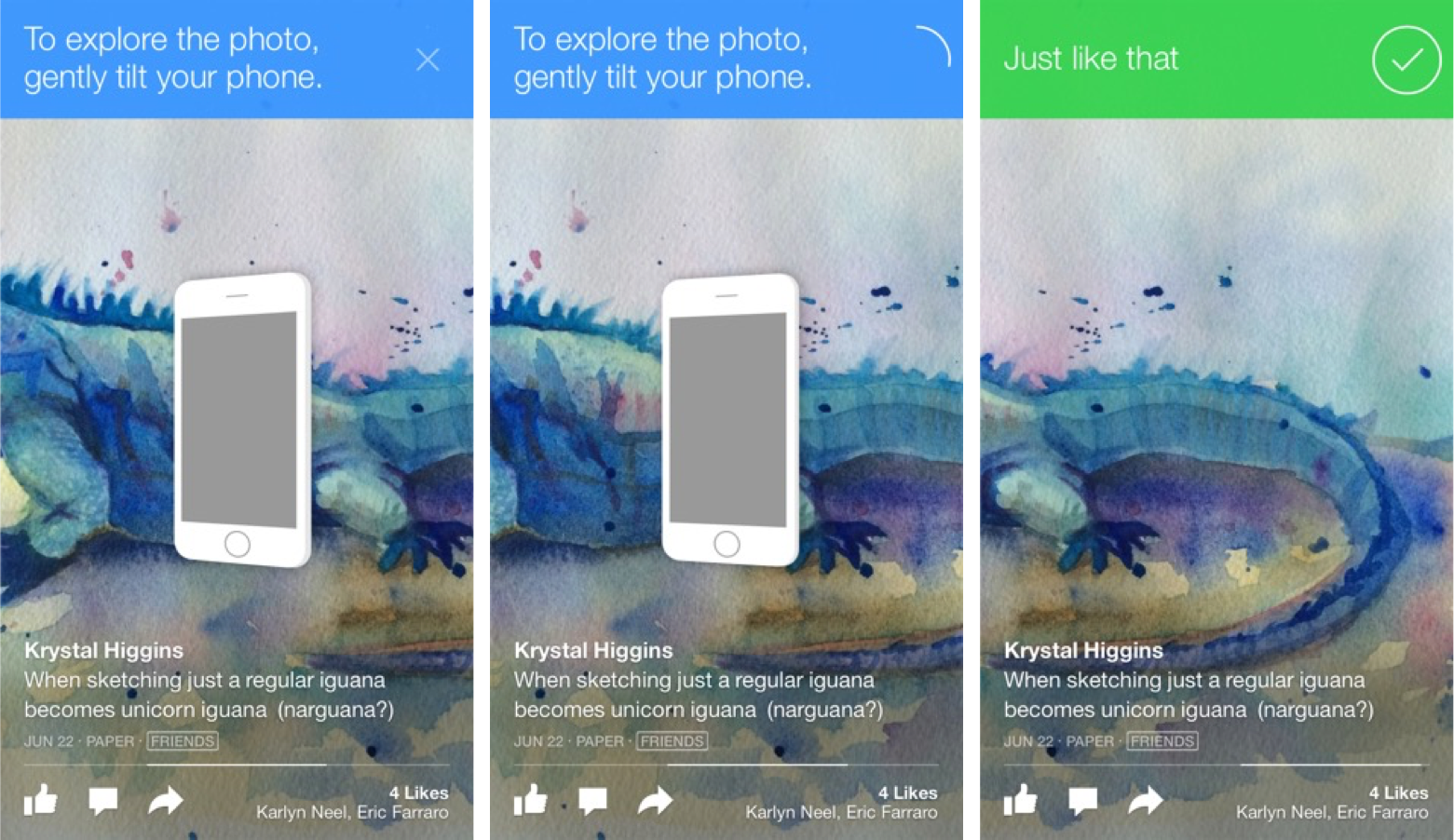
Instead, you can provide structured guidance the first time someone encounters the new feature or interaction. The key is not to block them from interacting. For example, the Facebook Paper app used a guided tutorial only when someone came to a new content interaction for the first time (here, we see the user being guided through panning an image horizontally by tilting their phone, something that was novel when this app was first introduced). We can see there’s realtime feedback from the guidance as the user succeeds in the action.
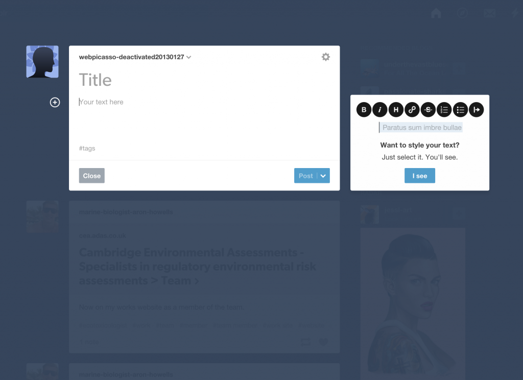
Tumblr’s website used a guided display of hints about text styling that only appeared the first time the user created a post. Note how the hints are not blocking the user’s interaction with the compose view.
Don’t overdo it
The above examples demonstrate some ways we can think about providing guidance as the user interacts, depending on the complexity and novelty of your product and/or its features.
But good guidance also means being selective. You don’t want your guidance to add frustration to the user’s experience.
- Don’t waste the user’s time. Don’t educate about obvious interactions, like pointing to a share button and telling a user that this is how she should share. Solve those kinds of problems in your core UI and focus education on the big, standout tasks in your product.
- Avoid modal dialogs. A user can’t learn in context if they’re being kept from it by a pop-up message that doesn’t allow someone to interact with the UI it’s informing them about.
- Allow escape. Give folks the ability to get rid of or get out of guidance. There are always people who have used your product before and may have been misidentified as a new user, or those who just like to jump straight into complexity. For example, the Plants vs. Zombies 2 playthrough tutorial was opt-in.
Now let’s knock down some commitment walls!
Guided interaction is about helping people understand your product’s value in an authentic context and through gradual engagement. Some inline guidance or playthrough-type experiences is one consideration to have. But you can’t get people to the value of your product if you put signup or paywalls in their way!
To learn how to avoid that big pitfall, head on over to my post about free samples.